It is a minority of price points that have an above average meaning (often predictive), is one of the ways to interpret Tsaklanos his 1/99 Investing Principles. A long term chart often explains why a market is either hesitant or explosive around certain price points. Morover, it is the long term chart that can reveal some utterly important trends, often in the form of a very simplistic trendline (simple line, either horizontal or rising/falling). The S&P 500 has such a trendline: it’s beautiful on the long term timeframe, but explains a lot of price action on the short term timeframe.
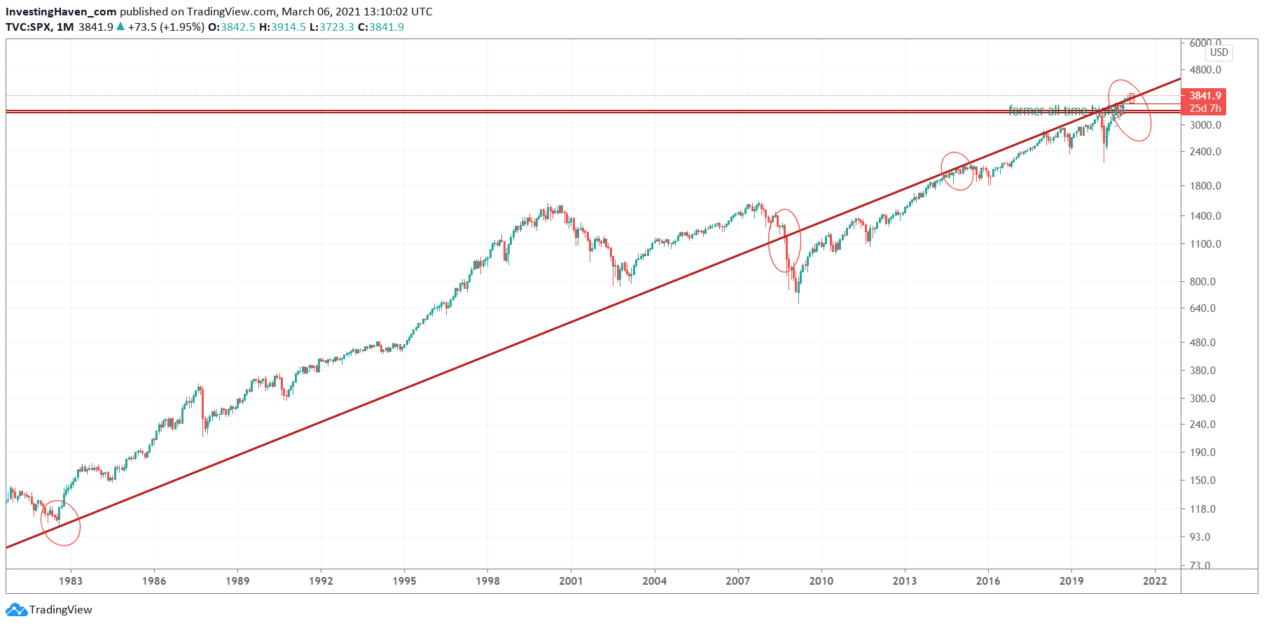
The first chart we feature is the secular S&P 500 chart (40 years).
The simplest trendline we did find on this chart, one that everyone can find and draw, is the red thick rising trendline. Why would this be an important trendline? For 2 reasons:
- It marked the start of structural trends and/or major breakouts or breakdowns.
- It has several touches.
We see that this trendline was the last touch in 1983 before a major bull market started which lasted 17 years!
Moreover, it was when the 2008 market crash accelerated that this long term trendline was broken to the downside (start of a series of big red candles).
In 2014/2015 this trendline provided resistance after which the 2015/2016 temporary downtrend in stocks started.
It was exactly at that point where the epic 2020 Corona crash started.
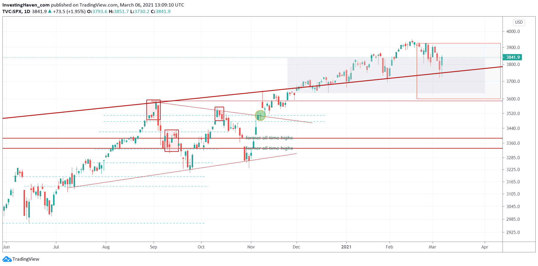
The daily S&P 500 chart shows a close up of current price action as it relates to that secular trendline.
Since December of 2020 the S&P 500 trades above this secular trendline, and has tested it multiple times as support. Even last week the S&P 500 found support *exactly* at that same trendline.
Coincidence?
Not really, coincidence doesn’t exist in markets. There is much more logic than anyone would expect, it just requires a lot of study and an open mind to discover trends, patterns and relevant price points.
We said many times that we expect March of 2021 to be volatile, and we might see some price action above and below this secular trendline. Ultimately, we believe that the market will resolve higher. In the bigger scheme of things, which is the secular chart featured above, the stock market may accelerate its long term bull market … provided it continues to trade above that secular trendline in a few weeks and months from now.
Enjoying our work? We invest in broad stocks as wel as commodities in our Momentum Investing portfolio. In our Trade Alerts premium service we focus on SPX trading in the short term. Next to SPX trading we take a few swing trades per year. In 2020 the combined portfolio delivered +93%. Results are tracked in our trade log books, and publicly shared every 6 months on our Mission 2026 page.