Staying focused is important. It is so easy to get caught up in the endless stream of news. As per Tsaklanos his 1/99 Investing Principles investors better limit the time they spend looking for news, and stay focused on a limited number of indicators to understand the trend of markets. For global investors it is key to follow just a few charts which tell in which direction stocks are trending. It is the Russell 2000 index, the Russell 2000 to S&P 500 ratio and the Russell 2000 to 10 year Yields ratio. All 3 charts are embedded in this article, and if anything they show that the current trendless state is really stretched.
As per our investing tips we choose just a few indicators we want to follow. Especially 10 year Yields play a crucial role in markets because of their ability to define the trends for other markets.
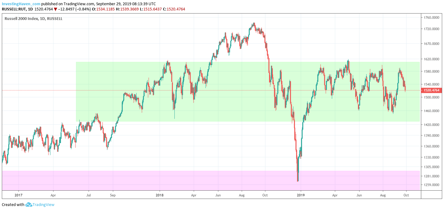
The first chart depicts the Russell 2000 index.
This is THE most important stock index because it is the ultimate measure of RISK ON.
In the last 2 years this index has been trendless. It has been moving in a wide range between 1410 and 1625 points. Only last summer did this index break out, but it eventually got invalidated because of falling rates (which is visible on the 3d chart).
As long as the Russell 2000 index does not get above 1625 points we will continue to see stock markets struggle.
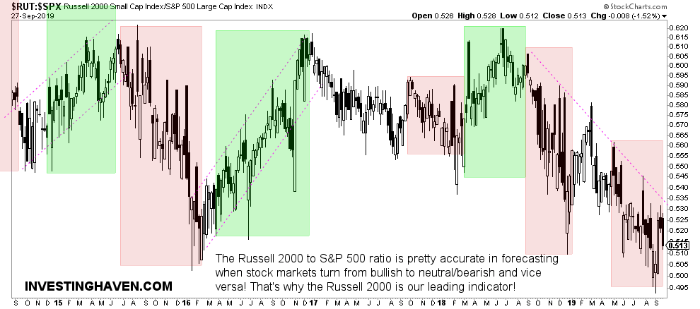
Next is the ratio of the Russell 2000 to the S&P 500 index.
This is a great measure of relative strength of the RISK ON factor.
We look for trends on his chart. The green areas indicate RISK ON, the red ones RISK OFF. Trend changes are indicated by a breakout or breakdown.
For now, we see a very long RISK OFF trend, unusually long. This may suggest times are about to change, but the trend remains RISK OFF until proven otherwise. This ratio is not a timing indicator.
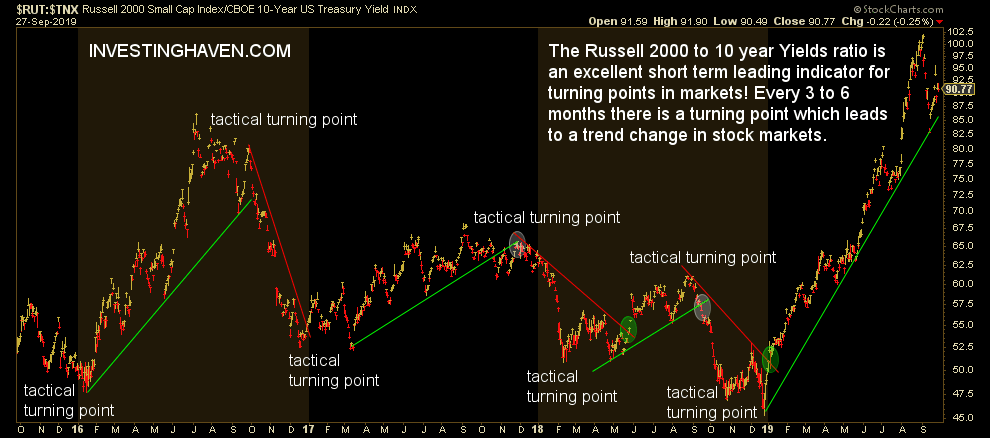
Third, but likely the most important chart is the Russell 2000 to 10 year Treasury yields.
This is a great ratio to find market turning points. Not the secular turning points in markets, but tactical (which is on a 3 to 12 month timeframe).
In essence, this ratio worked very well in recent years. However, according to this ratio we should be in a bullish stock market trend right now with the Russell 2000 index outperforming Treasury yields in relative terms. This obviously does not match with the findings on the above charts.
What does this mean?
Most likely, it does suggest that the Russell 2000 can be rising in relative terms against Treasury rates without being a real bear market. Stated differently, we are in a trendless stock market.
The million dollar question is what will happen once this ratio will start pointing down. The answer to this question will come from the other 2 charts shown above.
That’s why it’s crucial to read the 3 charts in conjunction, and not in isolation. This is the perfect illustration of how markets work together to define a trend, and even investors interested in just stocks should look outside the stock market to find clues of the next trend.
For now, until proven otherwise, we are in a trendless stock market. Only once the 3 leading indicators in this article turn positive simultaneously will we be convinced about the continuation of the stock bull market (also RISK ON).
We would think it’s about time of RISK ON to return, but we need the confirmation based on the data (not our opinion or desire).