The Japanese Nikkei 225 index is one of the most volatile stock market indexes. Volatility comes with risk but also with opportunity. At this very point in time, it looks clear that the Nikkei 225 comes with opportunity. The 40 year chart structure has a secular bullish reversal, one over 30 years. The Nikkei 225 index favors a resolution to the upside.
It might not be the hottest stock market in the world, it might not be the most popular stock market in the world. Still, the Japanese Nikkei 225 index has one of the stronger long term chart structures among world indexes. It certainly has one of the longest term patterns, one that is reliable.
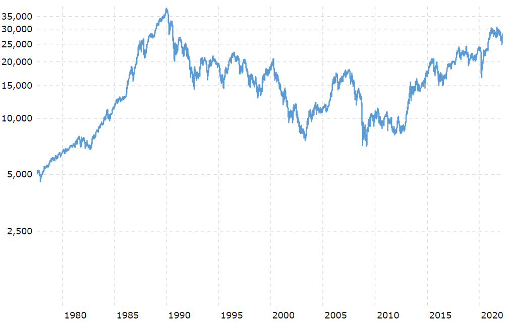
Japanese Nikkei 225 index historic chart
The chart pattern we see, both on the log and non-logarithmic chart of the Japanese Nikkei 225 index, is a bullish reversal over 30 years. It doesn’t happen often that we see such a wildly bullish pattern over such a long period of time.
Note that these are long term structures. These should not be confused with short term structures.
What do we mean by this? While this chart pattern is strongly bullish, and favors a long term upward resolution, it is directionally a long term move higher. The timeframe is what matters, and the timeframe associated with this chart is expressed in years.
While we see the Japanese Nikkei 225 index move higher in 2022, it might comes with significant drops over the coming years. Still, the direction should be higher.
The impact of the Corona crash is a good illustration.
On this long term timeframe we look at the Corona crash and interpret it as a ‘buy the dip’ opportunity. That’s because of the long term bullish structure in which the crash happened. The bullish structure could absorb selling.
You might argue that the Corona crash was a ‘buy the dip’ opportunity in most, if not all, markets. That’s not accurate though. While indexes in the U.S. came with a ‘buy the dip’ opportunity not all indexes were able to absorb selling and remain higher some 24 months after the crash.
What’s next for the Nikkei 225 as per its historic chart
If anything, this chart pattern suggests that this index is on its way to test ATH.
The historic Nikkei 225 chart suggests hat the index is on its way to its historic highs. ATH highs in this index were printed in the year 1989: 38,915.87 points.
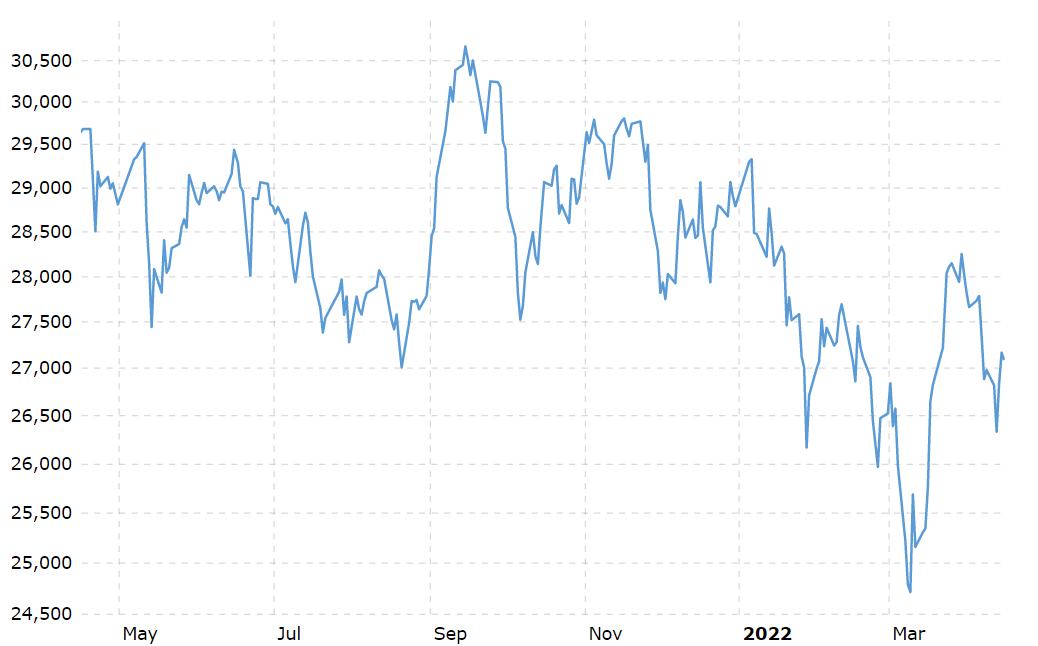
In order to understand when the Nikkei 225 index could be starting its move to ATH we need a shorter timeframe. Below is the 12 month chart.
The pattern we could find on this chart is an inverted head & shoulders structure. It started in January of this year, and the current month suggests that the right shoulder (inverted) is being printed.
We need at least 3 to 4 more weeks to have a confirmation that this is an inverted head & shoulders. If so, this would be bullish for the medium term. It would suggest that the Nikkei 225 index will clear 30,000 points.
Time to buy the Nikkei 225 index?
The observation about the head & shoulders pattern really is the crux of the story. It also answers the question whether it is time to buy the Nikkei 225 index.
This is the short version of our answer: if U.S. indexes are printing a similar head & shoulders pattern, then what’s the difference between investing in the Nikkei 225 index vs. investing the S&P 500 (even the Nasdaq)?
Probably, there is not a lot of difference.
Not anymore, there used to be a big difference.
Note that the Japanese index printed an ATH in 1989 while U.S. markets continued rising another 11 years. Moreover, since 2013 U.S. markets continued moving higher and continued printing new ATH almost every other year. Not so in Japan.
In recent years, though, the correlation between Japan and the U.S. is stronger than ever before.
It suggests that in highly connected markets which is how global markets have evolved over the years it doesn’t really matter whether you invest in market A or B if they are connected. What matters is timing your entries and exits, what also matters is finding the sectors that do well in each bullish cycle.
This, and many other topics, is what we discuss every week in great detail in our Momentum Investing analysis.