What is the inflation outlook for 2018 and beyond? That is what we answer in this article which describes a unique yet very relevant viewpoint based on a set of 5 economic and market indicators.
Based on economics 101 we intuitively know that inflation is defined as the process of continuous price increases of most goods and services. Under an ‘ideal’ scenario a sustained rise in prices will ultimately lead to inflation due to healthy economic growth though there are also periods in time in which inflation happens despite weak or negative economic growth.
When a healthy economic growth induces a higher inflation (Chart 1) the aggregate demand (AD) in an economy expands faster than long run aggregate supply (LRAS), a higher inflation rate will be expected. With demand rising faster than supply this suggests that economic growth is higher than the long run sustainable rate of growth.
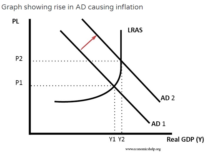
Chart 1 (Not according to scale)
Instead of deviating too much into what cause inflation and how it is measured, InvestingHaven wants to delve into 5 macro indicators to find out the level of inflation for 2018 and beyond.
#1 – Fed Fund Rate
Has the number of rate hikes carried out so far by the US Federal Reverse (FED) provided sufficient evidence to conclude what the situation for inflation is? Since the global financial crisis struck in 2008 Fed interest rates (detailed in Fed Funds Rate) have been kept at 0.25% from Dec 2008 for a good 7 years before raising it to 0.5% in Dec 2015 to spur economic growth.
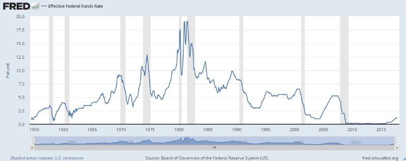
Fed Funds Rate
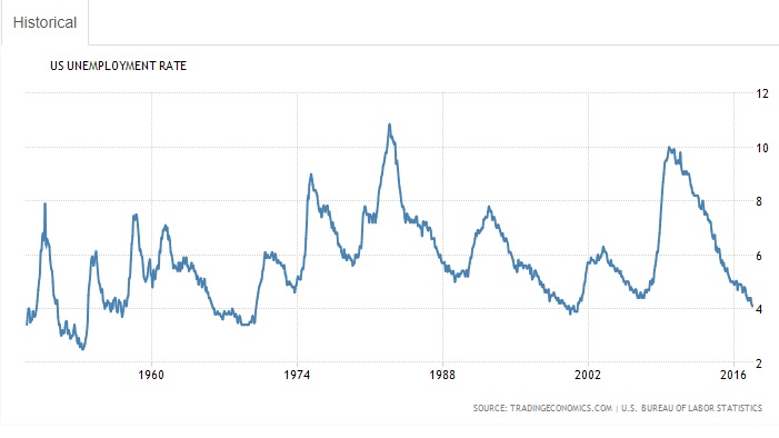
US Unemployment Rate
The US unemployment rate was successfully driven down from the peak of 10% in 2008 to 4.1% by 2017. Year 2001 was the last time unemployment rate hit ~4. This indicates a speedy pace of economic growth if not in full-throttle.
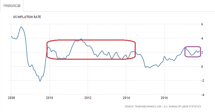
US Inflation rate (last 10 years)
Referring to the US inflation rate (10 year chart), there was a promising inflation of above 2% most of the time between 2010 – 2012 and yet the FED didn’t bother to make it 0.5%, they knew it was unsustainable and subsequently inflation rate fell to near 0% again. For the last 1 year or so the official inflation rate is again fluctuating in a narrow range around 2%. What is the underlying message FED wants to bring across? We highly suspect that, this time, the FED is confident that solid inflation will hit. As of Dec 2017 the Fed Fund Rate has risen to 1.5%. Furthermore the Fed has hinted that they would raise rates to 2 percent in 2018, 2.5 percent in 2019 and 3 percent in 2020. Seems like they see the urgency to increase the rate because of the fact that inflation is catching up fast. After all, the Fed interest rate is one of the major tools used to combat increasing inflation. The team at InvestingHaven felt the same.
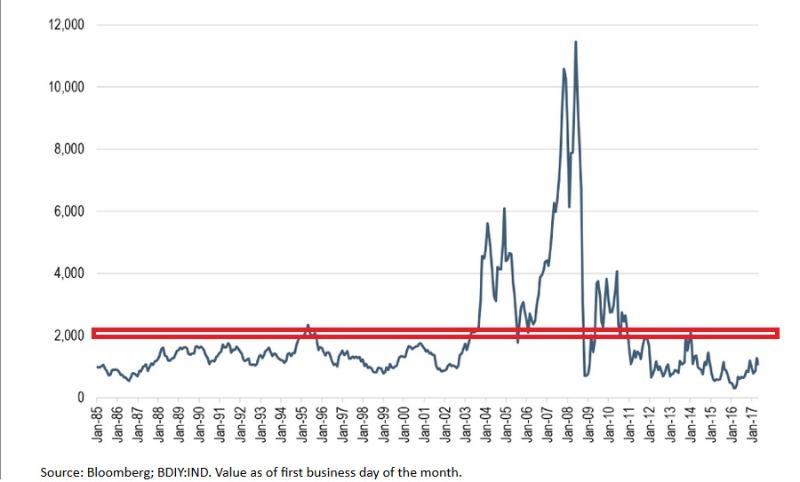
#2 – Baltic Dry Index
The Baltic Dry Index (BDI) is an economic indicator issued daily by the London-based Baltic Exchange. Not restricted to Baltic Sea countries the index provides “an assessment” of the price of carrying major raw materials around over sea. Taking in 23 shipping routes measured on a timecharter basis the index covers Handysize, Supramax, Panamax, and Capesize dry bulk carriers carrying a range of commodities including coal, iron ore, steel, cement, grains and so on around the world.
The historical chart of BDI (see below) shows that the majority of the time BDI is suppressed below 2000 except between 2004 – 2008 when hyper and super inflation occurred which finally crashed together with global equities. So if the BDI is moving higher it implies that the price of shipping raw materials is increasing. Consider this, when there is higher demand for the raw materials it will directly impact the shipping cost. Typically, demand for commodities and raw goods increases when global economies are growing. The reason for BDI to emphasize only dry raw materials because an increasing demand of these raw materials provide a glimpse of what the near future holds. Producers purchase large amounts of raw materials when they need to build more finished goods and infrastructure, such as automobiles, heavy machinery, roads and etc. For investors, knowing when the global economy is growing is helpful because it means stocks, commodities and the value of commodity-based currencies should increase in general.
We believe we can fire a full-fledge inflation call as of the moment when DBI breaks above 1950 points.
#3 – Copper to Gold Ratio
The monthly chart above is the copper/gold ratio as historical as it can get.
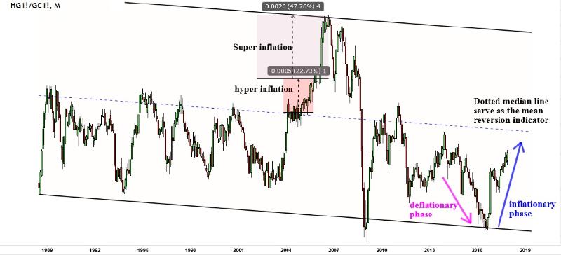
It is still a pretty important indicator. Why copper (COPPER) and gold (GOLD)? Copper is durable, highly conductive, coupled with its malleability and resistant to bacteria. The nature of this metal allows for many industrial uses including in electrical wires, motors, and plumbing. Gold has a handful of industrial applications too, but its relative scarcity makes it useful mainly as jewellery and money in the form of bricks, ingots, and coins meant to store value. As a general rule of thumb copper’s rise tends to suggest that current and/or expected economic activity is improving. Gold can be more idiosyncratic, but it sometimes rises when investors fear turmoil.
As a general rule of thumb a surge in the copper/gold ratio highlights the potential economic growth extending further, which, in turn, can nudge inflation and lead central bankers to raise interest rates (mentioned in point 1). This tends to put pressure on bond prices and boost yields. The average American car has approximately 55 pounds of copper wiring, while electric cars require closer to 160 pounds (source). As a result, the International Copper Association increased copper demand for cars and busses from 185,000 tons in 2017 to 1.74 million tons in 2027. The near ten-fold increase would represent 7% of today’s global copper production.
The copper/gold ratio chart shown above, apart from the fact that it moves in a slightly tilted downtrend channel, it mimics very closely the price of BDI. Even as prices spent most of their time in the lower half of the channel, an upside move indicates an inflationary phase while a downside move points to deflationary forces at play. The median line serves as a fence for super economic growth. There is a small period of hyperinflation which matches the BDI chart, and the last short vertical move of super inflation which meant the super economic growth cannot sustain for long time.
This is the third indicator flashing inflationary forces at play.
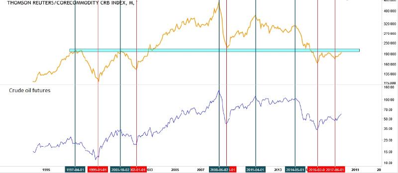
#4 – Thomson Reuters Core Commodity CRB Index
Founded in 1957, the CRB Index has a long history as the most widely followed index of commodities.
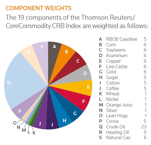
There has been so much emphasize on crude oil that crude alone can be used as a proxy for the CRB Index. The monthly comparison chart below shows that every single bullish and bearish reversal in crude oil can be superimposed on the monthly chart of CRB index. Should the price of oil go beyond 62 and the CRB index beyond 205 respectively, inflation will be gaining traction. As long as both crude oil and CRB index stay underneath the major resistance, inflation is contained.
#5 – TIP/TLT ratio
The US Treasury issues both fixed income treasury bonds (TLT etf) and price-inflation linked bonds called Treasury Inflation Protected Securities (TIP ETF). TIPS are price-inflation sensitive bonds that adjust upwards in periods of price inflation, whereas normal fixed income bonds suffer in periods of inflation because the fixed size coupons a bond holder receives can buy less goods or services. Since the par value of TIPS moves up and down based on the Consumer Price Index (CPI), it gives us a good gauge of inflation, especially when compared to traditional US Treasury Bonds – an inflationary expectation indicator
This monthly ratio chart above is solely utilized to monitor the inflationary or deflationary sign of investors’ risk appetite and their expectation of inflation. This should not to be interpreted as a buy recommendation.
Whenever the ratio goes up it is an indication that investors favor TIP over TLT as they are expecting economic growth accompanied with inflation. The opposite is true as well. Unless prices break up of the red downtrend line, and make a higher high above 0.97, it is not convincing enough to confirm the onset of full-borne inflation.
Conclusion about inflation outlook for 2018 and beyond
The 5 factors we discussed in this article are the ones that InvestingHaven’s team considers important and relevant. The confirm that the current stage of economic growth has a significant level of inflation. Although this could be interpreted as a confirmation of future economic growth we would recommend investors to remain cautious and seek advice of a certified and qualified financial advisor.
Disclosure: I/we have no positions in any asset mentioned, and no plans to initiate any positions within the next 72 hours.
I wrote this article myself, and it expresses my own opinions. I am not receiving compensation for it. I have no business relationship with any company whose stock is mentioned in this article.
Additional disclosure: This insight does not constitute an investment recommendation, but is produced to keep individuals informed of market / economic trends that we follow