The most important Japanese stock index, the Nikkei 225, has a spectacularly interesting chart setup. After a 15 year bear market, it seems that the bull is returning … seemingly with a vengeance.
If anything, the long term chart of the Nikkei 225 looks horribly volatile. This is not a stock index for the faint-hearted investor.
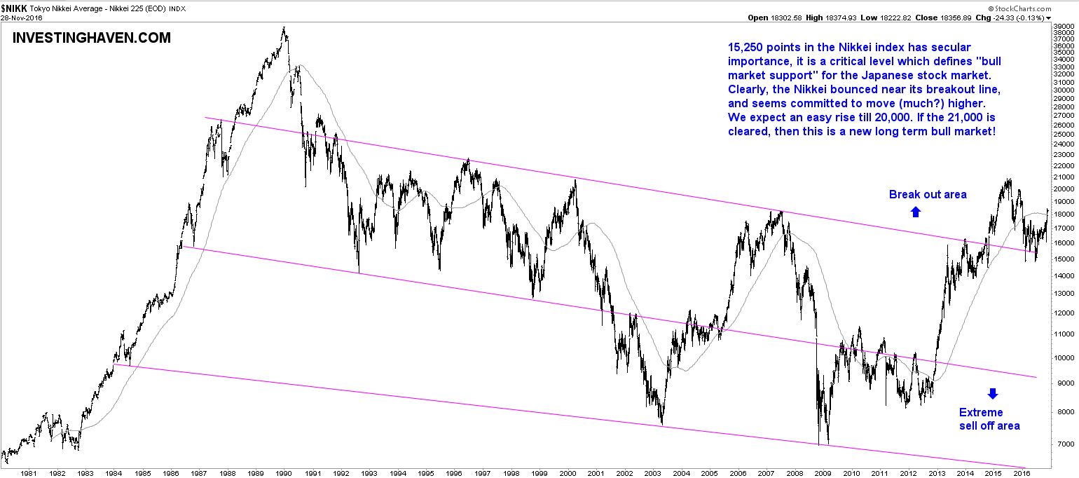
The Nikkei 225 long term chart which we analyze in this article goes back 35 years. Between 1983 and 1990, the Japanese stock market rose fivefold. That is pretty amazing for an index.
However, since then, things went downhill. The chart has a clear and concise pattern, based on a descending channel. The lower band is an area which characterizes periods of extreme selloffs. The area above the channel is a breakout area, i.e. a bull market area.
As seen on the long term Nikkei 225 chart, the index has moved last year into that breakout area. Interestingly, the index retraced to the upper line of the channel, which has been tested successfully three times, and is now moving higher again. We interpret this as a confirmation of the breakout.
The ‘real deal’ (i.e., the real bull market) will be confirmed once the 2015 highs will be taken out. Watch the 20,000 to 21,000 area closely, as annotated on the chart.
In sum, we believe the Nikkei 225 looks quite bullish at this point, and, given the volatile nature of the Japanese stock market, this bull run could go hard. Investors should select a safe ETF with sufficient trading volume to play this market, or select a couple of Japanese stocks.