Loyal readers know that we take the copper chart very seriously. In fact, it’s one of our leading indicators. We are not only looking at copper as a trade or investment, although the copper market is an interesting one for trading and investing. Rather, we analyze the relationship between copper prices and the state of the global economy. Copper is known as “Dr. Copper” because it is widely regarded as a leading indicator of economic activity.
About a month ago, we wrote this article Is Dr. Copper As Concerned About The Economy As Experts?
We made the point that copper prices have been volatile in recent years, but the current chart structure of copper does not necessarily indicate a concern when it comes to the global economy and the condition(s) of the market. In a way, it confirmed that supply chain disruptions and inflation should be transitory, even though persistent.
Investors should pay attention to trends on the copper chart.
The copper chart provided much more reliable information that experts and gurus. To make this point, we highly recommend you re-read these articles:
- January 12th: Are Economic Experts Lying Or Confused Or Both?
- March 5th: Copper Says No Market Sell-Off In 2023. Are you Listening?
The copper chart shown below shows the price movement of copper futures over a period of 18 months. Looking at the chart, we can see that copper futures began a strong rally in early 2021. The rally peaked in May 2021, with copper futures reaching a high of $4.88 per pound. However, since then, the price of copper started a downtrend which ended with a double bottom in 2022 (July and October). Since then, a series of higher lows started.
Since last week, however, the rising trend that started in October 2022 is broken to the downside!
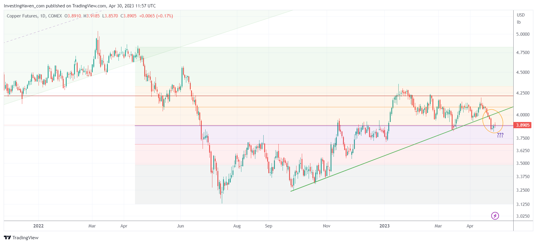
We better start paying attention now.
While this does not necessarily suggest that a crash is going to start or that the global economy is going to fall in a deep recession, it certainly bares watching.
Best case, copper is starting a consolidation. In the end, price action in 2023 is doing just that: consolidating. So, the probability of a continued consolidation is high.
However, the break of the falling trendline makes this setup more vulnerable.
Luckily, copper finds itself in an area with great support. We are using color codes to make our charts easy to read, based on Fibonacci levels. The area with the red and purple shaded area come with great support. This should hold. It also means that IF that area gives up it can become very serious.
As long as support on the copper chart holds, there is nothing wrong with the global economy. Markets work, they move higher and lower, in a certain structure. Key support should be respected, after the rising trend is now broken, is the key take-away from the above chart.
For now, we assume that we’ll have a bearish bias in the context of a wide consolidation, in the months of May and June, as discussed in This Market Is Doing A Great Job In Hiding Its Intention.
Are you fed up with conflicting market signals and messages? You might want to consider our auto-trading service, you completely outsource the trades, we only trade the S&P 500. We closed 4 consecutive months with portfolio growth, but the best is yet to come. More about our auto-trading service >>