
Our Bitcoin forecast 2019 is underway, even if the timeline is delayed. The long term Bitcoin price chart shows why we believe so. In essence it shows a strong similarity with the previous bear market and how it ended. As always chart analysis pays off, we believe this applies more so in crypto land.
As per InvestingHaven’s methodology, and as explained in our 100 investing tips, we apply the ‘start with chart’ principle. Let’s first understand what we can derive from Bitcoin’s long term chart.
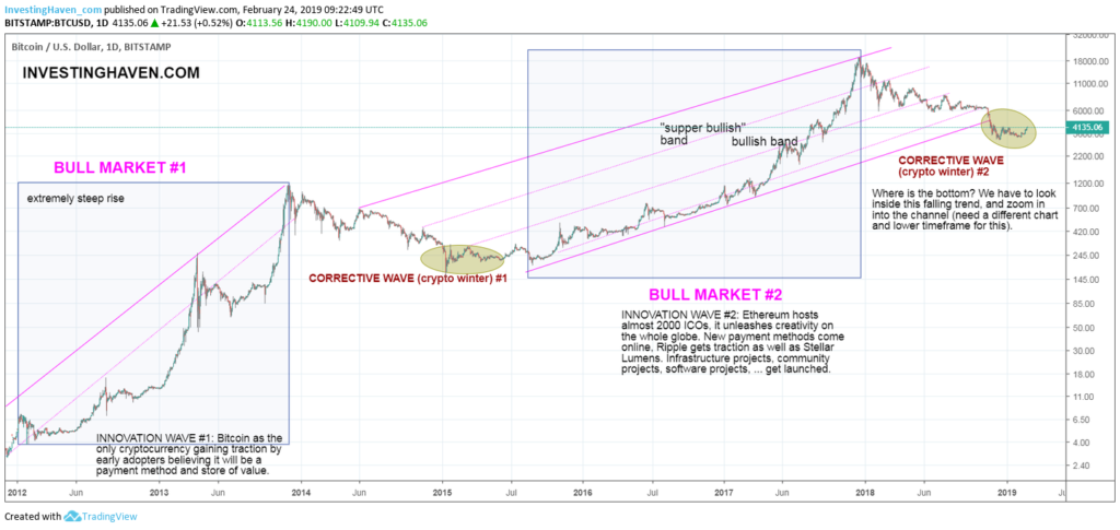
Bitcoin Long Term Chart is Bullish
Bitcoin (BTC) is still the largest cryptocurrency in terms of market cap. This may change in 2019 or 2020 as per our 5 Must-Read Cryptocurrency Predictions. However, for now, we just go with the long term Bitcoin chart as the leading indicator.
The long term Bitcoin chart shows 5 important take-aways for crypto investors! From the long term Bitcoin price chart below, we derive the following observations.
- The $6000 mega support level got tested successfully multiple times in 2018. Each time it held strongly.
- However, at the end of 2018 it broke down. The subsequent move is very important, as the decline stopped in a similar fashion as in 2015. Although the breakdown was a reason for concern the subsequent move may signal the opposite!
- Bitcoin’s long term price chart shows that Bitcoin fell through its rising channel a couple of months ago. This is not the most bullish development, admittedly. But the whole point is that this is part of the corrective cycle in the context of the 2nd bull market with subsequent bear market.
- Exactly the same happened during the first bear market, with the end of the bear market in 2015 with the great illustrations mentioned in the next paragraph.
- The recent rise is absolutely in line with our vision explained on Medium.com. We said the next bull market would be not as steep as the previous two ones. The way the recent bottom is now evolving confirms this vision, and vice versa.
That’s what we start seeing on Bitcoin’s long term price chart now. Note the similarity between 2015 and the present day. Pay special attention to the yellow circles. This has a very similar setup.
Bitcoin Long Term Chart Reflects Our Investing Thesis
What we believe is that institutional money is waiting to enter the crypto space. The new crypto bull market will be driven by institutional money in combination with the new wave of innovation and adoption which will come from security tokens combined with stablecoins.
This is our main investing thesis on the next phase of the crypto bull market.
We also believe this is becoming increasingly visible on Bitcoin’s long term chart.
Bitcoin Long Term Chart Reflects Sentiment as a Contrarian Indicator
Now here it becomes is interesting, because we just said that 2015 was the start of a new bull market. But 2015 was still a bear market, one that most thought would mark the end of Bitcoin and cryptocurrencies?
Not convinced, this just a subset of news that was published back then:
- “Is Bitcoin headed to fresh new lows” published in March 2015. This article came out AFTER the low of January, after which Bitcoin never came back to that point.
- “Will Bitcoin ever rebound”, published by CNN early 2015. This is a great quote from that article: “Bitcoin was a bubble that has burst. Jeffrey Gundlach, head of influential investment firm DoubleLine, is firmly in the Bitcoin bear camp. In a webcast on Tuesday, Gundlach declared that Bitcoin is “on its way to being relegated to the ash heap of digital currencies.”
- “Bitcoin might be dead. It doesn’t matter,” published by Telegraph in the UK almost the same day Bitcoin set its lowest point between 2013 and the present day. What about this last paragraph of the article: “Jeffrey Smith, chief information officer of one of the largest mining operations going, CEX.IO, recently said that the company would soon be shutting-down to ride out the storm: a “forced temporary measure, the result of cloud mining costs exceeding mining profit.” This could create a negative feedback loop as miners retire, the network becomes less secure and resilient, investors lose faith, and the price drops further.“
These quotes are available on the internet, so it is easy to verify this.
Bitcoin Long Term Chart Is Again Contrarian In 2019
The more important point is that they were published right at the major bottom of the previous bear market, say at the depth of crypto winter #1. Today, as we transition again out of crypto winter #2 as said in Cryptocurrency Alert: The Crypto Winter Has Ended we see the same thing happening.
Here is evidence of exactly the same pattern happening at the depth of crypto winter #2. When Bitcoin was crashing in late 2019, and set a major bottom which likely was THE bottom, people were publishing exactly the same type of b******t:
- On Dec 11th, 2018: Bitcoin will continue to fall to $1,000 as published on Express.co.uk.
- On Dec 5th, 2018: Bitcoin did not find a bottom, we can expect more downside based on ‘great’ charts in this article which appeared on Forbes.com.
- Bitcoin can fall below $1,000, obviously, says this article on Quora.
- Magic Vitalik says all is over and done last September, he missed the bottom with 3 months though. The ultimate contrarian indicator!
- A year ago this prediction of Bitcoin $1,000 appeared on TradingView. Obviously this is not serious but we included this article to show the ‘great value’ of social media. Anything can be published, anything can be expected.
What is so great about chart analysis combined with sentiment analysis is that they measure the opposite:
- When the chart reaches extreme highs it feels extremely safe and secure.
- When the chart reaches extreme lows it feels like hell.
Major bottoms may feel bad, and this feeling is amplified by social media and financial media articles. But it really is the opposite. That’s how it went in 2015, that’s how it went in 2018.
One thing is clear from the Bitcoin long term chart: Crypto is NOT dead, crypto is alive and kicking. That’s what Bitcoin’s historical price chart says to us, and it keeps on improving with each passing day that Bitcoin remains stable around current price levels (while sentiment becomes worse). We like this, a lot even!
Bitcoin still is the crypto with the largest market cap. It may or may not remain the number 1, we will have to find out.
Conclusions on the Long Term Bitcoin Chart
Our conclusion is Bitcoin is transitioning from a bear market to a new bull market. In essence, though, it means that the grand bull market in Bitcoin and crypto never died, the bear market was tactical in nature!
As we can see on Bitcoin’s long term chart bulls couldn’t keep the price above 6,000 last years but bears couldn’t push the price below 3k support area either, which in itself is constructive.
Hence we base our price perspective on the dominant long term trend which is a strong upwards trend with lots of volatility, sharp retraces but Bullish nonetheless.
The long term Bitcoin chart signals it is time to buy Bitcoin?
People are asking us whether it is time to buy Bitcoin. Our point of view is very simple: if everyone was crazy to buy Bitcoin at the top and ignored sell alerts like this one, then it would not be very wise to ignore today’s opportunity at much lower prices. So yes it is good to add to your positions below $6k.
Want to know more about investing in Bitcoin, altcoins or blockchain stocks? We have identified the 10 most valuable cryptocurrencies and 10 best blockchain stocks, become a member NOW >>