The US dollar hit 14-year highs. Is this the time to buy or to sell dollars? The answer to that question is mostly easy to derive from the charts, but one has to look at several timeframes. In this article we focus on the very long term chart of the US dollar.
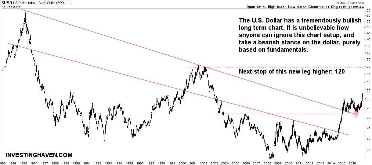
The 34-year chart of the US dollar is incredibly enticing. Anyone can observe a constructive chart setup.
One of the key principles investors have to apply when revising charts is to focus on a minority of price points. Only 20% of price points are relevant and valuabel, the rest has no value. Those important price point are typically bottoms and tops. Connecting those price points in a logical way result in patterns.
Simple patterns on the US dollar long term chart
Interestingly, the long term chart of the dollar is basically as simple as a chart can be. There are two resistance lines, annotated with purple on the chart. Although not indicated, we could draw a support area at the bottom (we did not do so as our focus here is on the upper area of the chart).
The dollar broke through the highest trend line (resistance) in the fall of 2014. Since then, it tested that trend line several times. The final test, earlier this year, coincided with another trendline (horizontal purple line on the chart). As annotated with the red circle, the test was successful, and the dollar went higher from there.
It is beyond us how anyone can ignore this chart setup. Some dollar bears keep on whining on a collapsing dollar because of whatever fundamental reason. Even the Nasdaq site published an article recently on a dollar crash, and, similarly, Marketwatch came ouf with a bearish dollar post right at a time when the dollar successfully tested major support (red circle on our chart).
While those fundamental explanations could be true, the chart gives a different message. At least, this analysis is to the point, bullish dollar. Clear and distinct chart setups, on very long term charts like this US dollar one, should not be ignored.
5 reasons why the long term dollar chart is bullish
Let’s summarize the 5 reasons why we believe this chart setup is very bullish. First, the dollar broke out of a very long term declining pattern (breakout in the fall of 2014). Second, it also broke through a decade long resistance area, the horizontal line on the chart. Third, both trendlines were tested successfully in 2016.
Next, all the above mentioned points are on a 34-year chart, which is a very long timeframe. Chart patterns on such a long timeframe have the highest possible value. Last but not least, the dollar broke through its recent tops at 100 points.