We are entering the weakest period of the year in markets. September and October are historically the weakest months. August is known to be sometimes bullish but often the start of a bearish period. Smart investors start taking cautionary measures, and that becomes clear in how markets are trending now.
If anything, the relative strength of major indices is starting to become worrisome. Potentially this is a confirmation of the coming weak period. The Nasdaq has been leading, but it created a reversal as it peaked, both in July and last week. Moreover, it seems like a first sign of a lower high has set. Watch the Nasdaq chart here.
From a different perspective, small caps, represented by the Russell 2000, are seriously lagging. Small caps are considered the barometer for risk sentiment. If they are weakening relative to the other key indices it is not a good sign for markets.
Now that comes on top of historic lows in volatility last week, a sign of maximum complacency. We recently looked in the historic VIX index chart and observed that the only instances where the index was as low as it is now (over the last 30 years) were followed by quick spikes higher, relatively soon after current levels were hit.
Does that suggest that markets will crash? That is certainly NOT what we are suggesting. We are saying that historically low volatility will not last long. As volatility picks up, it bears watching which markets and segments do well and which ones sell off. For instance, it could well be that gold will act as a fear trade in the coming months (if that is the case, it will be reverse its long term bear trend into a bull trend) and that bonds will outpeform …
So the message of this chart is that maximum complacency is not bullish, but it triggers smart investors to watch closely what is going to happen as volatility will pick up in the coming weeks and months.
Today, we share 3 additional volatility charts which confirm the above worrisome levels of complacency. This courtesy of Stockcharts.com:
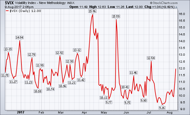
Measures of market volatility are bouncing. Not enough to signal any trend reversals, but enough to keep an eye on. The first chart shows the CBOE Volatility (VIX) index climbing 9% today to the highest level in a month. It would need to clear its early July peak at 12.54, however, to send a more negative warning.
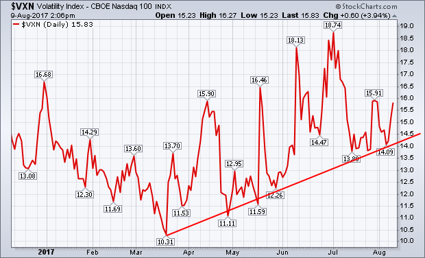
A little more concerning is the recent rise in the CBOE Nasdaq 100 Volatility Index ($VXN). [While the VIX is tied to the S&P 500, the VXN is tied to the 100 largest stocks in the technology-dominated Nasdaq market]. The second chart shows the VXN forming a pattern of rising peaks and troughs since March. That divergence between the two measures of volatility is unusual since they usually trend in the same direction. The divergence is also quite large.
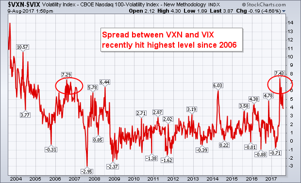
The third chart shows the “spread” between the VXN and the VIX reaching the highest level since 2006 at the end of May (see circles). It’s pulled back over the last two months, but remains elevated. It’s hard to tell if that wider spread between the two is sending a warning. But it’s the kind of unusual behavior that suggests that market risk might be more elevated than the lower VIX reading would imply.