The historical Canada stock market chart has an amazing setup. Investors better take this into historical chart account. After 3 attempts over the last 10 years to start a new secular uptrend the million dollar question is: will this time be different? The long term monthly Canada stock market chart will soon provide us with the answer.
Investors tend to focus on the short term. That’s because of the mainstream media which is in existence to publish a minimum of articles per day (volume leads to short term focus) but also the countless social media messages which are simply short term in nature. Here is the key point: without an understanding on the long term trends investors cannot be successful, i.e. repeat success with a minimum success rate of 80 to 90%.
This rule applies as well to Canada, we would even argue more so than in most other markets right now in Canada, where we see a major opportunity setting up.
Note that this opportunity was in the making for a long time. As it always goes in markets the best opportunities are brewing for a long time, so there is plenty of time to get in, but here it also becomes interesting: most investors cannot wait (as the preparation time is uneventful mostly and that aren’t astronomical results), they mostly give up as they see the returns are moderate at best or, worse, even neutral.
This is what we wrote in the last 18 months about Canada’ stock market:
Major Long Term Opportunities Brewing in The Canadian Market
3 Outstanding Canadian Banks Charts for 2018 and Beyond
3 Canadian Bank Stocks To Buy For 2018
As European Financial Stocks Are Consolidating, Canada Is The Place To Be
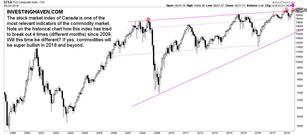
A formidable monthly Canada stock market chart
Every investor, before making an investment decision, should check all 3 timeframes on the chart, and spot the opportunity on all 3 of them: the daily chart, the weekly chart, the monthly chart.
The monthly chart of Canada’s stock market has an amazing setup: a rising triangle. It is as close as possible to a fact that this will resolve in a major bullish outcome.
This pattern is as perfect as it can be: resistance and support lines are tested several times. This increases the accuracy of the pattern, and, with that, the odds of the outcome.
One of the most important observations on this chart is the 3 attempts to break out as indicated with the 3 small red circles. One in 2008, one in 2017 and one in 2018.
Will this time be different?
That may be the case, and smart investors closely watch what happens in July of 2018. If the TSX index, representing Canada’s stock market, closes above 16277 points, and does so in August as well, it will be hugely bullish! Canadian stocks can be bought aggressively in such a scenario!