
U.S. stock indexes like the Dow Jones Industrials, the S&P 500 and the Nasdaq are hitting all time highs. This is typically the moment when investors become cautious because, well, who buys stocks at all time highs? We have a very outspoken answer to the question whether this is a valid concern or not. Is it time to buy stocks at this point in time in 2019? Yes, is the very clear answer, stocks offer an investing opportunity right now. We have 5 charts that suggest that this is the time to buy stocks! These charts are based on our leading indicator methodology, combined with our investing tips for successful long term investors.
Essentially, this article is all about the question when to be fearful in stock market investing and when to be aggressive in buying stocks.
We continue to see that most investors struggle hugely with this as they become aggressive at the end of a bull market cycle, and are cautious when major bottoms are set. When stocks hit all time highs, like today, after attempting multiple times to move above this level for 18 full months, there really is no reason to fear a new stock market crash is underway … on the contrary!
That’s why one of our 100 investing tips is this one:
Emotion is the n° 1 enemy of any investor. Only a small number of investors is able to manage their emotions when it comes to making decisions and choosing a market to invest in.
We should certainly mention this investing tip as well:
Your emotional and mental game is what makes the real difference in trading and investing. The fact that you are aware of this is the first step to success. Continue to educate yourself on this as it needs many, many years and many, many mistakes before you master your own emotions and be part of this selection group of smart and successful investors.
Read more about your own emotions being your biggest hurdle for success in 10 Tips To Master Investing Without Emotions.
5 Charts Suggest It Is Time To Buy Stocks In 2019
Let’s turn our attention to the 5 charts that suggest it is time to buy stocks in 2019.
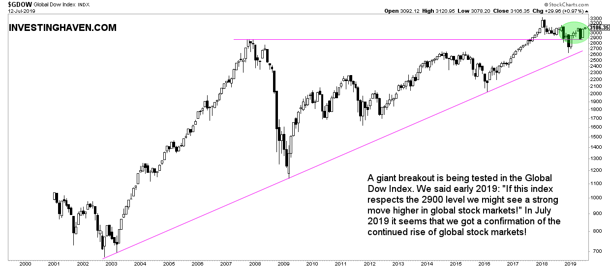
First, the Global Dow Index GDOW representing the global stock market.
The monthly chart which shows the secular trend is pretty straightforward: a breakout to all-time highs in 2017, followed by a strong correction last year and a retest of the breakout in 2019.
We signaled this Global Stocks Epic Fight Between Bulls and Bears many months ago, and favored a bullish outcome as we saw this retest shaping up a few months ago Global Stock Index Still Favors A Bullish Outcome.
Right now it is pretty simple: July 2019 marks a confirmation of the retest of the breakout. This suggests that global stock markets will continue to rise!
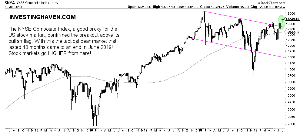
Second, on a shorter timeframe, the weekly NYSE Composite Index (NYA) has a clear trend. The NYA represents U.S. stock markets pretty well because of its wide variety of components.
Its bullish flag that started in January 2018 concluded in July 2019 with a breakout above this bull flag.
This suggests that the risk off cycle ended without a stock market crash, and that we are entering a new risk on cycle.
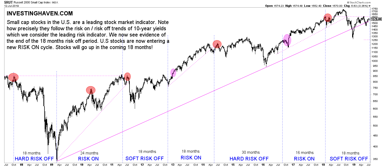
Third, the previous chart nicely brings up the risk cycles which we see on our proprietary chart of the Russell 2000.
As seen below the risk cycles tend to last between 12 and 24 months, mostly 18 months. In the last 18 months we have seen a risk off (soft, without a severe stock market crash). Consequently, we are about to start a new risk on cycle. This is what will be confirmed once the Russell 2000 crosses the dotted line at 1625 points. All indicators suggest this will happen any time soon!
Fourth, 10 year Yields, our leading risk indicator for global (!) markets, has limited downside potential. That’s what we see on the 50 year chart which reveals the longest possible chart patterns.
What this really means is that there is limited downside risk in risk assets like stock markets, because 10-year Yields are a leading indicator for risk assets!
Moreover, a very important insight we get out of this chart, especially looking at the 3 red lines: the current setup is morphing into a secular trend change. 10 year Yields are moving from a falling trend that lasted +35 years into a flat pattern. This likely will be the start of rising rates in the next decade.

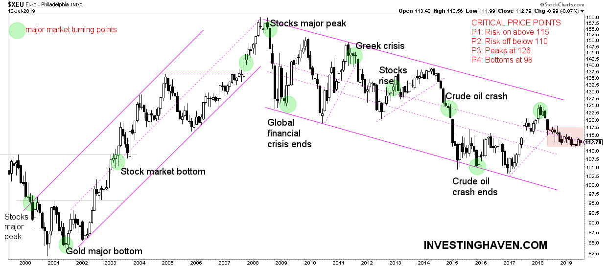
Fifth, last but not least, the long term Euro chart.
As said before this is THE most important leading indicator for global markets. If and when the Euro turns up or down strongly it starts affecting other markets, and triggering new trends.
The Euro is flat currently as said in Currency Market Writes History: Why Is The Euro Flat For 12 Months. This suggests one thing: there is no downward pressure on global stocks!
[Ed. note: As of this week we will provide in-depth analysis to our ‘free newsletter’ subscribers. We will bring premium content with specific (gold and silver) investing tips on a weekly basis, mid-week, free of charge. We will do this for 4 to 6 months. Subscribe to our free newsletter and get premium (gold and silver) investing insights in 2019 for free. Sign up >> ]