The breakout on the PEPE price chart looks powerful. Which chart is the one that helps investors understand upside potential in the price of PEPE?
There is a lot of confusion about PEPE.
On the one hand, PEPE is breaking out. A falling trendline is broken, as seen in the chart embedded in this article.
At the same time, any breakout requires a time window of at least 5 days in which it can invalidate. The PEPE breakout is not confirmed, not yet.
What to make out of all this? Above all, is our bullish 2025 PEPE prediction still valid?
How not to chart PEPE
If anything, when talking about breakouts and chart structures, it is imperative to understand how not to chart things out.
The PEPE chart, in particular, requires a precise way of charting.
One of the most frequently made mistakes is focusing on the short term.
While the short term may bring excitement, it is certainly not helpful, on the contrary. This is an illustration of now not to chart PEPE out:
Nice little $pepe dip is fine this Sunday evening
there’s still still many up legs to go imo and this is an absolute monster trend https://t.co/xE19mvNjUY pic.twitter.com/ek2ZX9bTMr
— Bluntz September 29, 2024
The PEPE chart that makes you dream
Even if one takes the right timeframe, it is important to understand chart dynamics.
To take, for instance, this next post featuring a PEPE chart which we like a lot. The creator of this chart rightfully annotated the 2 big ‘pumps’ in PEPE in the past. However, with a focus on the price axis of the PEPE chart, he completely missed the importance of the time axis.
The last time $PEPE created a macro range, subsequent downwards channel and imminent breakout…
We 8x’d our market cap.
We’re around $4b right now, do we 8x again soon?
That’s targeting $32b.
Frogtober. pic.twitter.com/ljm7CnyNFF
— spuro September 27, 2024
The time required for PEPE to ‘digest’ the previous ‘pump’ was almost one year. It is not reasonable to expect another big ‘pump’ after some 6 months.
Time and price, both, are equally important because every chart has two axes.
The potential risk of a focus on the price axis only is that one starts dreaming, way too early, setting up for disappointment along the way.
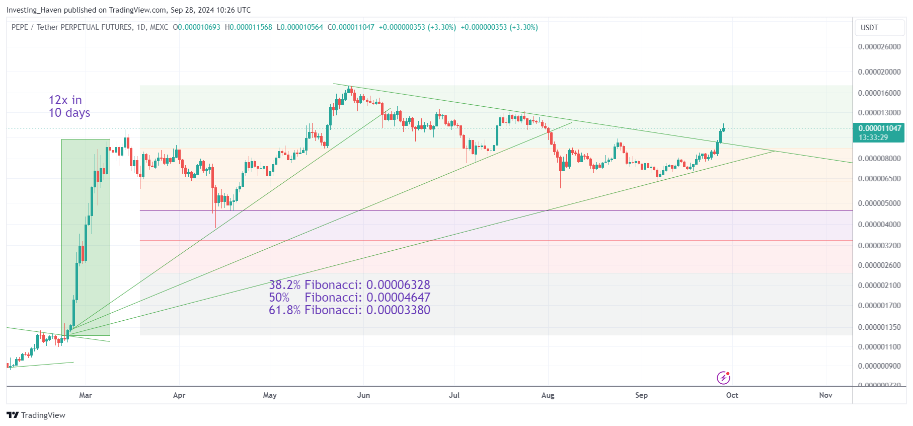
Our unbiased PEPE chart
We believe the next PEPE chart is the one that combined the right timeframe with the right chart structures.
What we observe:
- PEPE respected its 38.2% Fibonacci retracement level – great!
- PEPE is breaking out, clearing a falling trendline – great!
- PEPE is now testing the start of the reversal structure that started early August (some 10 red consecutive candles) – this is a point of resistance.
Moreover, very often, during a consolidation, the market has clear multiple falling trendlines, most of the three of them. While it’s easy to get excited about the breakout above the falling trendline shown on below chart, we believe it is justified to get excited once the third falling trendline will be cleared. This also combines the point made above – the 12x pump printed in Feb/March 2024 requires much more time before the next big rally can start.
PEPE chart conclusions
A few important PEPE chart conclusions:
- Overall, the chart structure is looking good, a pretty constructive development is ongoing.
- In terms of price, it is great to see how the 38.2% Fibonacci level is holding up very well.
- In terms of time, the big run of Feb/March 2024 seems to need more time before it has matured to develop the next big run.
- The breakout which is currently ongoing, clearing the falling trendline, is not confirmed as any breakout requires at least 5 consecutive day for confirmation.
The upside potential of this chart pattern is significant.
Here is the point though – the longer the consolidation goes on, the higher the upside potential.
In a way, investors should pray that PEPE does not start running at this point in time, but at a much later point in time. That’s because PEPE will be able to stage another 12x run if the rally starts in, say, 6 months from now.
Investors tend to want big profits NOW.
Patience is boring.
We believe the exact opposite is true – the longer a consolidation goes on, the higher the upside potential. We like PEPE at this point in time, but we don’t think it’s ready to stage a 12x run, on the contrary, it’s way too early for this to happen.