This article has a stunning 10-year gold price chart which puts the new gold bull market in perspective.
The 10-year gold chart with our chart annotations helps readers understand the message of the chart.
It’s a bullish message.
Gold price chart – the big picture
One of the best practices of reading charts is the top down approach – start with a higher timeframe.
- We first look at the 50-year gold chart.
- On there, we find the structure of the gold price over 10 years.
Gold’s The big picture timeframe is the 50 year gold chart shown below.
READ – Gold prediction 2025
That’s where big picture (dominant) chart patterns become visible. What do we see?
- A falling wedge that took 20 years to complete (1980-2001).
- A secular uptrend (2001-2011).
- A consolidation in the form of a cup and handle formation that took 10 years to complete (2013-2023).
The latter is the important insight to take into account when analyzing the gold price on 10 years.
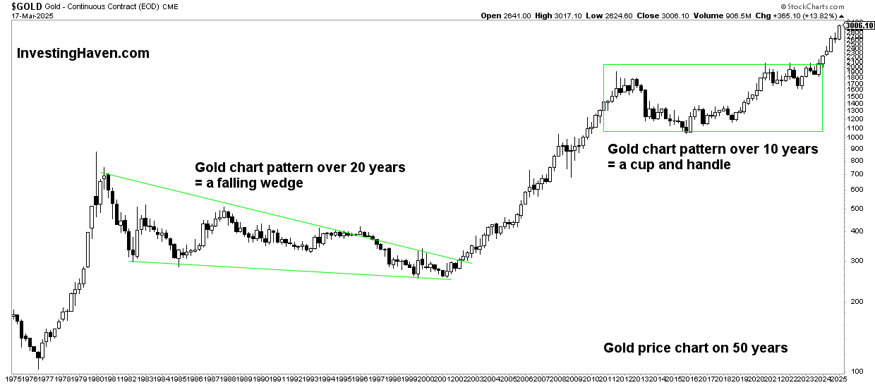
It took the gold market exactly 10 years to complete a bullish chart formation, a basing pattern:
- This period has felt very uncertain to most gold investors.
- The broader investor public did challenge the gold thesis.
- However, the long term gold chart was very clear.
That’s why chart pattern and accurate chart readings are so important – the break through the noise. Much of the noise is created by gold news that tends to contain information that is irrelevant to the investor. Equally important is to emphasize that gold charts without patterns and structure are meaningless.
Moreover, it’s only long term charts that can offer valuable insights. In a world focused on short term gold price changes, with hashtags and cash tags, it is challenging to see the big picture clearly.
Gold price chart on 10 years: dominant pattern
The reason we started analyzing the historical gold chart (above) is to find the dominant pattern on the 10-year gold chart.
Strictly speaking, the 10-year chart goes back to 2014. That’s the problem.
The dominant pattern, cup and handle formation, a bullish one, started in December of 2012. A regular 10-year gold chart would not capture the ultra bullish chart pattern.
That said, it is clear from our chart annotations how gold required 10 years to complete a long term chart pattern. It’s a bullish pattern.
A few notes from gold’s 10-year price chart:
- The pullback with mid-point 2015 was deep. This resulted in a powerful bullish reversal.
- It took gold 8 years to get back to the initial level from back in 2012.
- The 3-year consolidation since 2020 created a solid support structure – it felt uncertain for sure.
The above points contribute to the powerful nature of the subsequent breakout.
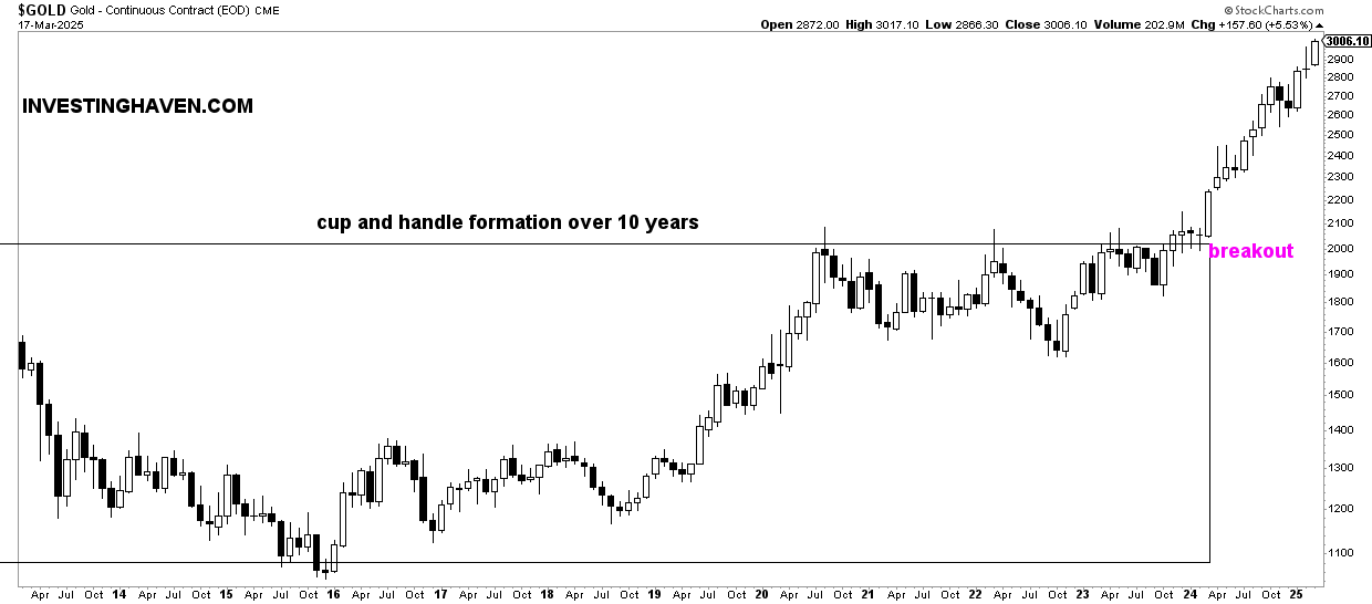
Consequently, the breakout that occurred in 2024 is a bullish secular breakout.
While gold may retrace, re-test its breakout level around $2,100, it is likely going to qualify as a bullish back-test.
Gold price chart on 10 years: quarterly cycles
One often overlooked dynamic are the short term cycles.
They can help investors tremendously;
As seen on this 10-year gold chart, we annotated the quarterly cycles with boxes.
Why this matters? The quarterly cycles help us understand turning points, trend changes, which comes with crucial information for investors.
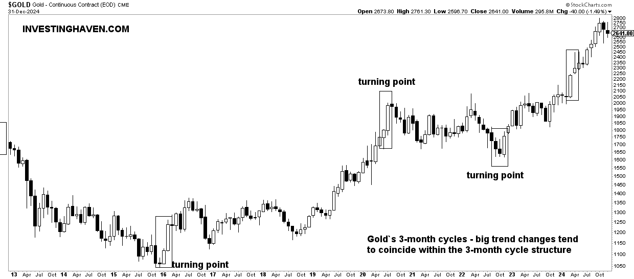
Again, these quarterly cycles are not available on regular gold charts, also not visible to regular readers.
That’s why we frequently cover these quarterly cycles in our premium gold & silver market reports.
Conclusions from gold’s 10-year price chart
While the 10-year gold chart may look very exciting at first glance, the reality is that it has a treasure of insights.
The point is this – charts without annotations are mostly noisy.
Certainly a volatile market like gold requires decent chart annotations.
That said, the key findings from gold’s 10-year chart:
- A bullish long term pattern concluded in 2023 (arguably, early 2024).
- This bullish pattern is called a ‘cup and handle’.
- The breakout of 2024 is ‘the real deal’.
- While gold may re-test its breakout level, somewhere in 2024, it is clearly set to move higher in 2025 and beyond.
Charts don’t lie.
The 10-year gold price chart does not lie.
Gold has a bullish long term setup.