The 20-year gold price chart in this article shows the long term dynamics and patterns. Gold’s new bull market is visible on gold’s 20-year chart.
Gold has long been a cornerstone of investment portfolios, offering a hedge against inflation.
RELATED – Gold prediction for 2025
Analyzing the 20-year gold price chart provides valuable insights into the metal’s performance and its role in the broader financial landscape. This article will highlight key gold trends and pivotal moments over the past two decades, comparing them to the longer-term and shorter-term gold chart views.
Gold price chart on 20 years
The gold chart of the latest 20 years has a few distinct phases:
- The new gold bull market started on March 4th, 2024 (source: Is Gold Expected To Set New ATH).
- The consolidation in the form of a ‘cup and handle’ chart pattern – this took 10 years to complete (2013-2023).
- A long uptrend prior to the 2011 peak.
Below is the 20-year gold price chart with the different phases explained above.
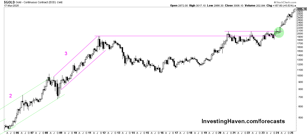
Gold trends in the last 20 years
Based on the gold chart on 20 years, shown above, we identify a few distinct periods which coincide with high level gold trends.
Early 2000s gold bull market
The 20-year period begins with the early 2000s, a time when gold started a significant bull run. From around 2001, gold prices began a steady rise, driven by a combination of factors including declining confidence in traditional investments and rising inflation fears.
Gold trend: This trend was part of a broader commodity rally, reflecting growing investor demand for safe-haven assets.
Gold’s 2011 peak
One of the most notable highlights of this period is the peak in 2011. Gold reached unprecedented heights, surpassing $1,900 per ounce, the previous gold ATH.
Gold trend: This surge was largely influenced by the aftermath of the 2008 financial crisis, which led to increased concerns about debt levels and economic stability. The Federal Reserve’s monetary policies and global economic uncertainties further fueled this rally.
Post-peak correction
Following the 2011 peak, gold experienced a period of correction and consolidation. Prices fluctuated and generally trended downward or sideways.
Gold trend: This phase was characterized by a stronger US dollar, reduced inflation fears, and changing interest rates. The correction phase also saw gold prices tested by market sentiment and geopolitical events, reflecting a period of market adjustment.
Gold’s resurgence in the 20s
In recent years, gold has seen renewed interest, particularly in response to rising inflation concerns, economic uncertainties, and geopolitical tensions.
Gold trend: The past few years have demonstrated gold’s resilience as a safe-haven asset, with prices responding positively during times of market turmoil and instability.
Gold’s new bull market
On March 4th, 2024, the new gold bull market officially kicked off.
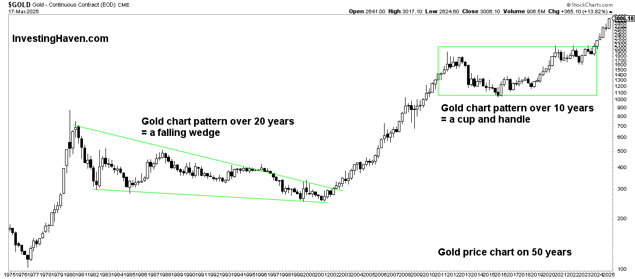
Gold’s 20-year price chart: comparison
When comparing the 20-year chart with the 10-year and 50-year perspectives, several key observations emerge:
10-year trends: The 10-year trend shown on below chart creates a more detailed view of gold’s recovery phases. In chart terms: a consolidation in the form of a bullish reversal.
50-year trends: The 50-year gold chart provides a long-term perspective, showcasing gold’s evolution over several inflationary cycles. It emphasizes the cyclical nature of gold prices and the long-term bullish trend that has persisted despite corrections.
Conclusion
The 20-year gold price chart offers a comprehensive view of the yellow metal’s performance.
By examining these trends in the context of shorter and longer-term perspectives, investors can gain a deeper understanding of gold’s long term dynamics.