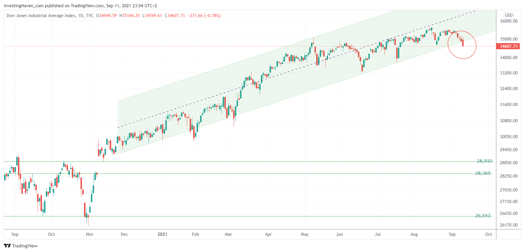
The Dow Jones index is ‘somehow’ concerning looking at it from a chart perspective. It looks like it is falling from a cliff. How concerning is this? What to expect?
The Dow Jones chart looks scary, for sure. As seen on below chart, the daily Dow Jones chart, It it is now violating its November uptrend.
What does this mean, what not?
This does not imply that a crash is imminent. This chart may look scary, but it’s not THAT bad YET.
What this chart tells us is that unless a quick recovery takes place in the next 3 trading days the uptrend is slowing down and making place for a consolidation.
Imagine that, a consolidation. Let’s face it, the Dow Jones continued to make new ATH while the vast majority of stocks were declining this year. What is going to happen with 99% of stocks if consolidations in key indexes will start? The answer: a stock picking market to an extreme degree.
We verified our “crash indicators” (leading indicators for the market that may spell a bigger sell off is underway). They do not flash warning signs as of yet. We checked all of them, we cannot find really concerning setups yet. This of course is subject to change, strong setups can develop in a few weeks time. But right now we believe that the patterns of key indexes shown above are going to qualify as healthy retracements. But the market will have the last word, and we are eager to find out if our market readings will be accurate.


