We are quite bearish on gold since the summer of 2016. Although we believe that gold will continue its long term bull market at a certain point, we simply don’t see any sign of that happening in the short to medium term. The gold chart in this article is another bearish signal, next to our bearish gold price forecast for 2017.
Our methodology is based on leading indicators and a fixed set of other indicators. When it comes to gold, the gold charts in our methodology are the long term gold price combined with other key assets like stocks / bonds / leading currencies. Moreover, we monitor our proprietary market barometer in conjunction with long term price charts. The gold miners to gold price ratio chart is not a leading indicator for us, but we use it to get a confirmation of our gold outlook.
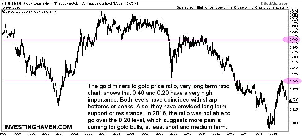
The gold miners to gold price long term chart shown below carries a very interesting insight. The 0.40 and 0.20 values are extremely important. They have provided long term support and resistance in the last 3 decades. Once the ratio broke out or through those levels, it mostly indicated a new bullish or bearish era.
The area below 0.20 is clearly very bearish. The gold market got into that bearish area after the catastrohic collapse of 2013. Interestingly, gold tried to break through that important 0.20 area in 2016. That happened at a time when ‘everyone and his uncle’ was bullish on gold. At that point, we wrote our bearish gold price forecast for 2017. The ratio not being able to go through 0.20 suggested the bear market was not over.
This chart does not provide any timing insights. It should only be used to get a bullish vs bearish sentiment on the gold market. Right now, bears are clearly leading, and there is no sign that the pain is over.


