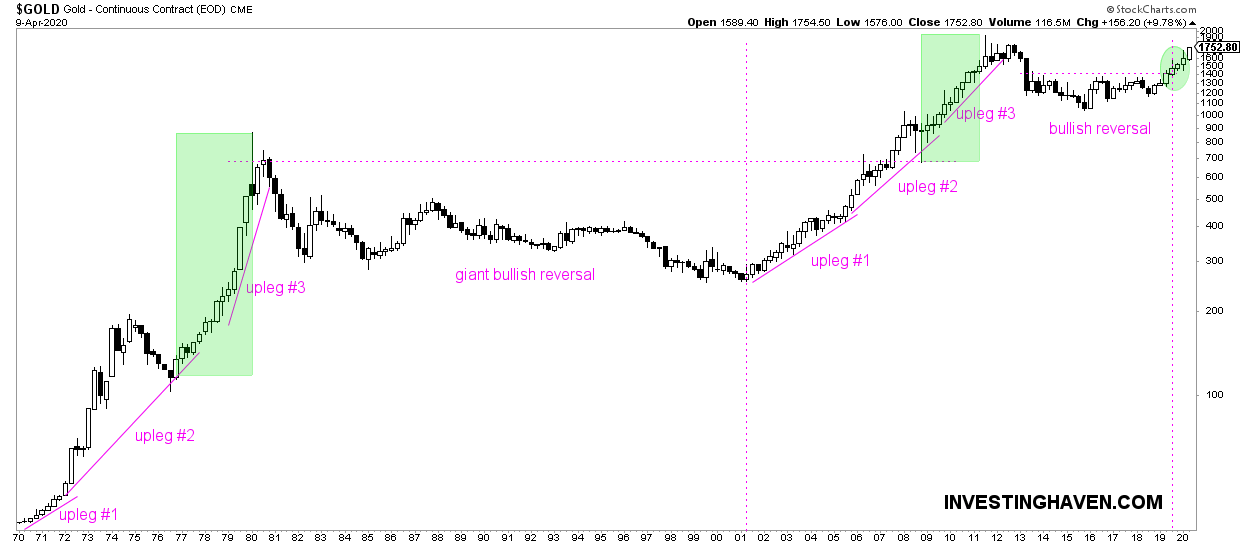
Gold’s long term chart looks absolutely gorgeous. It is one of the few charts that is much more constructive post-Corona crash compared to pre-Corona. Moreover, as said today in Momentum: Gold’s Long Term Trend vs. The Inflation Indicator it is becoming blatantly clear that gold was ‘sniffing’ inflationary pressures since last summer, a trend that is being confirmed now on the inflation indicator chart. The longest term gold chart is the one we feature in this article. Our gold forecast is about to reach our 2021 target.
Below is the longest timeframe of the gold price chart: the quarterly chart.
This really shows the long term trends. When looking at this timeframe we are not interested in 5 or 10 pct moves up or down in the coming days or weeks. With this timeframe we are interested to understand the 2020 gold trend.
We call this ‘secular’ trend.
There are a few secular gold trends visible on this chart:
- The breath taking uptrend between 1970 and 1980.
- The long term basing formation between 1982 and 2001. This was a painful time for gold investors, but it also was a giant bullish reversal pattern that gathered ‘energy’ for the next mega-uptrend in gold.
- The bull market from 2001 to 2011.
- The bear market from 2012 to 2019.
Right now gold is in a new bull market. It started last summer, and we did indicate this with the dotted purple vertical line on the chart.
Yes, gold is headed towards all-time highs, it will soon test 1896 USD. In the end this is just 8 pct below it.
But we do not care about those short term price moves, we do care about medium to long term trends.
Gold confirmed its new bull market last weeks when policy makers across the world announced massive monetary and fiscal stimuli, all inflationary in nature.
We saw a buy signal on a few gold plays and gold segments earlier this week.


