The historic gold charts show the dominant trends for the gold price. There is no need to look at the longest timeframes because the gold price chart on 20 years shows the ongoing dominant trend which is sufficient for gold investors. The gold price chart on 20 years reveals 2 very specific price points which are the ones that are crucial in determining when the new secular gold bull market starts. Note that these price points were also discovered in our gold price forecast 2019.
Most investors tend to forget the importance of long term charts. Some other investors tend to focus on charts that span over too long time periods. For instance the intraday or daily gold price chart do not caryy any relevant information on dominant patterns, and the 100 year gold chart is way too long to see the current pattern at play.
Specifically for gold (GOLD) it is important to choose the right timeframe, and we make the point in this article that the gold price charton 20 years is the one to look at to determine the ongoing dominant trend.
Note that the 20 year gold chart may be combined with the Gold Price Historic Chart on 40 Years although it is a not a must to do so.
We made the point before that the most dominant trend is visible on the historic 40 years gold price chart, which is true, but that is on the longest timeframe. What we are adding now is that the 20 year gold price chart shows findings that are confirming the 40 year chart which is why prefer to look at the 20 year gold chart for more specific price points.
Gold price historic chart on 20 years
Why do we consider the gold price historic chart on 20 years so important?
There is a specific reason for this. And it is visible on the chart itself.
First, market-wise, the last major gold bull market started in 2001 which is almost 20 years ago. The gold price was in a long term uptrend of 10 years after which a bear market started that is still ongoing. Having such a major bull market as well as bear market in one chart is imperative to understand the ongoing dominant trend.
Second, chart-wise, it is all about finding the right pattern at play which determines the end of the ongoing bear market and start of a new bull market. It is pretty hard in a world in which ‘everyone and his uncle’ are drawing chart patterns and sharing them on social media to know which pattern really is at play and has predictive value.
In other words it is easy to draw lines and look for patterns, but it is quite challenging to find the right pattern at play which will determine the exact price points that investors need to know for entry and exit positions We believe the 20 year gold price chart has these crucial price points.
To us, the most important price levels to determine when the new gold bull market starts are the ones that are visible on a horizontal as well diagonal pattern. Continue reading to understand what we mean by this.
Dominant trend on the 20 years gold price chart
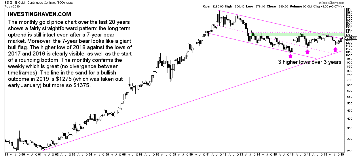
Below is the gold price chart on 20 years.
The 2 dominant trends are clear:
- The grand gold bull market that started in 2001, and peaked at 2011, after a 10-fold rise of the gold price.
- The violent gold bear market that started in 2011, and is still ongoing.
Now here it becomes interesting. The million dollar question is which trend is now dominant?
Is it the bear market pattern is the dominant trend or the bull market is dominant? In other words is it the falling channel since 2011 that is dominant or is it the rising trendline since 2001?
This may seem a detail, but it really isn’t. It’s the most important question to sort out.
We firmly believe that the falling channel is the one that has the predictive value. A limited number of price points important to watch should be derived from the falling channel is what we are saying. As per Tsaklanos his 1/99 investing principles it is a handful of price points we should derive from this bear market channel.
More specifically, we believe there are 2 price points which have predictive value.
A new gold bull market if and once $1375 is broken to the upside
The ‘line in the sand’ price points for a bullish outcome from the ongoing bear market: $1275 and $1375.
The first critical price point is $1275. As seen on the 20 year gold chart it is resistance on a diagonal pattern or the bear market channel.
The second critical price point is $1375. As seen on the 20 year gold chart it is resistance in a horizontal pattern since +5 years.
We strongly believe that if and once both price points are taken out (to the upside) we can know for sure that the bear market ended, and a new bull market (bullish scenario) or a consolidation period (neutral scenario) will have started.
Note that we want to see 3 monthly closes above both price points in order to confirm this bullish’ breakout’ event.
Gold price 20 year chart vs. leading indicator Euro 20 year chart
It is important to back up any forecast with additional evidence in the form of leading indicators.
For the price of gold it is crucial to check correlated assets. The Euro correlates positively to the price of gold.
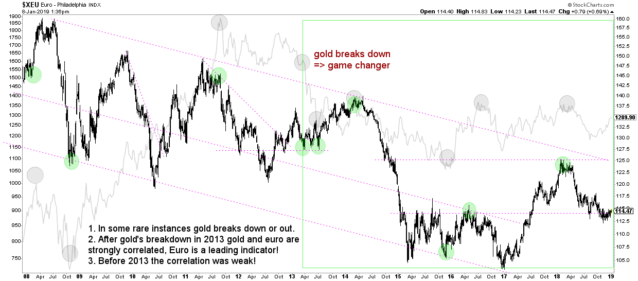
The next chart shows the correlation between the gold price (light grey) and the Euro (black), both on 20 years.
In recent years, the Euro has been leading the price of gold higher and lower. Every time the Euro tested secular support or resistance, or broke out or down, it preceded an important top or bottom in the gold price.
For our conclusions on the 20 year gold chart to be confirmed, not only do we want the conditions outlined above to be met but also do we want to see this at a time when the Euro is rising. The most ideal scenario of course would be that the gold price breakout would happen at a time when the Euro breaks outside of its long term falling channel but the odds of this happening is not very high. We believe a rising Euro within its long term channel is acceptable as well.


