Long term gold charts help investors identify long term gold trends. The long term gold charts highlight a few major trends. We look at several long term gold charts in this article.
RELATED – Our Gold Price Predictions for 2024 2025 2026 – 2030.
Each long-term gold chart offers a unique perspective on gold’s historical performance:
- The 10-year chart provides actionable insights for recent trends.
- The 20-year and 50-year charts offer deep and insightful views of gold’s performance over the medium and long term.
- The 100-year chart presents the longest-term perspective, demonstrating gold’s enduring value.
Understanding these charts helps investors make informed decisions based on historical trends.
Historical charts – beyond the headlines
In the fast-paced world of investing, news headlines and market sentiment can create short-term noise that may overshadow the broader trends.
Analyzing these charts provides a clearer view of gold’s performance over extended periods, helping to distinguish between temporary market reactions and sustainable (dominant) trends.
Gold has long been considered a safe-haven asset, reacting to various economic and geopolitical events:
- While news headlines can drive immediate price movements, they often do not reflect the underlying long-term trends that influence gold’s value.
- Long-term charts allow investors to see past the noise and focus on the broader patterns and trends that have historically guided gold’s performance.
By examining gold’s performance over different timeframes investors gain insights into how gold has behaved across various cycles and environments.
While news and short-term market movements are important, long-term gold charts offer a comprehensive view of gold’s historical performance, providing a more stable foundation for investment decisions.
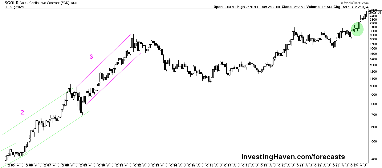
The most actionable long term gold chart – 10 years
The 10-year gold price chart is highly actionable for short- to medium-term investors.
It offers insights into recent trends and market dynamics:
- Post-financial crisis recovery: This chart captures gold’s recovery after the 2008 financial crisis, highlighting significant price movements and market reactions.
- Volatility and resilience: The past decade has seen considerable volatility, driven by shifting interest rates, inflation concerns, and geopolitical events. The chart provides actionable insights for navigating these fluctuations.
- Resurgence: In recent years, gold has gained strength as a safe-haven asset amidst rising inflation and global uncertainties, making this chart particularly relevant for current market conditions.
Check out our 10-year gold price chart >>
The most insightful long term gold chart – 20 years
The 20-year gold price chart offers deep insights into gold’s performance. It shows:
- 2000s bull market: This chart illustrates the early 2000s bull run, driven by economic uncertainty and rising demand for safe-haven assets.
- 2011 peak and correction: The peak in 2011 and subsequent correction are prominent features, reflecting shifts in economic conditions and market sentiment.
- Recent trends: Recent years have shown renewed interest in gold, especially during periods of economic instability and inflation, providing valuable context for long-term investment strategies.
Go to our 20-year gold chart page >>
The most insightful long term gold chart – 50 years
The 50-year gold price chart offers extensive insights into gold’s performance over multiple cycles:
- Long-term bullish trend: This chart highlights a long-term bullish trend, with gold showing resilience and growth over five decades.
- Historical events: Key events such as the end of the Bretton Woods system and major financial crises are reflected. They offer insights into gold’s role as a hedge against economic instability.
- Cyclical patterns: The chart reveals cyclical patterns and long-gold term trends. They help investors understand gold’s historical behavior in different economic environments.
Check out our 50-year gold price chart >>
The longest term gold chart
The 100-year gold price chart provides a comprehensive historical perspective:
- Century-long trends: This chart showcases gold’s performance over a century. It highligts its enduring value and role as a long-term store of wealth.
- Major historical events: The chart covers significant periods including the Great Depression, World War II, and economic booms and busts. It illustrates gold’s resilience through diverse economic conditions.
- Long-term resilience: The 100-year view underscores gold’s ability to maintain value and act as a hedge against long-term economic uncertainty.
Check out our 100-year gold price chart >>
Conclusions
Charts with a long term timeframe offer valuable insights into gold’s performance across various timeframes.
By examining the 10-year, 20-year, 50-year, and 100-year charts, investors can gain a comprehensive understanding of gold’s historical trends and its role as a safe-haven asset.
This overview provides a context for making informed investment decisions based on long-term trends.