
The historical charts section on InvestingHaven.com is a collection of significant long-term charts with hand crafted annotations. Many global markets are covered: stock indexes, commodities, gold and silver, cryptocurrencies. All of these historical charts show the dominant trend which is the reason we spend so much time analyzing and creating these historical charts.
We feature historical charts primarily on the following timeframes:
- 20 year charts
- 40 year charts
- 50 year charts
- 75 year charts
The added value of lower than 20 years chart and higher 75 year charts is pretty limited in understanding dominant trends.
Historical Chart: Gold Price
The first set of historical charts are the gold charts. It is the sector that has such a rich history, but also proponents and opponents.
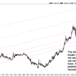 Based on thorough studies of the gold market we have identified the most relevant long term gold charts. We have annotated each of the 3 gold charts to display the patterns that determine the dominant trend. The top 3 gold charts with long term timeframes are the 20 year, 40 year and 50 year gold charts.
Go to the long-term gold charts >>
Historical Chart: Silver Price
The silver price chart on 50 years is featured next. The ‘restless metal’ has a very volatile long term chart.
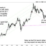 Silver follows gold’s price higher and lower. No surprise. We do not necessarily need to look in each timeframe for silver after analyzing gold’s long term charts. That’s why we only feature the 20 year price chart of silver. The monthly 20 year silver chart is here.
Look at the 50 year silver price chart >>
4 Precious Metals – Always A Bull Market In One Of Them
The long term charts of the 4 precious metals show that there is always a bull market in one of them.
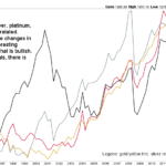 Based on the chart which shows the prices of gold, silver, platinum and palladium in the last 30 years it is clear that one of the 4 precious metals is trending at any point in time. This suggests it is prudent to have a precious metals account in which you hold one of the 4 precious metal at any point in time aiming for appreciation in value.
Check this Long-term precious metals comparison chart >>
Historical Chart: Dow Jones Industrial
The U.S. stock market index featuring 30 large companies Dow Jones Industrial is in existence for a very long time. Its historical chart is a great gauge for the U.S. stock market.
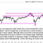 The historical charts of the Dow Jones Industrial show one thing: the high level direction of this index points higher. This implies that bear markets may occur in stocks but they are always temporary in nature. Some consolidations may take several years. In the end stocks resolve to the upside, according to historical charts.
Go to the 100 Year Dow Jones Chart >>
Historical Chart: Bitcoin Price
The second asset for which we feature historical charts is Bitcoin. Because Bitcoin only exists since 2012 there is only one long term chart we can feature: the 7 year chart.
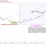 Bitcoin’s historical price chart shows that Bitcoin fell through its rising channel in November 2018. This is not the most bullish development, but the point is that this is part of the corrective cycle in the context of the 2nd bull market with subsequent bear market. Exactly the same happened during the first bear market!
Go to the Long Term Bitcoin Price Chart >>
Historical Chart: Coffee Price
Another commodity which has an amazing historical chart is coffee. The price of coffee is a pressure cooker, ready to explode in 2019!
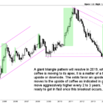 Coffee’s historical price chart has this giant triangle pattern which is about to resolve in 2019. It might be a setup for an explosive breakout. The article discusses the leading indicators for the price of coffee, and which conditions should make coffee bullish within its long term chart setup.
Go to the Historical Coffee Price Chart >>
Historical Chart: Sugar Price
Though not the type of investment that regular investors are looking into we have also covered sugar with its historic price chart.
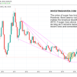 Sugar’s historical price chart shows this potentially bullish setup. However, according to our analysis, fundamentals do not favor a long term rise of the sugar price. This is a classic case in which the historical price chart does not confirm the fundamentals of a market, called a divergence.
Go to the Historical Sugar Price Chart >>