The Dow Jones historical chart on 100 years is enclosed. The Dow Jones is moving right above the top of its 100-year channel on its 100-year chart. This may signal a structural change in stock markets, in particular large caps.
READ MORE – Dow Jones articles
In this article, we step away from the short term Dow Jones chart which is really distracting. We take a long term view, focus on secular trends which are available on the historical Dow Jones chart. We present readers with a few close-ups which reveal actionable insights to investors.
One of the take-aways is that the Dow Jones is consolidating right at its 100-year rising channel. It is even trying to move higher which is an ‘event’ with secular significance.
In this article we look at the Dow Jones historical chart on 100 years on multiple timeframes. We use the same 100-year chart and look at the monthly, weekly, daily timeframes.
- Dow Jones: secular turning point
- Dow Jones Chart On 100 Years: monthly
- Dow Jones 100 Years Historical Chart: Distinct phases
- Dow Jones Chart On 35 and 7 Years
- Dow Jones Chart On 50 and 20 Years
Dow Jones: secular turning point
One of the questions top of mind of investors is when markets turn down decisively, and start a multi-year bearish trend.
“If we try to resolve this question, by looking at the Dow Jones historical chart on 100 years, we believe we see resistance right below 40k points, presumably around 38-39k points.” We wrote this prediction mid-2023; as we head into the 2nd half of 2024 it appeared to be a correct assessment.
While the touch of resistance of the Dow Jones historical chart on 100 years, in the 2nd half of 2024, might trigger a pullback, it’s not necessarily going to qualify as a secular bearish turning point similar to the one in 2000 or 1929 (which resulted in a multi-year bear market).
From a timeline perspective, we believe the big secular turning point is due late this decade, somewhere between 2027 and 2028. Between now and then, there will be pullbacks and rallies, but no secular bearish turning point, according to our cycle analysis.
Dow Jones chart on 100 years
The longest timeframe of the Dow Jones chart is the quarterly chart on 100 years
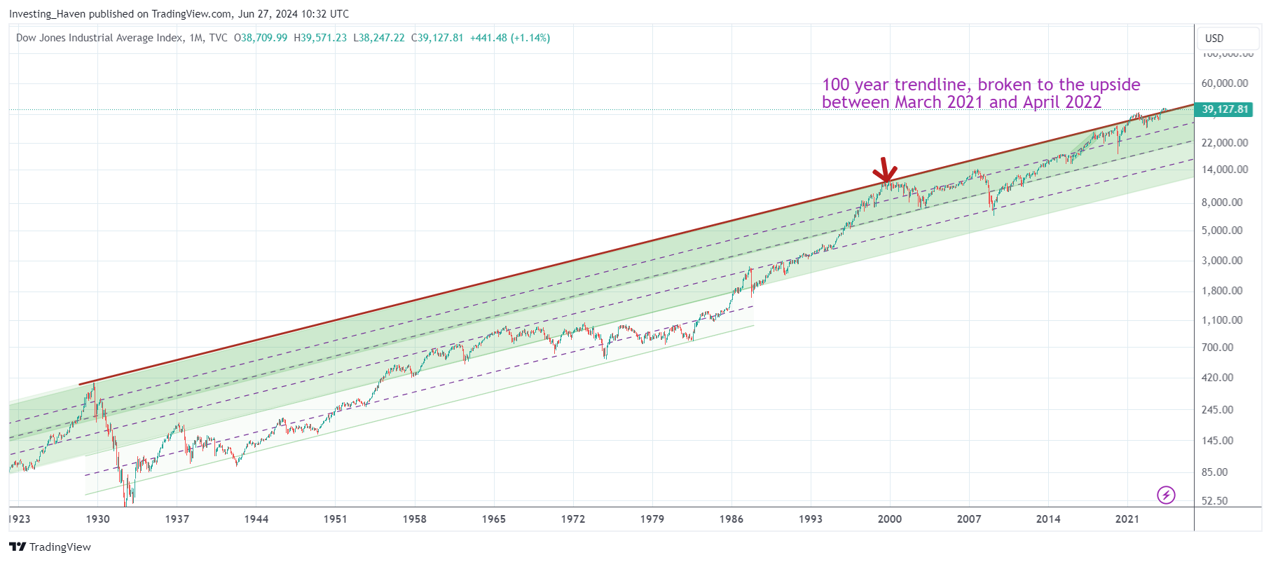
The only occurrences in which the Dow Jones index fell below its 100-year rising channel was in 1930 and 1974. No coincidence the Wall Street crash of 1929 resulted in the Dow Jones falling to levels so low even on a 100-year rising channel.
A rising channel is a common thing on any chart. However, it is really exceptional to see a 100-year channel like the one on the Dow Jones historical chart.
Another important observation on the 100-year chart of the Dow Jones is the outcome every time it touches the top of its 100-year rising channel:
- Each and every time the top of this giant channel is tested it resulted in a long and/or exceptionally aggressive decline.
- The tests of resistances that took place in the last 100 years: 1928, 2000, arguably 2020 (although not perfect).
- In 2021, the Dow Jones index exceeded its 100-year channel for some 12 months (until April/May of 2022).
This brings up the question whether aggressive selling can be expected heading into 2023 or 2024? The one big difference between the occurrences in 1929 and 2000 is that the rally into the top of the channel was a very steep, a multi-year rally. The shape is materially different in the period 2019-2023. This makes it doubtful that the test of resistance in the period 2023-2024 is going to trigger a violent sell-off.
INSIGHT – We partially agree with this Dow Jones analysis. Short term, the 2024 rally seems extended. However, we have to step away from short term chart analysis to see the big picture. In the grand scheme of things, given the analysis outlined in this article, it looks like a major market sell-off is not imminent. A healthy and regular pullback is certainly in the cards in 2024.
Dow Jones 100-year chart: distinct phases
5 distinct phases are visible on the 100-year Dow Jones chart:
- Basically, between 1932 and 1966, the Dow Jones index has risen 10-fold.
- Buying in 1966 would have been catastrophic for one’s portfolio. That is because the Dow was trading in the upper area of its long term channel. The Dow corrected combined with sideways trading during 2 decades after which it tested support levels multiple times. As of 1984, the Dow went in almost one straight line up until the year 2000.
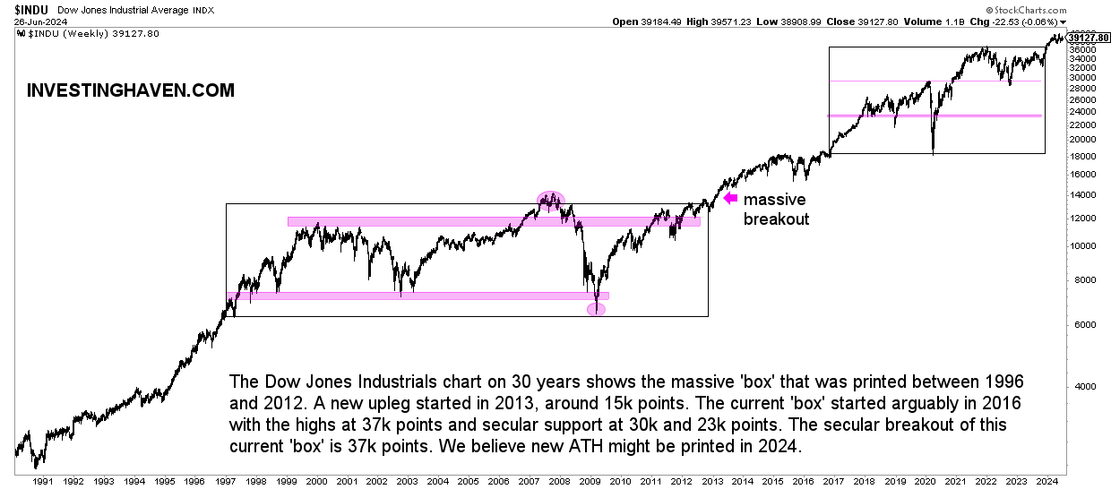
- Between 2000 and 2013 the Dow has traded in a wide range.
- In 2013 a triple top breakout took place. Arguably, that’s the moment when the stock bull market started, not March 2009.
At the time of the last update of this article, which is mid-2024, the Dow Jones Industrials Index is trading in its upper band of its long term rising channel.
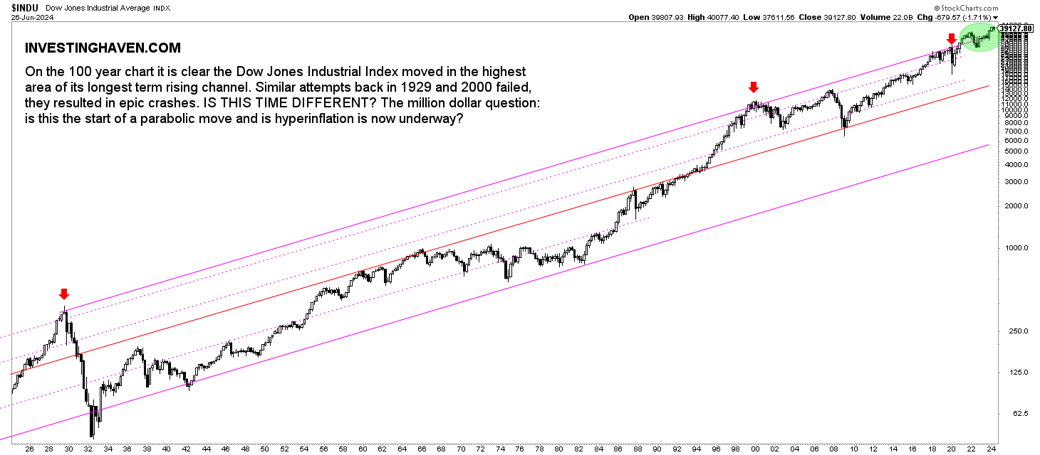
INSIGHT – What is clear from this chart is that the touch of the top of the 100-year channel did not trigger a huge sell-off, like it did in the past. This has not happened before in history. While the Dow Jones may continue moving at or above its 100-year channel for a few more years, it won’t last forever.
This may mean that large cap stock are signaling a structural change, introducing potentially a period of above average inflation (eventually maybe leading to a period of hyperinflation).
We believe that the top of this rising channel may be tested up to 7 years which ‘nicely’ aligns with the secular bearish turning point timeframe starting in 2028
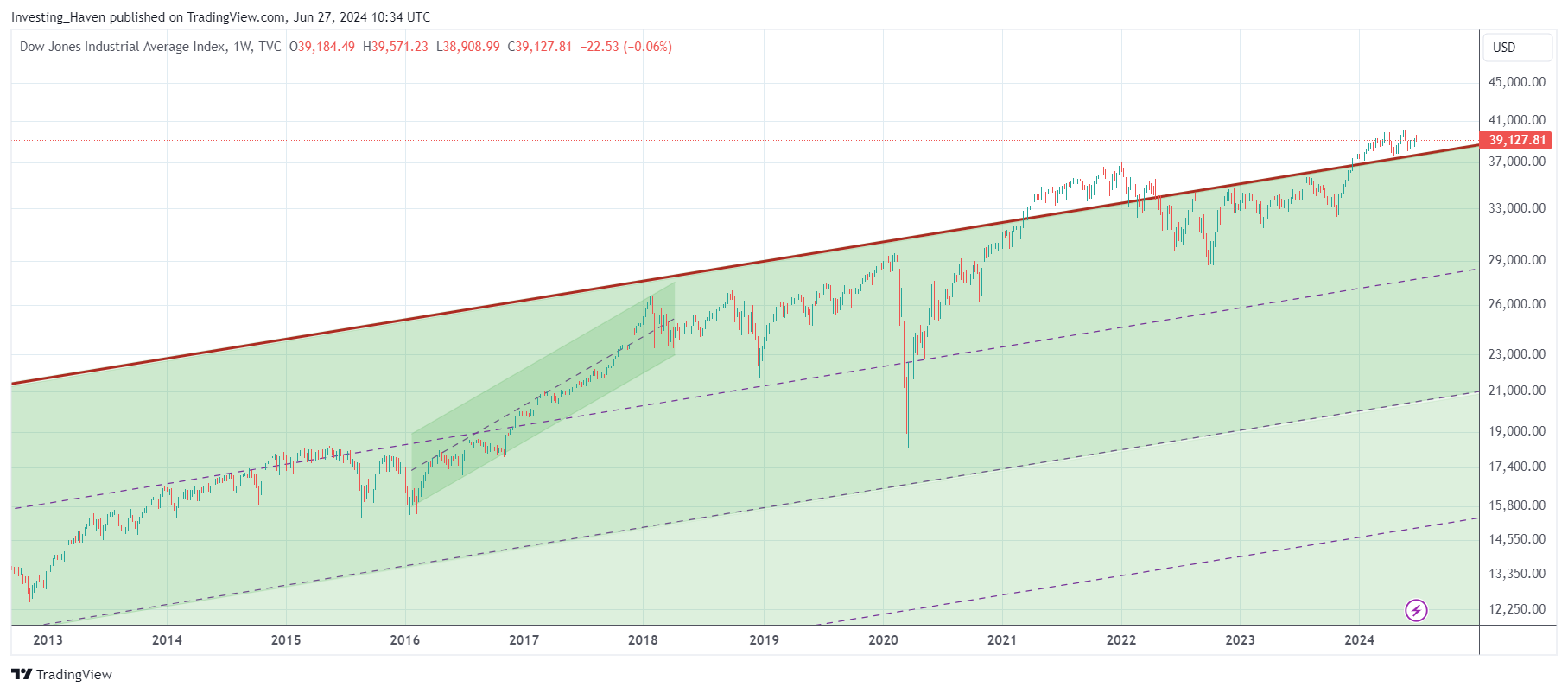
Dow Jones chart: dominant trends
In this section, we look at the last 35 as well as 10 years of the Dow Jones 100 year chart pattern
As seen, the Dow Jones index was able to clear the 100-year channel in March of 2021. However, it fell back into its channel in April of 2022. Since then, the bias has been bullish with a tendency to continue to move towards the resistance line of the 100-year channel. In 2024, the Dow Jones has even exceeded the top of its 100-year channel.
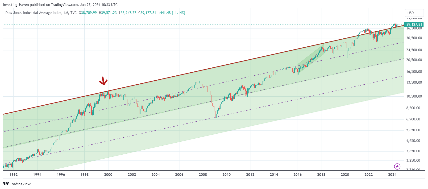
If we zoom in even more and look at the last 7 years we see how resistance of the 100-year channel was tested mid-August 2022. The subsequent move has been interesting: a continued attempt to move higher and go back to the top of the channel.
This view may suggest that a topping pattern is in the making. However, the rally to the top of the channel was not as steep as back in 20ies and 90ies. The recovery after the Corona crash was steep, but the Dow Jones has been slowly making its way higher since 2017.
INSIGHT – All this suggests that the Dow Jones might consolidate for a while; the expectation of an imminent crash similar to the ones of 1929 or 2001/2 is likely low.
Dow Jones chart on 50 years
This next chart view brings 50 years Dow Jones in focus. There is some more upside potential in the coming years according to this chart.
We wrote back in 2023: “While the 100-year chart suggested a local top around 38k, this chart view might bring the Dow Jones closer to 40k points by next summer.” This has proven to be a very accurate prediction.
INSIGHT – The Dow Jones broke out of a long term basing pattern, it did so in 2024. More upside potential, long term, can reasonably be expected.
Dow Jones chart on 20 years
For the 20-year chart, which comes with some very interesting insights, we copy a quote from another Dow Jones article we recently wrote Dow Jones Long Term Chart On 20 Years:
By combing the insights from the Dow Jones charts +20 years with the one below, we conclude that there is a high probability that the Dow Jones will move to 37k points in the first half of 2024 (where it will test the ‘end of the risk off structure’ and also the 100-year channel). We can reasonably expect a quick pullback, followed by a secular breakout later in 2024 or 2025. This is how we combine insights from the multiple timeframes with the Dow Jones long term chart on 20 years.
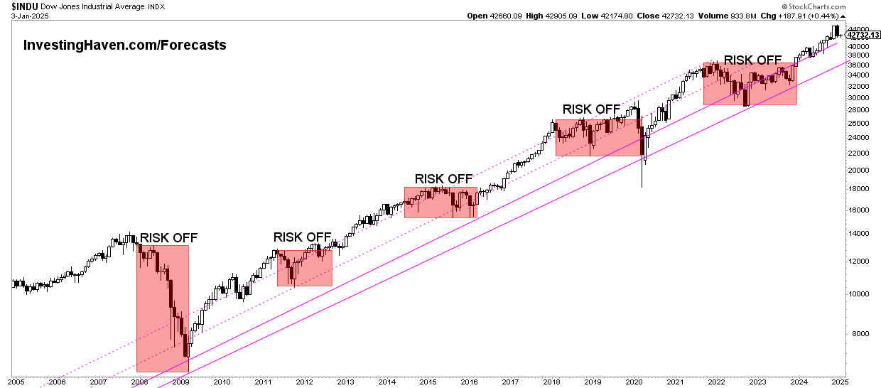
The secular breakout of the Dow Jones is 36k points. This would conclude a risk-off period. If history is a guide, the current risk-off period should conclude soon.
This is what we wrote in 2023:
We expect that the Dow Jones will conclude its consolidation in 2023. This should open the door for a breakout early 2024. We should remain cautious in the summer of 2024. One potential scenario is a breakout above 36k points early 2024, followed by a strong rally and a re-test of 36k points. Note that we may derive other scenarios from our charting and timeline analysis, however we prefer to re-visit the scenarios early 2024.
Dow Jones price action in 2024 happened exactly as predicted back in 2023.
IMPORTANT – In March of 2021, the Dow Jones cleared the top of its 100-year channel around 31.7k points. This price point will continue to carry an above average importance, going forward. Evidence of this was confirmed in October of 2023, when the Dow Jones hit 32.4k as support (nearly hitting 31.7k).
In sum, we expect that the Dow Jones will work around 3 really important price points in 2024: 31.7k as solid support, 36k points as a secular breakout point (also resistance), 40k points as a strong and rounded number.
Closing notes
Note that the Dow Jones Industrials Index was founded on February 16th, 1885, as per Wikipedia. The index tracks 30 large, publicly owned companies based in the United States.
Check out the Dow Jones resources and their X feed.