In a world of fast moving information and content overload it is easy to get caught up in the short timeframes. Over here at InvestingHaven we always check all timeframes, in a top down fashion (longest timeframes first). When looking at the S&P 500 charts we get really excited about the long term chart. It is clear that ultimately this market will crush our 2021 forecasts acknowledging we predicted a bullish market. However, short to medium term this market is vulnerable. This is why.
The weekly S&P 500 chart has the answer, and what a strong setup we see on there.
Early March we wrote this A Beautiful Secular Trendline On The S&P 500 Chart. In there
The secular S&P 500 chart on 40 years has one simple trendline which has been decisive since 1983:
- This trendline was touched in 1983 before a major bull market started which lasted 17 years.
- It was when the 2008 market crash accelerated that this long term trendline was broken to the downside.
- In 2014/2015 this trendline provided resistance after which the 2015/2016 temporary downtrend in stocks started.
- It was exactly at that point where the epic 2020 Corona crash started.
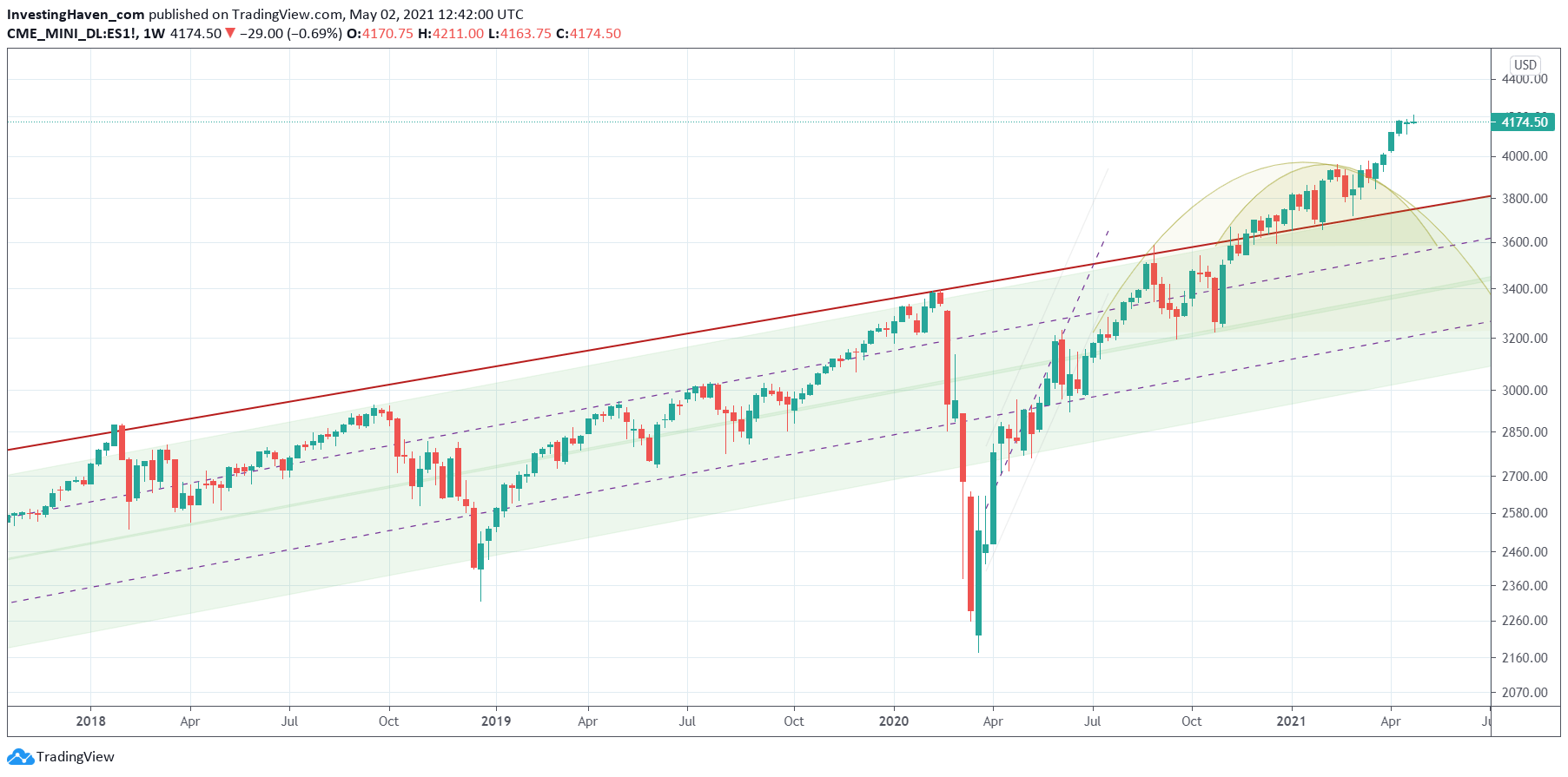
- Since December of 2020 the S&P 500 trades above this secular trendline, and has tested it multiple times as support.
Let’s review where the market currently trades against this trendline: it is above it for +1 month now!
The thick red rising trendline on the first chart, the weekly chart, is the one we were referring to earlier. We observe some 7 weekly candles above this trendline, without touching it.
This really suggests that stocks are accelerating their uptrend in the really bigger scheme of things. The good news: more upside, and the ideal environment for some sectors to go ild. The bad news: a bubble is underway!
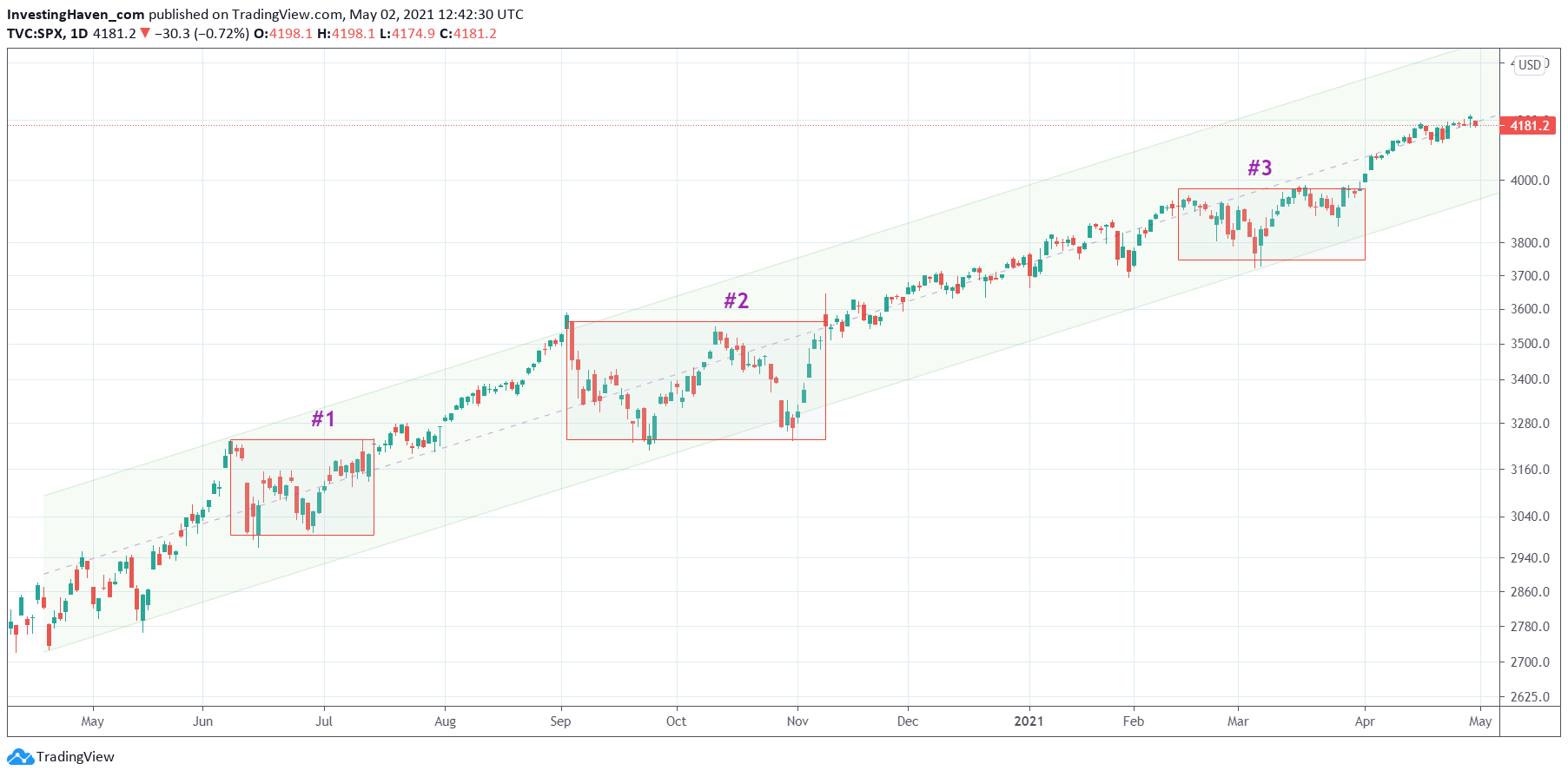
The daily chart post-Corona crash simply shows how strong the uptrend since last April has been. Right now the S&P 500 trades exactly at its median line. It looks a bit tired. We believe it is vulnerable to move back to 4,000 points before or around summer time. This would be a healthy retracement in the context of a long term uptrend.


