When analyzing long term stock market charts it is recommended to compare the charts on different timeframes. Moreover, it could be helpful to look at long term stock market charts on an inflation-adjusted base. This article features the S&P500 on 35 years and the 100 year inflation-adjusted chart.
We recently featured this long term stock market chart of the Dow Jones Industrials (DJI). However, in this article we take this one step further.
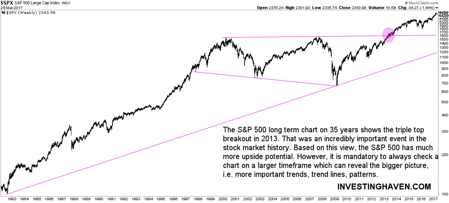
35-year stock market chart of the S&P 500
First, the 35-year chart of the S&P 500 reveals a hugely bullish chart formation. Most believe that the US stock market entered a bear market in 2000. That is partly true though. The long term stock market chart shows a double top combined with lower lows. However, after the 2009 lows, stocks moved higher, and set a triple top. That was followed by a breakout, and as it took 13 years to break out we can say it was a ‘secular breakout’.
The 35-year chart suggests much more upside potential.
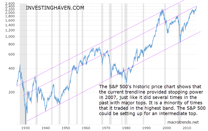
Long term stock market charts inflation-adjusted on 100 years
When zooming out to a 100-year timeframe, the chart pattern becomes totally different. One important thing to note: this represents the inflation-adjusted chart using the headline CPI (each data point represents the month-end closing value).
We should be careful comparing both charts, as they cannot compared one-to-one. The inflation-adjusted chart could potentially provide an additional insight though.
What can we derive from the 100-year inflation-adjusted chart? The very long term trend channel is an important observation. More importantly, however, is the secondary trendline, which connects several important tops in the last 100 years. Right now, the S&P 500 is testing that trendline.
Moreover, it is was only a minority of times that the S&P 500 was trading in the highest ‘band’, above the trend line that is being tested right now.
Although one cannot rely on this inflation-adjusted chart as the only indicator, it could provide additional insights. The message of this chart is that current prices could be an intermediate top. We have to combine this chart with chart patterns on other markets though, like long term Yields which we consider a leading indicator.
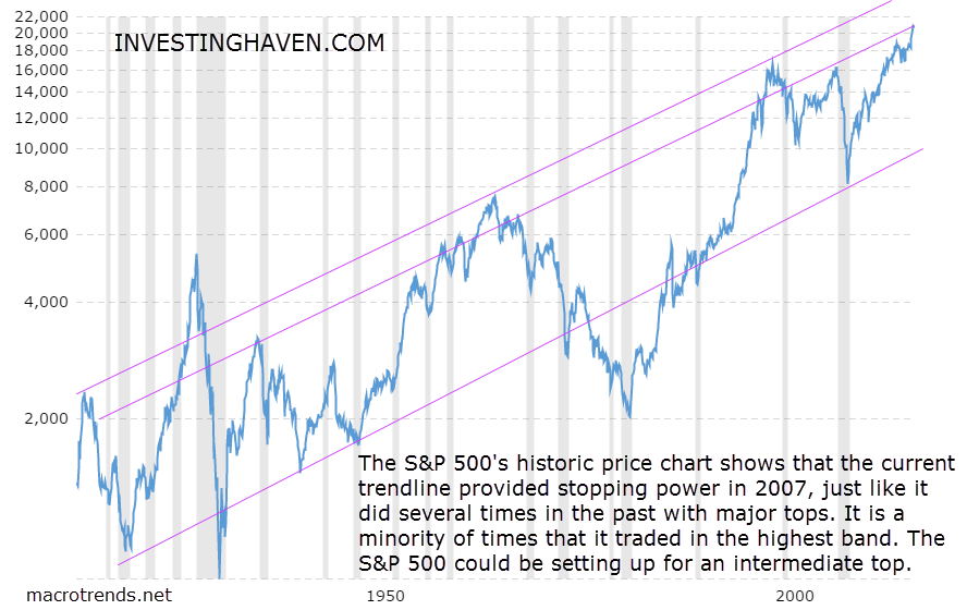
The Dow Jones Industrial makes a similar point, just much stronger. The pattern is even more explicit on the Dow Jones chart.
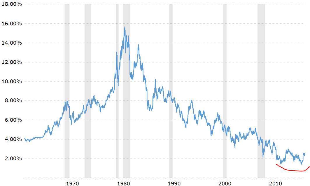
Which argument do we see suggesting stock markets have reached an intermediate top? Our leading indicator, 10-year Yields, is forming a unique pattern. As indicated in red, Yields could be making a huge double bottom, and that has not occurred in the last 4 decades!
The very long term downtrend in Yields since 1980 coincides with the very long term bull market in stocks. However, Yields are very close to a secular breakout. If that breakout were to occur, we would be in uncharted territory, and stocks could indeed be suffering, underpinning a topping scenario in stocks. In other words, investors watch closely current levels in 10-year Yields.
Chart courtesy: macrotrends.net


