The Dow Jones long term chart on 20 years has many relevant insights for stock market investors.
RELATED – Dow Jones historical chart on 100 years
The Dow Jones Industrials has a very interesting long term chart from which we can derive meaningful conclusions. In fact, our research suggests that a top-down approach of the Dow Jones long term charts if required to maximize the quality and quantity of the insights.
- Dow Jones in 2024 – no secular turning point
- Dow Jones long term charts +20 years
- Dow Jones long term chart on 20 years
- The ‘line in the sand’ levels
- Dow Jones long term charts on less than 20 years
- Conclusions
Dow Jones in 2024 – no secular turning point
The single most important fear of investors is the fear of a stock market crash.
That’s why we want to start off by looking at a potential bearish secular turning point that may occur in 2024.
Let’s review conclusions and observations from recent writings.
How to know if stocks will tank in 2024?
The answer to the question “will stocks tank or even crash in the first half of 2024” can be answered by (a) leading indicator TIP ETF should not print more than 3 monthly candles below 105 points (b) volatility index VIXY should not print more than 5 daily candles above 27.2 points.
Will Industrial stocks be bullish in 2024?
The answer to this question will be clear well before 2024 kicks off. The long term chart of XLI will have the answer before January 2024.
While the above two points are not meant to represent an exhaustive analysis, on the contrary in fact, we can confirm that markets are moving in the right direction, i.e. confirming that the first quarters of 2024 will be bullish for stocks. That’s why we believe that the Dow Jones Industrials in 2024 will do well, for sure the first 4 to 5 months of the year.
November 2nd, 2024 – The predictions written more than a year ago, outlined above, were spot-on. Going forward, late 2024, it seems likely that the Dow Jones will retrace and form a basing pattern.
Dow Jones long term charts +20 years
We take a top down approach in this article. We start with the longest timeframes, particularly the Dow Jones long term chart on 100 years and 30 years.
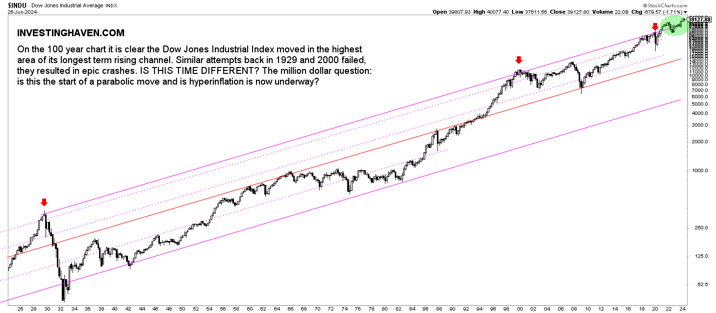
The Dow Jones historical chart on 100 years comes with a few take-aways:
- The Dow Jones reached the top of channel. Any time in the past this happened (1929, 2000, 2020) it resulted in massive market sell-offs. The one difference between now and back then is that those previous rises to the top of the channel came with very steep, multi-year rallies. The 2021/2022 test of the top of the channel did not come after a steep rally.
- For the first time in history, the Dow Jones exceeded the top of the 100 year channel. It happened between March of 2021 and April of 2022.
November 2nd, 2024 – The top of the channel surpasses 37k points currently. It is the the first time in history that the Dow Jones is trading for such a long time above the top of its 100 year channel. This is highly unusual, and suggests that the Dow Jones has to come back down to 37k.
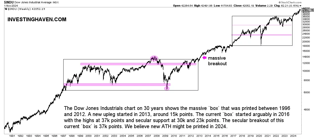
Dow Jones long term chart on 30 years is a timeframe that comes with more actionable insights.
- First of all, we see massive consolidation periods: 1997-2012 and 2016-today.
- Second, the 2020 highs acted as support in 2022. Needless to say, the 28.8k level in the Dow Jones is crucial.
- Third, in the current consolidation period we tend to see 3 levels, as indicated with the pink lines: 23k and 30k points. In our previous update, in June of 2023, we said: “We believe 30k might be tested this decade.” Interestingly, a few months later, in October of 2023, the Dow Jones cam quite close to testing 30k. It fell to 32,380 points.
November 2nd, 2024 – Our viewpoint is that the Dow Jones started a multi-year uptrend, characterized by higher lows. However, a retracement back to the 37k area cannot be excluded, along the way higher.
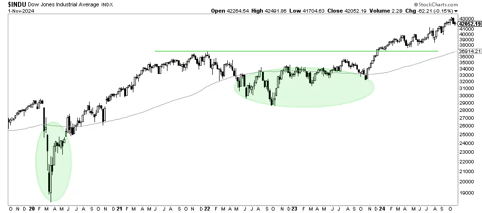
Dow Jones long term chart on 20 years
In this paragraph, we feature the Dow Jones long term chart on 20 years. In doing so, we work with the take-aways from the previous section.
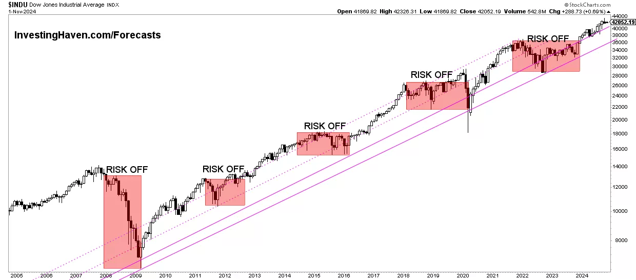
What stands out on the next Dow Jones chart is the 5 ‘risk off’ periods since 2007. Every such period tended to last between 12 and 24 months. The ongoing ‘risk off’ period should come to an end in January of 2023 but not later than the 2nd half of 2023.
The Dow Jones Industrials Index is expected to move higher once this ongoing ‘risk off’ period is complete. We need a lower timeframe to understand when this would be and which price point is going to be the turning point.
This is what we wrote in November of 2023:
By combing the insights from the Dow Jones charts +20 years with the one below, we conclude that there is a high probability that the Dow Jones will move to 37k points in the first half of 2024 (where it will test the ‘end of the risk off structure’ and also the 100-year channel). We can reasonably expect a quick pullback, followed by a secular breakout later in 2024 or 2025. This is how we combine insights from the multiple timeframes with the Dow Jones long term chart on 20 years.
November 2nd, 2024 – The 20 year Dow Jones chart suggests that a pullback in the context of the secular uptrend would be healthy. We do expect that the end of 2024 might be bumpy, until February 2025, with some temporary pullbacks, resulting in a nice bullish formation to make the secular uptrend even more solid.
The ‘line in the sand’ levels
As said in the previous sections, we strongly believe that the February 2018 lows and June 2022 lows are the line in the sand price levels. In particular, the 23,000 area and the 28,000 area in the Dow Jones Industrials Index are the most important levels to watch, not just in 2024 but also this decade.
Any monthly close below this area, as well as 3 to 5 consecutive weeks closing below this area, will be a major red flag for U.S. stock markets as well as global stocks.
November 2nd, 2024 – We do expect 37k to be the new ‘line in the sand’ level for the long term bull market. The worst case outcome is a drop below 37k, not much lower, certainly not below 35k, is how we read the charts at the time of updating this article.
As long as the ‘line in the sand’ area is respected we may see a continuation of the long term bull market that may have started in 2013.
In other words, the Dow Jones long term chart on 20 years learns that this ongoing bull market (1) may have started in 2013 (2) as long as it continues it might play out similarly to the early 90ies. As seen on the chart above there was plenty of upside potential in 1991. That was a very volatile year, admittedly, but in the bigger scheme of things it did represent a small blip, hardly visible, and a massive buy opportunity.
The point is this: as long as the Dow Jones Industrials continues to make higher lows and continues to respect the structure we find on the Dow Jones 20 year chart we are in a secular bull market. That’s an insight that is based on the long term pattern, and that’s why the Dow Jones long term chart on 20 years is so important.
Dow Jones long term charts on less than 20 years
What else can we find on the Dow Jones charts, although shorter timeframes than 20 years?
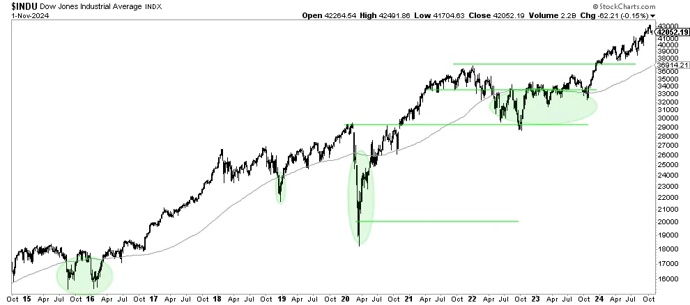
First, the Dow Jones 10 year chart comes with one really interesting insight. The long term moving average (90 weeks) is the one featured on the next chart. As seen, ‘risk off’ periods typically come with a period in which the Dow Jones trades for a certain period of time below its 90 week moving average.
In 2015/2016, it took the Dow Jones a double W reversal over 12 months. In 2018, the pull-back below the 90WMA took some 3 months. In 2020, it took the Dow Jones some 6 months below its 90 WMA.
In 2022, the Dow Jones fell below its 90 WMA in April. We can reasonably expect that the Dow Jones will clear its 90 WMA the latest in March of 2023. Note that the level to clear is 33.6k points, just 6% above the 31.7k points ‘line in the sand’ level we mentioned before.
November 2nd, 2024 – This timeframe emphasizes the importance of 37k points. Moreover, it also confirms that a drop to 37k-38k might be very healthy, sort of a breakout back test. The most bullish outcome would be a drop that does not drop below 39k.
The 5 year Dow Jones chart zooms in and gives some more nuance and detail. We can reasonably expect that 2022 will be all about a W reversal below the long term moving average, one that might take close to 12 months to complete.
November 2nd, 2024 – This timeframe emphasizes the importance of 37k points. Moreover, it also confirms that a drop to 37k-38k might be very healthy, sort of a breakout back test. The most bullish outcome would be a drop that does not drop below 39k.
Dow Jones charting – conclusions
This is what we conclude from the Dow Jones long term charts on 20 years, 30 years, 100 years (all DJ charts created in TV):
- The top of the 100 year channel was reached. Although it came with a big sell-off every time it do so in the past (1929, 2000, 2020) we believe this time around it will not be as bad. The reason is that the rally that preceded is not as steep.
- The Dow Jones will likely trade in a wide range this decade: the 2017 lows to the 2021 highs.
- The line in the sand levels are 23k and 28k points. Other crucial price points, this decade, will be 31.7k and 33.3k.
- We do expect at least one market sell off in the next 3 to 4 years and the levels that will be tested could be 23k (presumably temporarily). We believe a mini-version of the Corona-crash might occur in the first half of 2024
- On the flipside, we do see the Dow Jones clear ATH at a certain point. The Dow Jones 100 year channel will cross 37k points in Feb/April of 2024.
We recommend checking extreme sentiment changes for contrarian signals.
As we add commentary in November of 2024, we see that 39,000 points might be a reasonable pullback target in the period November 2024 to January 2025. A drop to 37-38k points would qualify as a breakout back test.