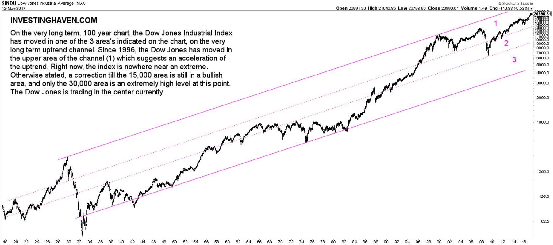
The most historic charts are mostly fascinating, and so is the Dow Jones 100 year chart.
While many are talking about extreme valuations of stocks, the Dow Jones 100 year chart suggests U.S. stocks are nowhere near extreme levels. That does not tell anything about a correction, or timing thereof. It simply suggests that the Dow Jones has upside potential before reaching extreme levels.
Looking at the 100 year chart of the Dow Jones, it becomes clear how strong the uptrend has been in recent decades.
Phases on the Dow Jones 100 year chart
Basically, between 1932 and 1966, the Dow Jones index has risen more than tenfold. Buying in 1966 would have been catastrophic for one’s portfolio (insight 1). That is because the Dow was trading in the upper area of its long term channel in(insight 2). The Dow corrected over 2 decades to test its support level several times. As of 1984, the Dow went in one straight line up until 2000.
After 2000, the Dow has traded in area (1) and (2) as its rise accelerated (insight 3).
Right now, the Dow Jones index is not near an extreme level (insight 4). The 30,000 level is the extreme level.
We are not suggesting that the Dow will reach 30,000 points any time soon. We are just saying the 100 year chart does not suggest an extreme price position.
Investors should read this chart combined with leading and secondary indicators. Leading indicators are primarily 10-year Yields which started a secular downtrend as of 1982, as seen on this long term chart. It is no coincidence that 10-year Yields, a leading indicator for stocks, started an historic downtrend as of 1982, the year stocks started an historic uptrend (insight 5).
Shorter term, investors watch the 3 percent interest rate level in 10-year Yields for a potential long term trend reversal, which would have profound implications on the Dow Jones as well as the U.S. bond market.


