Silver is undervalued, significantly undervalued. This becomes clear when looking at the price of silver expressed in other assets. In this article, we look at the silver price expressed in leading assets to make our point: silver in Australian Dollar, copper, commodities, Dow Jones, Treasuries and even Bitcoin.
RELATED – Will Silver Ever Hit $50 An Once? Here Is The Answer And Must-See Charts.
If anyone wants to understand valuation of a market or asset like silver, it makes sense to complement regular chart readings with relative readings.
In the case of silver, we want to see what the price of silver is expressed in leading assets. Those ratios (silver expressed in another asset) paint a picture. Moreover, the chart pattern of those ratios has a message.
We look at the price of silver expressed in:
- Currencies – Australian Dollar, the most commodities friendly currency.
- Stocks – Dow Jones.
- Commodities – CRB index as well as copper price.
- Treasuries – TLT ETF.
- Bitcoin as the leading momentum asset.
Interestingly, silver expressed in all these leading assets paints a clear and consistent picture:
Silver is ridiculously undervalued as evidenced by (very) bullish chart patterns on the secular timeframes of those ratio charts.
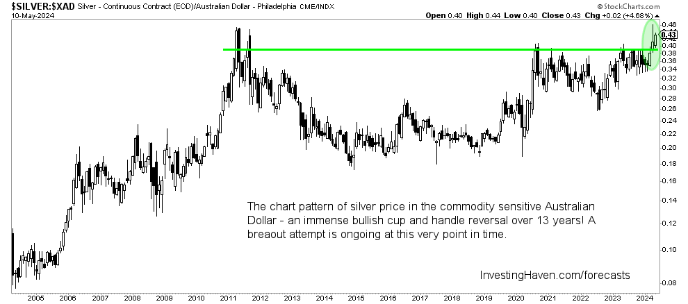
Silver ridiculously undervalued: silver to AUD
The Australian Dollar (AUD) is the most important commodities friendly currency.
The rule of thumb is that when the AUD is on the rise, it signals a bullish environment for commodities as an asset class.
When we look at the silver price to AUD ratio, in a way expressing silver in Australian Dollar instead of USD, we see a tremendously bullish cup and handle reversal.
Take-away: This chart pattern is clear – both silver and AUD want to move higher, silver in a way gets a confirmation from the AUD. Visibly, silver will outperform the AUD.
Silver expressed in commodities
Silver tends to move higher and lower with spikes. No coincidence, it is the restless metal.
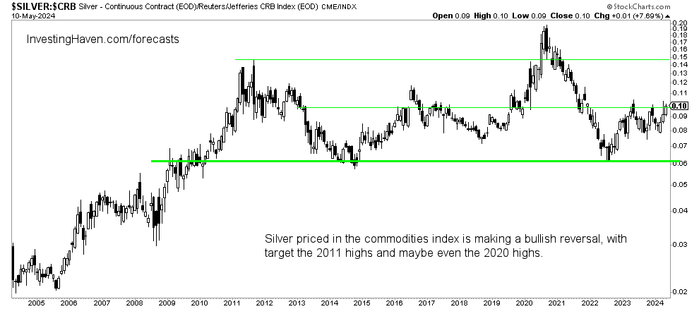
When we look at the ratio silver to commodities, using the CRB index as a broad measure for commodities prices, we see a very nice pattern.
The chart pattern of silver expressed in commodities is a multi-decade series of reversals. What stands out is how support has held very well. Also, resistance in 2005-2008 is now support since 2013.
Take-away: This chart pattern suggests that it’s a matter of time until the silver to commodities ratio moves to the 2016 and 2020 highs. This implies a surge in the price of silver with trendless commodities OR a really big spike in silver with commodities on the rise.
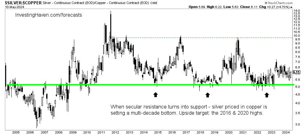
Moreover, when expressed in the price of copper, we see a similar setup: multi-decade support is perfectly respected. Remember, bullish chart patterns become reliable if/when support is respected.
Silver to stock prices ratio
The above measures were commodities oriented. We now pivot to comparing silver with stock prices.
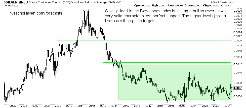
Below is silver expressed in the Dow Jones index.
What stands out is the multi-year reversal, with great respect for support over the last 6 years. This has a strong bullish bias.
Take-away: This chart pattern suggests that the 2016 and 2020 highs will be tested again, sooner or later. In other words, silver will outperform stocks in the not too distant future. This, of course, will come unexpectedly after solid performance of leading stock indexes in the last 18 months.
Silver to Treasuries ratio
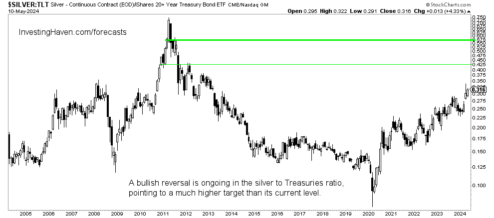
Treasuries are on the leading assets.
Silver expressed in Treasuries have a very bullish reversal chart structure.
Take-away: The end is not in sight. This ratio wants to move much higher which implies a big jump in the price of silver acknowledging the low volatility levels of Treasuries.
Silver to Bitcoin ratio
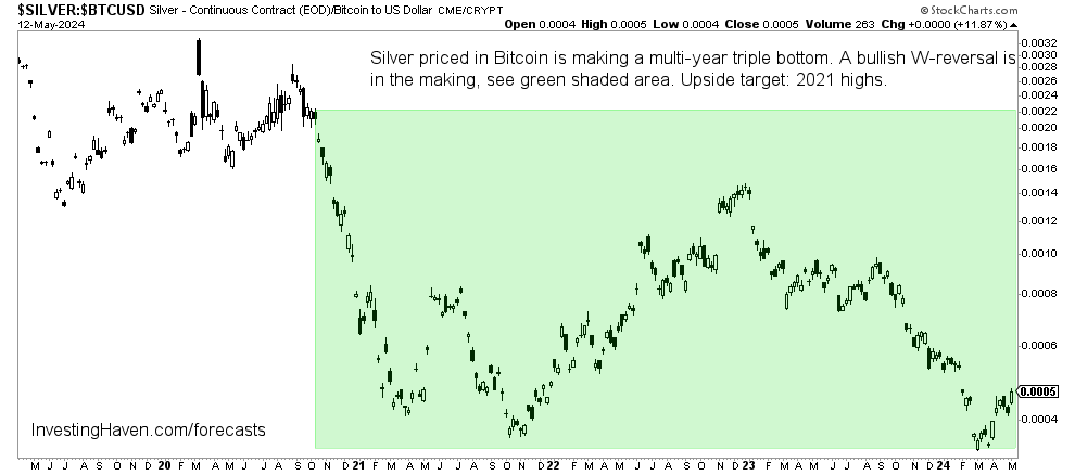
Ultimately, the highest momentum asset (the market most sensitive to risk) is crypto. That’s why it makes so much sense to look at the silver to Bitcoin ratio.
Astonishingly, the pattern on the silver to Bitcoin ratio chart is a giant W-reversal. Multi-year support is perfectly respected. This is very bullish, beyond words!
Take-away: This chart pattern suggests that silver is likely going to outperform Bitcoin in the short to medium term.
How high can silver go?
The upside potential in silver is high. Ultimately, silver will go to $50, it’s a given, the only question is WHEN will it exceed $50 and how much higher will silver go.
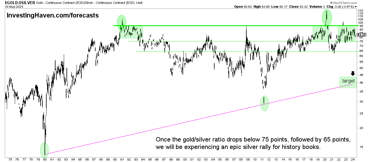
The gold to silver ratio might give us a clue. It currently stands at 83 points, at the time of writing.
We believe that this ratio will fall to 40 points. This implies a big jump in the price of silver, assuming a flat gold price, up to a jump of 100% in the silver price.
Silver is ridiculously undervalued
When looking at silver expressed in leading assets, the conclusion is clear, very clear:
- Silver is undervalued. Arguably, it is ridiculously undervalued.
- Chart structures suggest that silver is ready to move higher.
None of the conclusions outlined in this article has a timing aspect. In other words, conclusions like ‘silver is ready to move higher’ does not indicate WHEN silver will start moving higher. We look at secular charts in this article which means that it may take between days, weeks, months, up to one or two years until silver starts reflecting the bullish nature of the patterns shown on the ratio charts.
In the meantime, we stick to the strategic importance of holding physical silver as explained here as well.
If you like our analysis, you will certainly our latest premium gold & silver market report, sent to premium members this weekend: War Is Escalating Again. Can It Trigger A Silver Short Squeeze?

