It was a pretty devastating week for precious metals investors. One week ago, gold’s chart was still looking absolutely lovely. That’s when we wrote Gold Now In Love With Its Former All-Time Highs. One week later gold looks certainly less lovely, and much more concerning. Not a crash, but certainly more weakness, is what gold charts tell us now. InvestingHaven followers have done really well this year with our successful trades (also successful protection in terms of stop losses) in our short term portfolio, some great investments in precious metals miners in our medium term portfolio, and our accurate gold forecast and silver forecast.
Let’s review where we stand today.
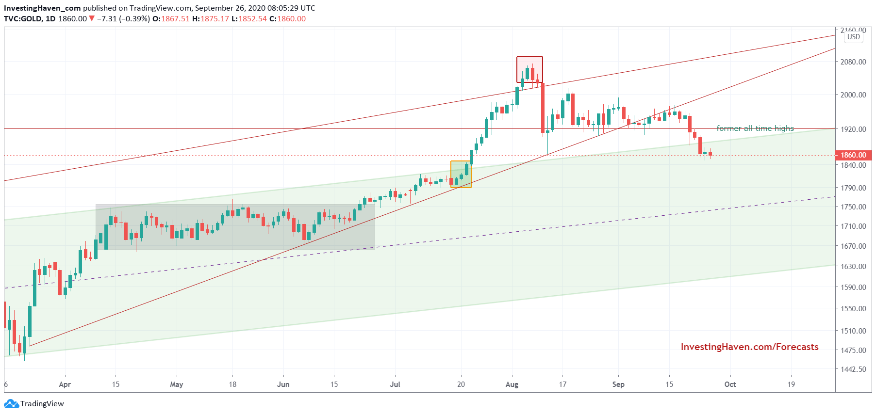
The daily gold chart is now BELOW former all-time highs, in a rather concerning fashion. This week’s ‘breakdown’ has a shape that we don’t like.
Moreover, and more importantly, we don’t see lots of support until 1790 followed by 1760. That’s just a few percentages, but still the picture has vastly changed.
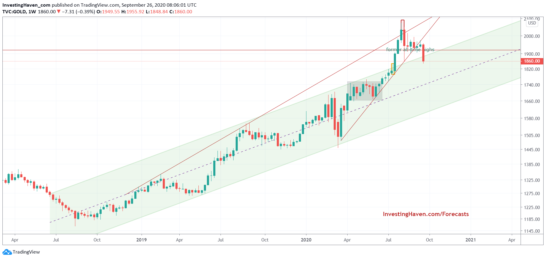
The longer term chart shows this really concerning big red candle that was printed this week.
Indeed, it’s hanging there, pointing downward, with no immediate support. Not the setup that makes you want to buy.
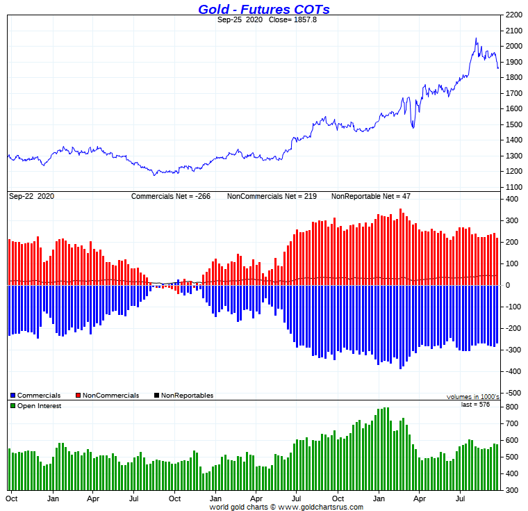
One of the leading indicators of gold prices is found in the futures market positioning. We covered the way to read this extensively in the past.
This chart does not give us a high level of confidence. It’s not a bad reading, but certainly not a promising reading neither when combined with the above charts.
That said we conclude that the gold market needs time, more time.
How much more time?
If the gold market has to recover based on its chart it might be lots of time.
If the gold market will recover based on additional fiscal stimulus as per Powell’s recommendation on CNBC Fed calls for more fiscal stimulus it might recover much faster. But we better don’t wait for this, we better monitor and react (as opposed to anticipating).


