Silver continues to be one of our favorite markets. In fact, for this year, we expect green battery metals as well as silver to be among the top performers. They may or may not be THE top performers of the year. What we do know, for sure, is that they are so bullish that they are worth holding for the medium to long term.
A while ago we published this article on Medium: Silver: The Longest And Strongest Chart Reversal In History Of Markets. This is a quote from that article:
We recently explained that Beauty Results In Profitable Investments. In essence, our theory behind this statement is that beauty matters in all areas of life. Everyone loves beauty, regardless whether it is largely subjective. Humans tend to look for beauty in their appearance, the car they drive, their home and garden, places they visit, etc. Our point of view is that beauty should matter in the area of investing. Financial markets should not be any exception to the hunt for beauty. This point of view is based on empirical evidence which came after thousands hours of research.
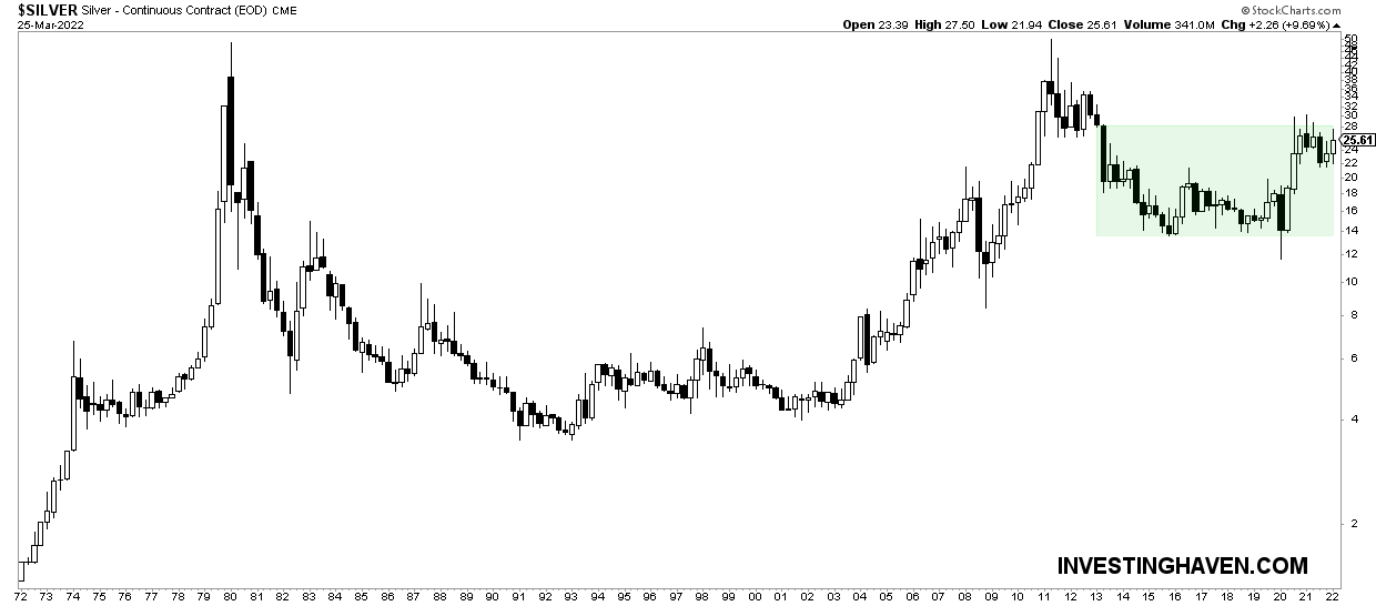
Interestingly, it is really simple to apply this idea about beauty to financial markets. Just check the chart, and put the bar very high. In the case of silver it is a beautiful rounded reversal pattern. What makes this chart so special and unique is the length but also the precision of this pattern.
For those that have missed our writings we will say it again: silver’s longest timeframe is among the most powerful chart setups ever in history of markets. When we say ‘markets’ we really mean assets, not individual stocks.
The long term chart in silver is a pressure cooker. In fact, it is just a strong chart that is really doesn’t matter whether it will start trending (higher, that is) next week / next month / next quarter / next year.
What matters is that the longest silver chart is so powerful that once it starts it will be unstoppable. Also, it is a matter of time until you will be struggling finding an entry point. Current entry levels are still great, but this likely won’t last forever.
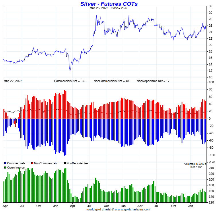
Short term, we see a dubious setup in one of silver’s leading indicators: the silver futures CoT chart. As said in the past, the short net positions of commercials (center pane of below chart) is some sort of stretch indicator: whenever those readings move close to zero it suggests that price has hardly any downside potential, while when it rises to historically higher levels it means that the upside potential is capped.
So, how do we interpret this apparent ‘conflict’ between the slightly bearish short to medium term outlook and an insanely bullish long term outlook?
Very simple, in our premium research service we included a silver chart which helps us recognize a short squeeze. It is a real possibility that a short squeeze is coming in silver, and it is one chart setup that can help us recognize a short squeeze (it’s available to premium members).


