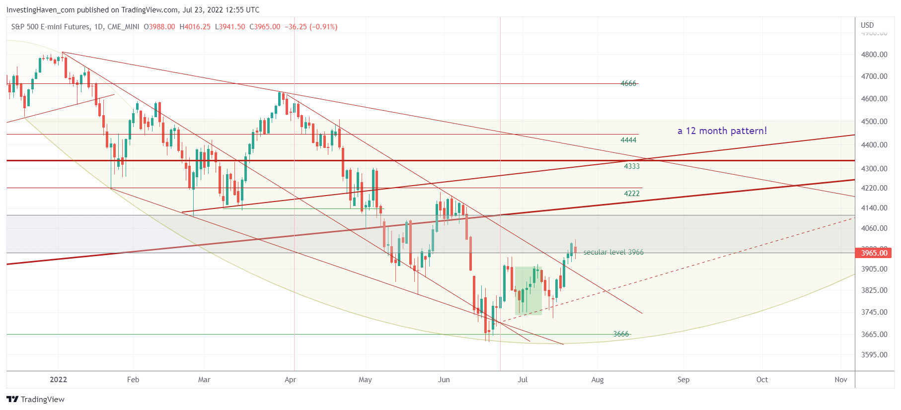
A lot is written abut the economy and markets lately. Very often, investors get overloaded by information. Most investors seem not be afraid about information overload, they tend to search for more information, often conflicting, as if more information comes with deeper forecasting insights. At InvestingHaven.com, we do the opposite. Very often, we select one or two data points, the ones we believe are dominant or could become dominant, to create focus but also peace of mind. Here is the one data point on what is becoming a very complex S&P 500 chart that we believe really matters in the 2nd half of 2022. It is, ultimately, a very easy but powerful S&P 500 forecast methods.
Before we look at the S&P 500 chart we want to emphasize that the period April – June has been extremely tough for investors. Markets were rude, merciless and broke lots of structures. We believe that almost every market got broken, although to a various degree.
That’s why we encourage our members to stay the course by giving space to the market to recover, by ensuring that you (we) hold quality assets which eventually will resolve higher.
We want to highlight how to handle this situation. From one of our investing success articles Investing Secrets: There Is A Fine Line Between Success And Failure we pick out the following quote:
FLOW is important in real life, it does matter when investing.
You recognize FLOW, you know when you are in your flow, timing your entries and exits feels almost perfect. You give time to the market, you are eager and patient, you act the right moment. You are really happy with your results.
But watch out, a few weeks or months later you may be shaken out of your FLOW. It can go fast. So, all you have to do is ensure that you carefully observe what you did well when you were in your FLOW. Also, what went wrong when you were shaken out.
If you do this sufficiently well, for long enough, learning thoroughly from success and failures, you will start seeing the fine line between success and failure!
Everyone was shaken out of his flow in the period April – June. It was extremely tough to forecast the exact pattern that unfolded in markets in that particular period.
With that said and with simplicity in mind (as said in the intro) let’s look at the S&P 500 daily chart. We can clearly see (1) a very complex chart (2) with a very long term rounded pattern that is a 12 month (!) pattern.
Try to find simplicity in complexity. What do you see?
There are two things that stand out:
- The 3966 level is a secular level. So far, we got a bullish reversal below 3966. We need to see a continuation of this bullish reversal structure.
- The dotted, rising trendline that connects the recent lows.
The latter is really important and will be key for us in the next few weeks and months. This trendline is a prime candidate to become dominant and represent a new uptrend. Not there yet, not confirmed yet.
But let’s face it, instead of spending countless hours on research on Bloomberg and Marketwatch, isn’t so much easier to track a few indicators like this potential new uptrend (in the form of the dotted line) to understand the intention of the market? That’s one of the many things we do in our premium research!


