The health care stock market sector is the outperforming sector in the S&P 500 in February 2017. Though this is an interesting insight for investors, the more important observation is the chart setup of the health sector (which is discussed in more detail in this article).
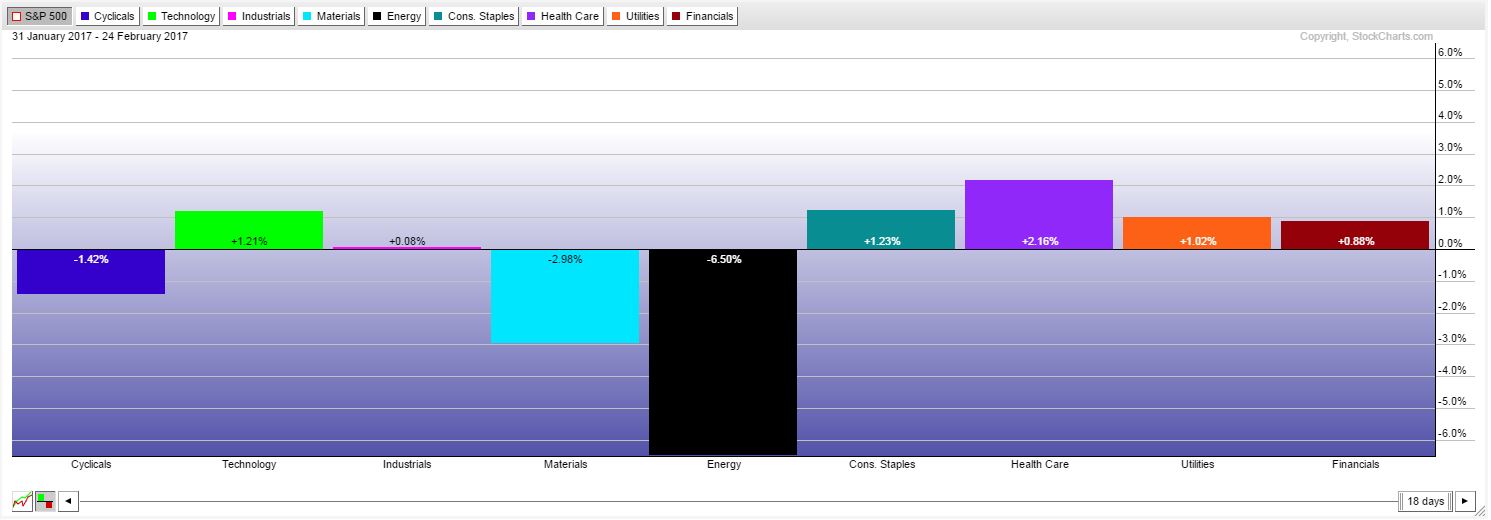
First, relative strength of heath care compared to other stock market sectors is very strong. In February 2017 health care was the best performing sector as shown on the first chart.
Health care rose 2.16 percent in February, followed by consumer staples +1.23 percent technology +1.21 percent. Energy stocks were the biggest losers this month, which does not come as a surprise as InvestingHaven identified that Energy Stock Market Investors should be careful as long as the XLE ETF remains in its current price range.
Health care stock market: watch the current chart setup
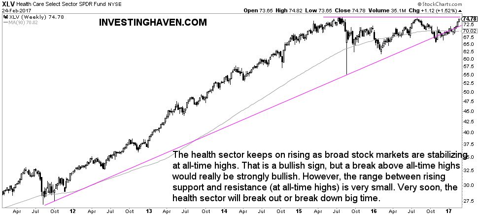
The chart of the health care stock market sector (XLV ETF) looks amazing. Watch the triangle pattern which is shown on the chart below. Since October of last year XLV was seemingly breaking down. However, the health sector refused to go lower, and investors consider this to be a false breakdown.
Interestingly, the health sector recovered and is now on the rise, even outpeforming all other sectors as explained earlier.
The most interesting observation on XLV’s chart is the narrow range between support (72.50) and resistance (75.00). This suggests that the sector will break out or break down, sooner rather than later. Smart investors are paying attention to the health care sector.


