Silver is moving between $16 and $20 for a year now. After the stunning move in the first months of last year, where the silver price rose from $14 to $21, the grey metal has basically consolidated.
Investors tend to focus on the short to medium term. That is a natural effect of the information overload we are facing today with financial media focused on day-to-day moves.
Smart investors look at different timeframes, and understand very well the very long term trends with are dominating in every market and stock.
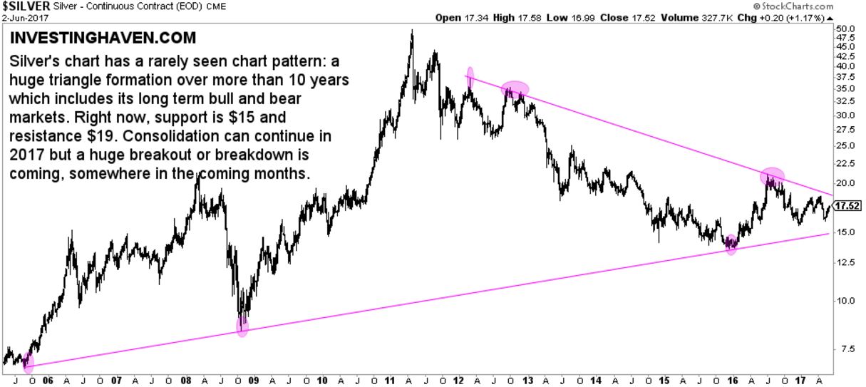
If we look at silver on a longer term timeframe we observe a very interesting long term pattern. It is a rarely seen pattern, for sure because of its length: an 11-year chart pattern. Let’s be clear here: this is highly unusual.
Although the silver chart will reveal many trends when examined in more detail, think of the 7th breakout attempt on the silver price chart (5-year chart), we only care about the dominant trend on the very long term (10-year chart). Visibly, at least for now, are the two trendlines shown on below chart: a series of lower highs (started in 2011) combined with a series of higher lows (started in 2005).
This silver price chart pattern is rare
The pattern on below silver price chart is quite sharp, so it has significant predictive value.
What this chart setup tells us is that silver could fall to $15 (even a bit lower) in the coming months. Once below $15 it could setup for another dominant trend which is not visible on the 11-year chart. Once above $19 to $20 it would break out from its series of lower highs, although the ultimate breakout test would be the $20 to $21 area.
We will soon find out if our Silver Price Forecast For 2017 will be achieved or not.


