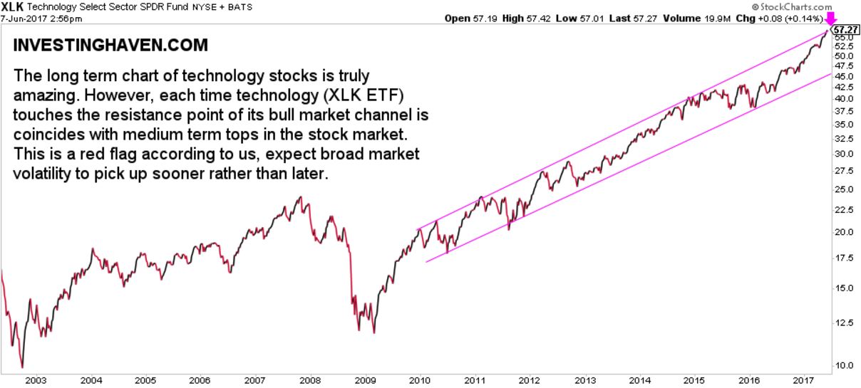
Technology has done amazingly well in recent years. Since the 2009 bottom the technology stock index XLK has gone up five-fold. The key question is: how much upside potential is there?
There is no better way to identify upside potential than examining a price chart.
The technology stock chart looks, without any doubt, amazing. Moreover, it is a very precise channel, the bull market channel.
The less positive news though is that the index has reached the resistance area of its rising channel. That is potentially a concerning thing. This technology index can certainly continue for a while at resistance, similar to what it has done in 2015. But, since 2009, the resistance area has mostly introduced a medium term op.
Given the ‘risk on’ cycle which is close to reach 12 months, as seen on this chart, we do not exclude a summer and fall correction. That would confirm our thesis outlined in our Market Barometer Suggesting Serious Volatility As Of Summer 2017.
Note that we are not suggesting that markets will crash. We are rather saying that this not the time to take aggressive positions in U.S. stock markets, on the contrary, this is a time to become slightly more defensive.


