After our palladium forecast got invalidated last week we see another opportunity arising in the precious metals space. One important finding of InvestingHaven’s research team is that There Is Always A Bull Market In One Of The 4 Precious Metals. Will platinum (PLATINUM) offer the opportunity of 2019 as we wait for our gold forecast and silver forecast to materialize? Let’s listen to what the platinum charts have to say on this.
This article features only the setup of the platinum charts. No fundamental analysis?
Why?
InvestingHaven’s methodology says “start with the chart”. As explained in great detail in these 100 investing tips:
A strict and disciplined way to identifying trends on charts is required. The most fundamental way to apply the ‘start with the chart’ principle is the top down approach: first study the monthly chart as it shows the ongoing dominant trends, then the weekly chart, only after this the daily chart. This is the right approach to understand trends. Only if and once patterns or opportunities on all 3 timeframes are in synch is it justified to do an investment. In other words the 3 timeframes have to confirm each other, not divergence.
Platinum Breakout In Progress: The Charts
Note that platinum as an investment is not very accessible. However, purchasing some physical platinum on a bullion service is pretty easy to do.
Let’s start with the monthly chart.
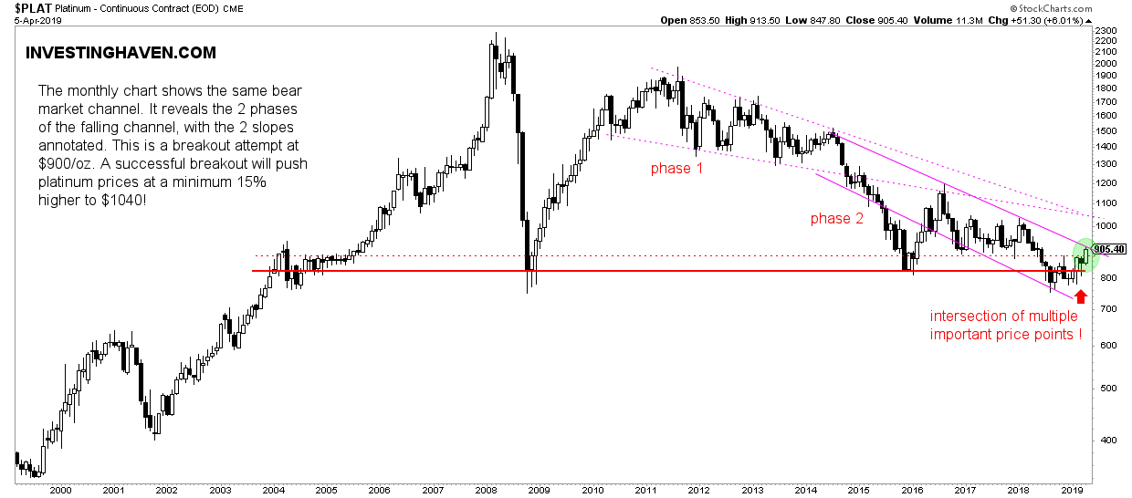
The pattern is pretty bearish in the last 7 years. This may be changing now.
A couple of crucial observations:
- Note the double bottom between 2016 and 2018.
- The bottom last year was about to break down, however it held strong right below secular support. This implies sellers were the minority.
- Note the 2 phases of the downtrend: phase 1 between 2012 and 2015, followed by an acceleration until end of last year.
Right now we see a breakout attempt which happens right at the intersection of multiple important price points. If the breakout materializes it will send lots of bullish energy to the platinum space! We see an easy ride to the $1040 area where it meets a very important area of resistance.

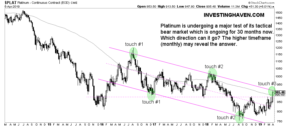
The weekly chart does not reveal any new insight compared to the monthly.
So then why do we include it?
Because it is a MUST to check different timeframes. No new insight against other timeframes implies a ‘confirmation’ and ‘convergence’ between timeframes. It’s a great sign, as opposed to ‘divergence’ which is a red flag.


