Bitcoin lost serious value this week. It fell from around $10k to below $8k. This 20 pct decline leads many crypto investors puzzled with the question whether the crypto bull market ended. Time to panic or a buy opportunity?
This is the type of situation where one, and only one thing, helps: stay focused on the charts.
We shared some great charts with our premium subscribers this week. Anyone who desires access to these exclusive charts should subscribe to our premium crypto service (you will get instant access to all materials, please go to the page with this week’s crypto alerts).
We will not share the exclusive charts to respect our members.
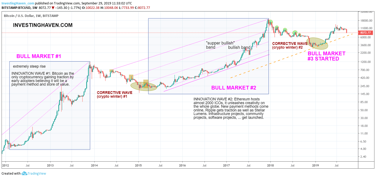
What we can do is share the long term Bitcoin chart.
Looking at the long term trends is the most obvious thing to do when doubting where a market is headed. It is the long term charts that show the long term patterns. We call it the secular trends.
As seen on the up-to-date long term Bitcoin chart (which we have shared many times on this site) there is still no real concern. The long term uptrend is intact.
What’s most interesting is this orange dotted line. What this shows is two things:
- It has almost the same slope as the previous bull market.
- It is the current slope of this ongoing bull market.
Let’s keep things ultra simple: as long as Bitcoin continues to trade above the orange dotted line it remains in a powerful long term uptrend. It is the ultimate confirmation that the 3d bull market is in tact.
A trend is a trend until proven otherwise. There is only 1 turning point, and other than that there is just the trend continuation.
For now, we don’t see reasons to be concerned. This may change in the future but only if we see signs of a turning point.
Our premium members receive continuous notifications about important evolutions in the crypto market. You too can receive them by signing up here >>


