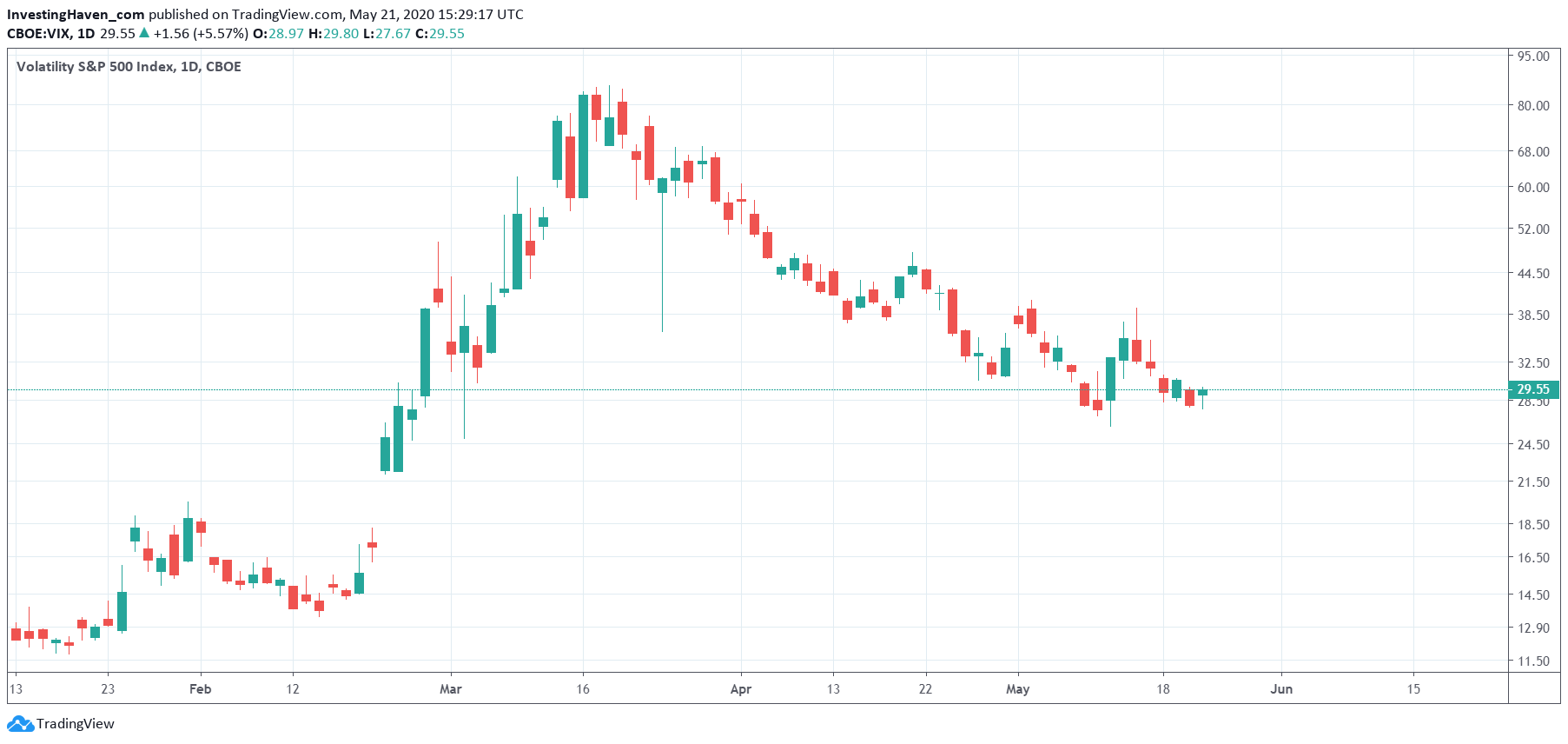
When investing more often than not it is good practice to apply the ‘less is more’ principle. This applies to the number of markets to invest in, but also applies to the number of indicators to include in a method. It also applies to charting. That’s why we decided to feature a pattern-less chart of one of the crash indicators: the VIX index. We do not use VIX to trade, but we use it as an indicator. Interestingly this indicator is now at a pivot point, this is why.
VIX is known to create havoc, especially when it rises fast.
Moreover, there are a few very precise price points that have a very high relevance.
Both points above combined give a good sense of what VIX is trying to do, and read in conjunction with broad market indexes it gives a good sense of where markets are headed short and medium term.
The details are preserved for premium members, as explained below. However, directionally we can share an interesting insight about the VIX indicator.
Below is the daily chart on 4 months.
- It shows the huge spike in March that came with the once-in-a-generation sell off in stock markets.
- It shows the steady decline since mid-March.
- Interestingly, in the last 4 trading days the VIX index is ‘stabilizing’. However it does so around 30 points which is not really the best spot for a ‘stabilization’ or ‘consolidation’.
Any VIX reading above 25 points is in a ‘high volatility’ area. Above 50 points is in ‘armaggedon area’.
Whatever happens in VIX in the next few days and weeks, above 25 points, will set the direction for stock markets and most commodities.
We keep a very close eye on VIX, and the price levels we monitor for our premium members.


