Whenever you have doubts: zoom out. Whenever you feel uncertain: read the tips in The Shocking Reality Of The Market. Whenever the entire world is screaming that the stock market will crash, you have to consider the contrarian viewpoint. We use a set of leading indicators, all of them are suggesting the decline in stocks came to an end. Here is one more: bond yields, the monthly chart.
In our recent post Volatility Indexes Sending A Bullish Signal To Stock Market Investors we explained how one of our leading volatility indicators sent a really bullish signal about the outlook of stocks.
In that same piece we showed the weekly VIX chart which clearly shows a topping pattern (bullish stocks).
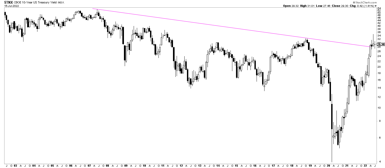
Here is one more leading indicator: bond yields, the monthly time frame.
Admittedly, the daily timeframe of bond yields is not really helpful lately. That’s why we say to zoom out if you have doubts.
Bond yields (10 years on below chart, inversely correlated to Treasuries like TLT) had been rising way too fast in April and May. The stock market does not like this. It also suggests that the Fed will likely raise rates.
What do you see on the monthly chart now? A huge topping pattern, with giant ‘wicks’ especially the one printed in June.
What does this chart suggest? The interest hike narrative is outdated. Stated differently, the market has ‘priced in’ the inflationary trend and its impact on policy makers’ decisions.
Remember, CPI numbers are lagging. If you carefully look at the futures market, they tell a very different story. We explained all this, in great detail, in two must-read pieces ‘The Shocking Reality Of This Market’ in our Momentum Investing service.
This one chart with a few wicks (below) is not sufficient to confirm a turning point in markets. There is much more evidence in our set of leading indicators. We are on record with this forecast: stocks have set a bottom, the decline came to an end. Leading indexes like the S&P 500 and the Nasdaq will resolve higher, not lower.


