After we observed yesterday a rarely seen Silver Price Chart Pattern we now turn our attention to the silver mining space. Silver miners, if anything, have also an exceptional chart setup.
The silver miners are represented by the silver mining ETF SIL. It is a publicly traded vehicle.
As said, the chart of the silver price is about to resolve anytime soon. It has a huge triangle formation and the apex of the triangle is near. That is a technical explanation and consideration which, in plain simple terms, means that the price of silver is soon going to trend higher or lower. It has been rangeboud in the last 12 months.
Silver miners (SIL) are in a similar spot. It is just that their chart setup is slightly different, though even more awesome.
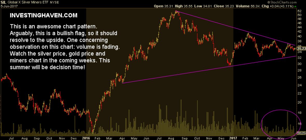
The daily chart of SIL also shows a triangle formation which started last year in March. Since then, SIL is moving in a perfect pattern.
This pattern is known to be a ‘bullish flag’. Stated differently, there is a high chance that this will resolve to the upside.
The concerning factor here is decling trading volume.
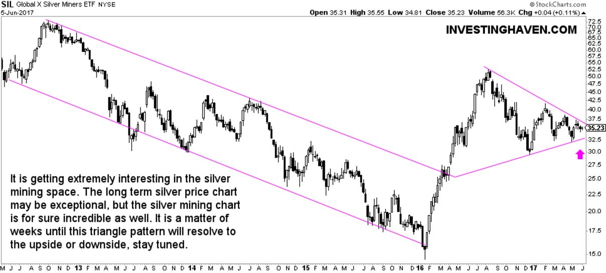
Smart investors analyze charts on different timeframes. The daily chart featured above may not reveal all trends. In other words, there could be a dominant trend in the silver mining space which is only visible on a 5 year time period, hence the need for a weekly chart of SIL, see the one below.
The weekly only confirms the picture on the daily.
One very important note: both the chart of gold and silver are close to a resolution. The same goes for silver miners (chart below) and gold miners (chart not in this article). Readers must keep a very close eye on all 4 charts. From our perspective: the precious metals charts all point to the same conclusion, i.e. this summer will be very hot in precious metals.


