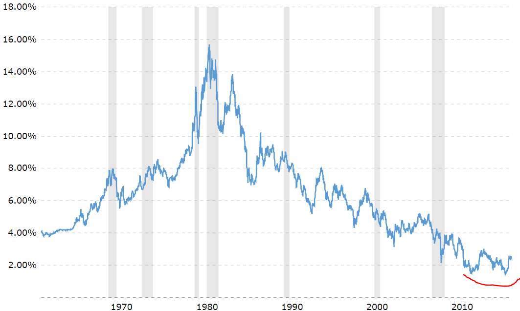
Our favorite leading indicator for stock markets is 10-year Yields. On its very long term chart we spot a potentially very disruptive event: a trend change after 4 decades. This could become MAJOR news once this materializeds, and it could disrupt (stock) markets.
Important to note, in general, we tend to write about medium to long term trends. When we mention leading indicators, risk cycles, the primary market trend, etc, we mostly looking on a time frame of 1 to 7 years.
When we mention potential disruption ahead, we really talk about a much, much longer timeframe, in particular 3 to 5 decades.
The bond market and Yields, both inversely correlated, have moved in one and the same direction in the last 37 years (over the long run, notwithstanding shorter term moves): bonds have gone up, Yields have come down. The historic chart of 10-year Yields, see below, shows how Yields topped around 16% in 1981 and bottomed below 2% in 2011 and last year.
From a chart perspective, we notice someting very unusual. First, it has never happened before that Yields refuse to go lower in a period of 6 years. Second, between 2011 and 2016, Yields have set a double bottom.
See the red annotation on the chart.
That could suggest that Yields have set a secular bottom, and that they will go higher from here. As soon as they go slightly higher from current levels, they will also break out (technically), which would be incredibly important news. Financial media will have no clue, and they will not notice this, but InvestingHaven readers are lucky to get notified once there is really important news.
What exactly will happen once Yields start a new long term uptrend is not clear. Because of the inverse long term correlation with stocks (stocks are in a secular bull market since 1981) it could suggest that stocks would weaken on the longer term. That does not necessarily mean a stock market crash, it rather means no strength in U.S. stocks.
Smart investors watch very closely 3% in 10-year Yields, a secular breakout level.


