It was quite a volatile year, with a mix of collapses and rallies across markets. Think of gold’s breathtaking rise, crude’s collapse, and copper’s rally. After the summer, gold started collapsing while crude and stocks rallied strongly. With this year’s volatility, it is quite challenging to define a market outlook for 2017. To get a sense of what 2017 will bring, we analyze our proprietary market barometer and our leading market indicator.
The problem with many financial media outlets is that their market outlook sections contain so much and diverse information that it becomes an impossibility it to utilize that info for forecasting. Take as an example the market outlook section on CNBC or the Financial Times. Both are not really useful. That is why we developed a simple and straightforward methodology based one proprietary market barometer and one leading indicator.
Our proprietary market barometer
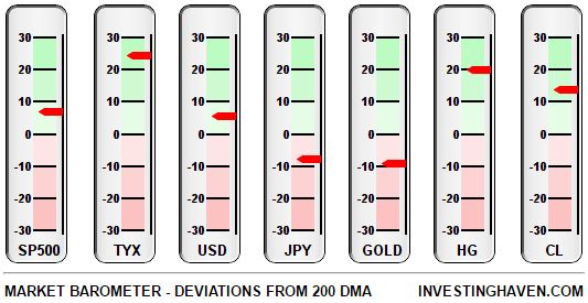
First, our market barometer looks at all leading markets, and gives a sense of intermarket dynamics. The point in this is that markets do not move in a vacuum, they move in relation to each other. For instance, early this year, gold rallied strongly as a sign of fear; consequently, crude and stocks tanked. Gold’s rally stalled when stocks started rallying. It is important to look at market trends as a function of each other.
Our market barometer displays the deviation of 7 leading markets from their 200 day moving average (DMA). A market trading above its 200 DMA is bullish and in a long term uptrend, a market below its 200 DMA is bearish and in a downtrend. The key challenge of our market barometer is to identify primary market trends based on how leading markets are moving against each other.
Right now, risk assets are in a bullish mode: stocks, yields, copper and crude are all in a long term uptrend. On the other hand, gold and the Japanese Yen, both fear assets, are in a long term downtrend.

‘Risk on’ market outlook 2017 based on this leading indicator
The market barometer reflects the state of markets at a given point in time. But is it fair to say that the ‘risk on’ trend will continue into the first half of 2017?
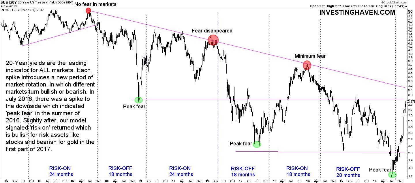
To answer that question, we look at our leading indicator: 20 year treasury yields. The next chart makes the point that 20 year yields introduce a new phase in markets (risk on vs risk off) exactly at times when extreme high or low fear levels coincide with peaks and bottoms on its long term chart (see red and green circles on the chart).
Right after the Brexit vote, 20 year yields bottomed, at a time of maximum fear, and most investors were expecting a stock market crash. That was a turning point for risk, and, since then, risk assets started outperforming fear assets. Stock markets broke to all-time highs, copper and crude rallied, while gold sold off.
With our leading indicator suggesting risk is on, we expect this trend to continue into the first part of 2017. As of the summer, our expectation is that stock markets will start correcting, potentially very sharply. Bonds will become attractive at that point, in line with our former bond market outlook, while commodities will certainly not be attractive.
When it comes to gold, it is too hard to make a prediction. If gold continues to behave as a fear asset, we expect gold to turn into a long term uptrend. The challenge with gold is that it has two faces. On the one hand, it is a fear asset. On the other hand, it is an inflation/deflation driven asset. Gold’s prospects always need to be assessed in the context of what other markets are doing. Initially, our gold price forecast remains bearish. We will need to re-evaluate towards the summer of 2017, and make a new call based on intermarket dynamics.


