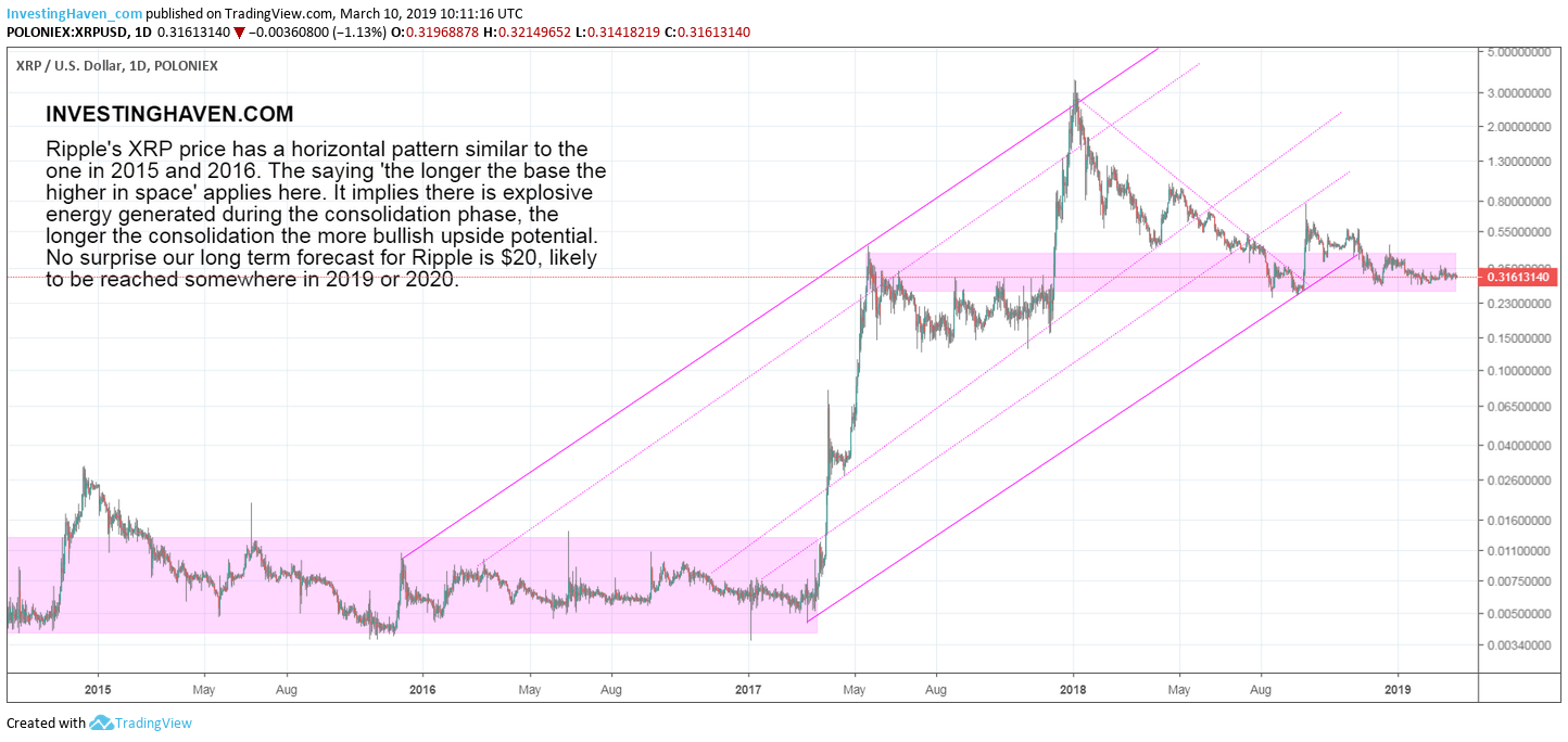
We received several reader questions this week on the XRP chart. They were not directly related to our XRP prediction nor to the XRP market cap. They were related to the XRP price (XRP) chart pattern. Interestingly, the questions suggest that our followers still do not really see how to correctly read cryptocurrency charts. That’s why we re-iterate in this article how to read the XRP chart. We do so by using the chart we outlined in this article XRP: the Longer the Base, the Higher in Space as that’s the one and only XRP chart that matter to investors in 2019, 2020 and beyond.
We got several questions from followers submitting XRP charts as part of XRP news articles. We will not refer to the particular ones we received, that’s not the point we are trying to make. Our aim really is to help followers understand how to use XRP charts, and how not.
As part of our 50 cryptocurrency investing tips we made the point that reading a chart may seem simple but it really is tough to get all important insights out of a chart. This is one of the crypto investing tips that stands out according to us:
Intraday charts are not for long term investors. They are only there for traders. Everyone has to make a tough decision: either you are an investor or you are a trader. In each case you need a different toolset, a different chartset, and different charting principles. The points made above apply to investors with a long term horizon, which is a bare minimum of 3 to 6 months.
Moreover, there may be many XRP charts as the ones on Ripple’s site but the trick is not to use many but rather the right XRP chart(s).
The XRP Chart that Matters in 2019 and beyond 2020
The big miss of the XRP charts we saw is that they are all way too short term focused.
Chart analysis should happen on 3 timeframes: short term, medium term, long term charts.
Because XRP is not in existence for a long time it is on the one hand easy to check all timeframes. On the other hand we are not able to use the monthly timeframe so we have to adjust our regular chart timeframes.
That’s the daily for the short term, weekly for the medium, monthly for the long term. They do not really apply to XRP charts. The trick is to adjust the time range in a way to see the complementarity between them.
The XRP chart over the last 2 to 6 months will NOT reveal the dominant trends from the longer time interval.
That’s why we want to share this rule of thumb with XRP investors: focus on the longest timeframe first. The XRP chart outlined below is the one that shows the dominant trend. All other XRP charts, especially lower timeframes or smaller time intervals, are a function of this! Do not forget this rule, never.
The XRP Chart says “the longer the base the higher in space”
As said in “XRP chart: the longer the base the higher in space” the majority of time XRP moves in a sideways pattern. For 18 months between summer 2014 and April 2017 it moved in a range between $0.0035 and $0.011.
The basing pattern in 2015/2016 was crucial for success. The base was long so the upward potential was strong.
Right now we see XRP moving in the $0.30 to $0.60 area for 9 months. XRP bulls pray that this consolidation goes on for another 12 months. The subsequent rise after this long base is enormous, and will send XRP to our projected target of $20.
Looking at only the last 3 to 6 months will not reveal this fundamental insight out of the XRP chart outlined above which is the dominant insight and trend.


