Last week, we explained how Ripple went from super bullish to neutral in less than a week. In essence, what happened in Ripple was that Ripple’s tested its breakout level, succeeded to break out but then back down a couple of days later. The breakout was invalidated, and we tend to call this a “false breakout.”
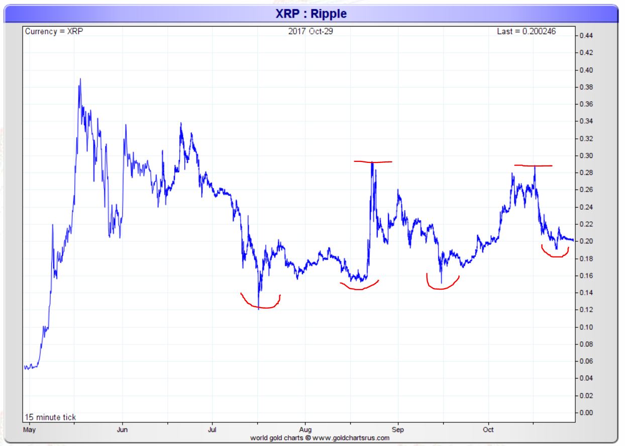
Although it is not visible on below chart it remains key for Ripple’s price to rise above 0.26 USD, and stay there for at least one or two consecutive weeks, in order to have a confirmed breakout. The chart that is featured in this article visualizes that point.
Other than the breakout point of 0.26 USD we have found another observation on Ripple’s chart: a pattern of higher lows as shown below. The red annotations show the extreme drops in each of the last 4 months, consecutively: July, August, September, October. Each of the drop reached a point that was higher than the previous one.
Moreover, Ripple’s chart remains in a sideways trading pattern, i.e. a consolidation. This is, by far, one of the most important challenges that investors face. A consolidation shrugs off bulls and bears because it creates disappointment. Emotions are the biggest impediment for success in markets, and disappointment is no exception to that rule.
Now here is the clue of Ripple’s chart: the combination of the pattern of higher lows with a consolidation pattern that is now ongoing for 6 months is an extremely powerful combination. Almost every other cryptocurrency is either in a strong uptrend or downtrend, not so with Ripple which is consolidating.
These factors lead us to believe that our Ripple price forecast of 0.50 USD in 2017 is still not out of the woods.
Ed. note: InvestingHaven is the first in the world to offer a Blockchain Investing Research service, subscribe now to get the top 3 to 5 tokens per year and our proprietary risk/reward score for all blockchain stocks trading on public exchanges.


