The annual forecast season is here. We’ll kick it off with the Dow Jones forecast for 2022. In doing so we will use the Dow Jones Historical Chart On 100 Years as one of the key charts. Why? Because the 100 year Dow Jones chart successfully confirmed an epic, secular breakout in the first week of October 2021. This will have a decisive effect on what stocks will do in 2022, is what we believe. Our Dow Jones forecast for 2022 is bullish, we believe 40k could and should be touched in 2022. However, we also expect one bearish cycle in 2022. So, while 2022 should be a year with bullish price action we also believe there will be some really bearish happenings especially if the US Dollar succeeds in clearing 94.60 points (which is what we expect given the very bullish chart setup).
Dow Jones Forecast 2022 Inspired by the 100 Year Chart
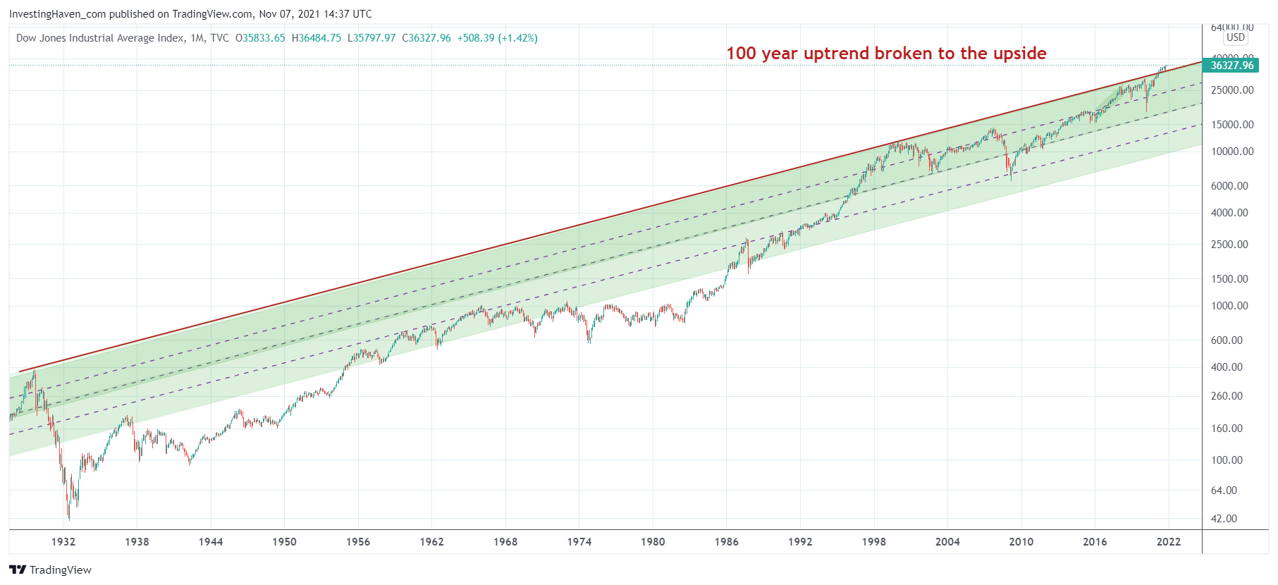
The 100 year Dow Jones chart is the one that has this once in a lifetime type of ‘event’: a secular breakout above 100 year resistance. Absolutely phenomenal.
On the first chart we did indicate what happened when the Dow Jones touched this 100 year trendline back in 1929 and in 2000 (see red arrows): an epic crash started. Arguably, in 2020 we got a similar attempt to clear the 100 year trendline, but it wasn’t as outspoken as back in 2000. If we include 2020 though we have 3 crashes every time this index touched the same 100 year trendline.
The 100 year trendline on the secular Dow Jones chart was broken to the upside in 2021 and this is the basis for higher prices in stock markets, at least that’s how we interpret all this. That’s also why our Dow Jones forecast for 2022 is bullish with a price target of 40,000 points.
We are living in special times.
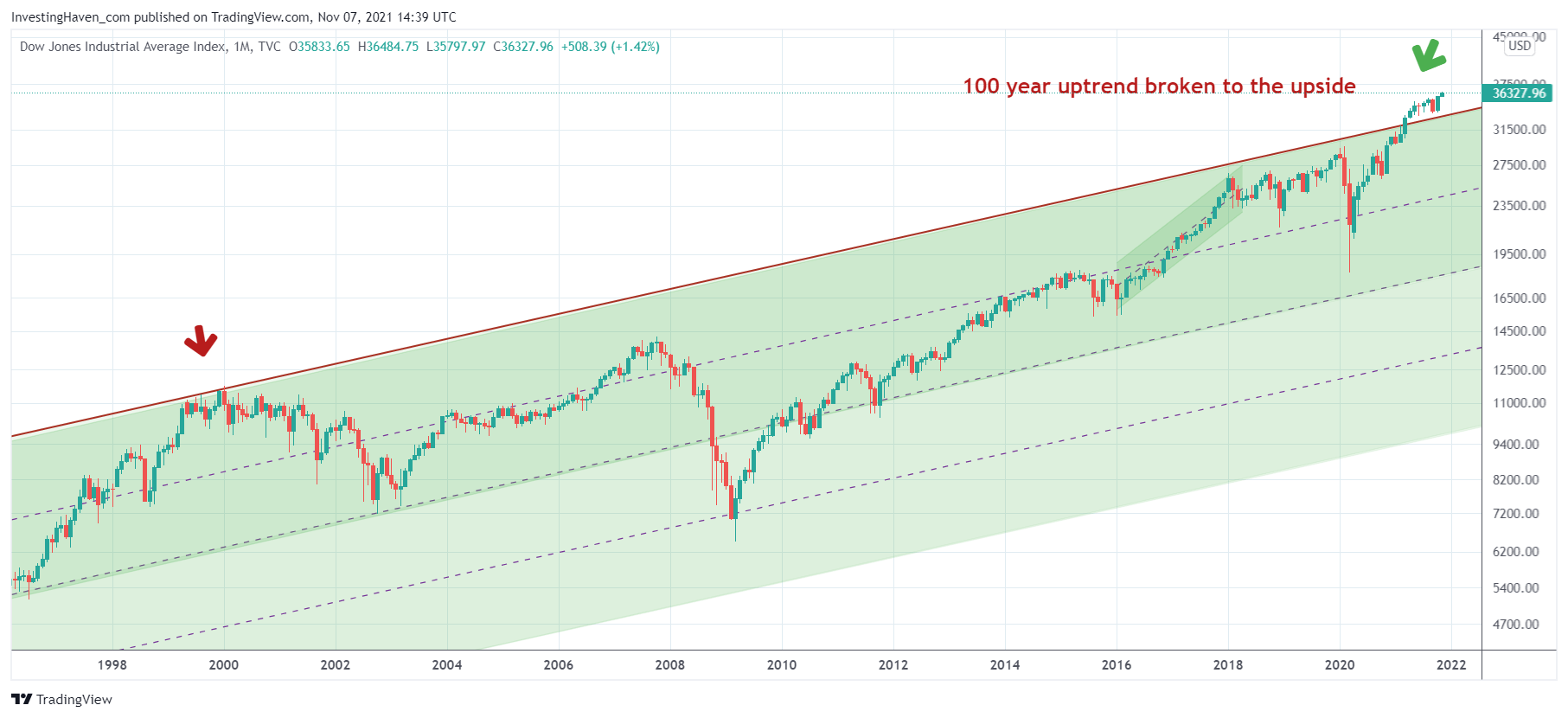
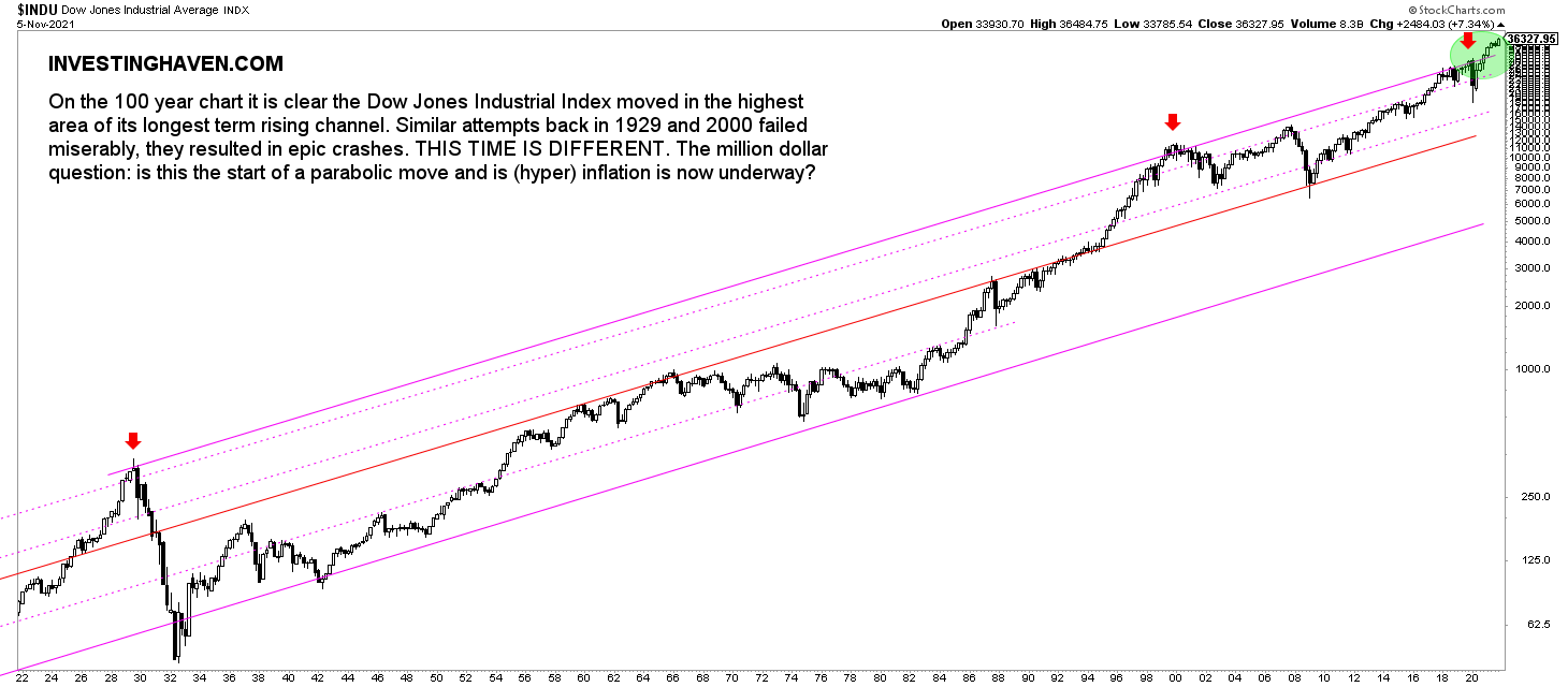 The Dow Jones chart above shows the epic breakout in the green circle.
The problem with the 100 year chart is that is really hard to see what is currently happening in order to understand upside potential (or lack thereof).
That’s why we include the 2 charts in the following section. They help us understand medium term upside potential.
Dow Jones Forecast – Upside Potential in 2022?
The 100 year Dow Jones chart is in uncharted territory! It has cleared 100 year resistance. How on earth is it possible to calculate upside potential based on logic resistance levels?
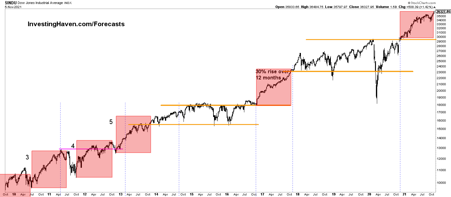
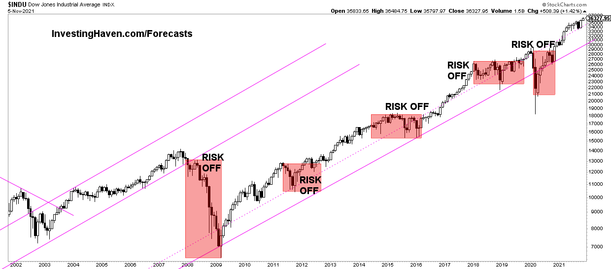
Here is one attempt: the next chart outlines periods in recent history in which the Dow Jones started a bull run. The areas in red are periods in which a ‘breakout’ took place. Interestingly, those breakouts printed mostly approx. 30% rallies.
If recent history is any guide we expect the current ‘breakout’ to move 30% higher. This gives us a target of 39 to 40k points.
Here is another way of looking. The ‘risk off’ periods and how long they lasted. Stated differently, how long does a ‘risk on’ period usually last?
The difference with the previous chart is that we focus on the timing axis while on the above chart our focus was on the price axis. The chart is self explanatory: we are one year into a ‘risk on’ period, in the bigger scheme of things, and those ‘risk on’ periods tend to last longer than one year.
Dow Jones Prediction Bullish even beyond 2022
The next 4 Dow Jones charts feature the 100 year pattern. However, we use a different chart format. It is a chart format that allows us to zoom in which is really key in understanding what is currently happening.
This is the 100 year Dow Jones chart. As impressive as the one above.
The lower the timeframe on the same chart the more impressive it gets.
This is the monthly chart on some 25 years. It is really on this timeframe that we start seeing how impressive the breakout is. Let’s repeat this once more: the Dow Jones index cleared a 100 year resistance line, and it did so in 2021. How can we not have a bullish Dow Jones forecast for 2022 but even beyond 2022?
Note on the above chart what happened back in 2000 when the Dow Jones was not able to clear its 100 year resistance line. That was pretty ugly, to say the least.
This is the weekly chart on 3 years.
As said, it gets more impressive the lower we go.
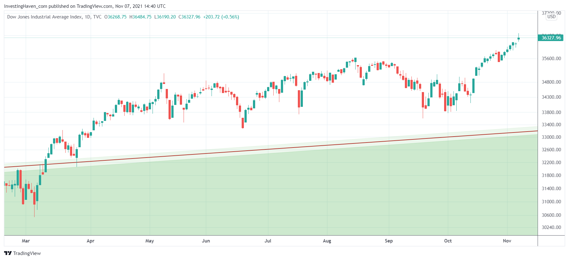
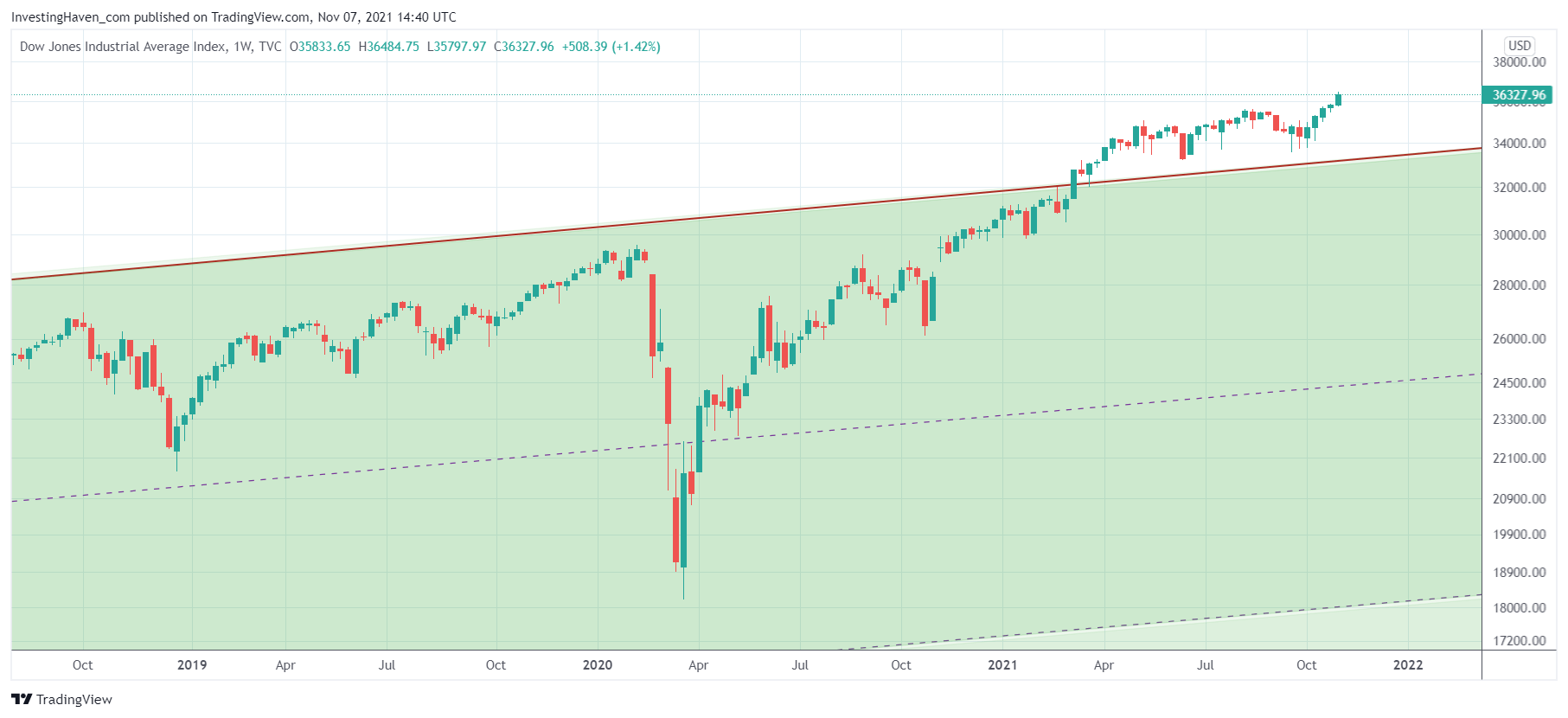 And this is the daily chart featuring the Dow Jones in 2021. Arguably, the lows of September and the first days of October marked a backtest of the 100 year rising trendline. It might be that price did not touch the trendline (which is true on this chart) but readers should not forget that these type of charting services are not desiged to make create 100 year charts. We are pretty sure that the recent ‘lows’ were a backtest of the 100 year trendline.
While it is clear that the above charts suggest that THIS TIME IS DIFFERENT because the 100 year resistance line was cleared and did not result in a Wall Street crash like in 1929 we would like to warn readers that is an exception. Don’t think in terms of THIS TIME IS DIFFERENT, the majority of times this saying is not valid. It is highly exceptional to see such an epic breakout on a chart.
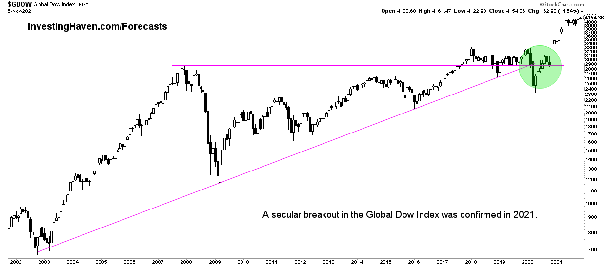
Even the Global Dow, the index for global stock markets, is in breakout territory.
Is the epic breakout in the Dow Jones good or bad news?
Investors would consider this Dow Jones forecast for 2022 as ‘good news’. However, there is a case to be made that this is not good news. Why?
The alternative viewpoint is that this epic breakout in the Dow Jones suggests that inflation is underway, maybe even hyperinflation. If we go back to the 70ies we can see that inflation picks up slowly, but accelerates at a certain point. Back then it was gold signaling elevated levels of inflation underway. This time it might be this epic breakout in the Dow Jones that is signaling that a big wave of inflation is underway.
While an inflationary environment is not a bad thing for investors we would certainly not prefer accelerated inflation. That’s NOT good. Things may get out of hand, and we might find ourselves in a situation in which there is no place to hide.
We are no conspiracy theorists, nor perma bulls or perma bears. We are realistic. And our healthy dose of realism tells us that high levels of inflation will not be a fun environment to make investing decisions.
What is the best way to handle rising stocks but also protect from elevated levels of inflation? Consistently building up your portfolio is the one and only answer. You have to grow your portfolio so you can create options in the long term. There will be different and multiple options to protect from high levels of inflation, and it all starts with a growing portfolio that allows for the right type of protection in the future.
Follow Up on our forecasts with our free newsletter
We absolutely recommend to subscribe to our free newsletter in order to receive future updates. We publish updates on our Dow Jones forecast. But we also do publish other forecasts.
We continuously, throughout the year, publish updates on our annual forecasts. Any revision in our forecast are published in the public domain and appear in our free newsletter. Therefore, the only way to track the pulse of markets and stay tuned with our forecasts is to subscribe to our free newsletter >>