Although gold sentiment is very bullish since early last year, the gold market continues to be in a bear market as proven by the long term gold charts. The fact about bear markets is that they have only one turning point, most investors tend to forget this important investment insight. Gold remains in a bear market until proven otherwise. In our own, words, as long as gold does not break above its bear market channel, it remains in a bear market.
We wrote last year that our gold price forecast suggested no trend change in the first period of 2017, and, so far, that forecast has been very accurate.
At a certain point in time, gold will shine again. That moment is simply not now.
Recently, we explained that gold was 8 pct away from a new bull market. However, since that point in time, the price of gold came down another 4 pct. The fact that the metal was not able to go higher and test a breakout level is bearish.
The bearish case is supported by the recent trend in the US dollar which continues its bull market. That is bullish for yields but bearish for gold. By the way, that was also the main reason why we wrote Gold Investors Watch Yields As A Gold Price Indication For March 2017.
This article features 3 different angles (not based on gold prices, but ratios) to make the point that the gold market arrived at a major point right now.
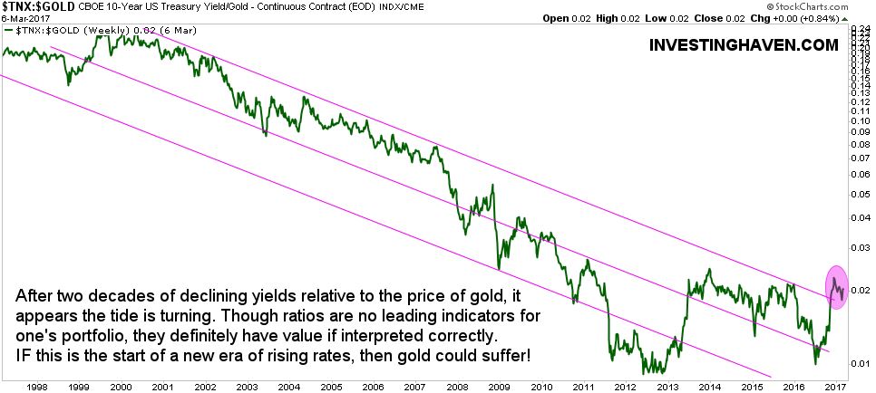
The first chart that shows the ratio of 10-year yields to the price of gold. Visibly, there was an attempt lately to break above a long term falling channel (see purple circle). If that breakout is confirmed, it would be bearish for gold. The opposite is true as well: if the ratio moves lower, to the lower area of the channel, it would be very bullish for gold. Right now, there is a bear market test ongoing.
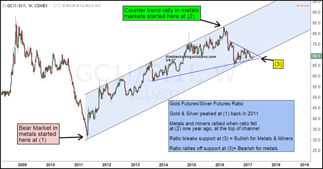
From a different perspective, the gold to silver price ratio provides another viewpoint to assess the bullish or bearish trend in the gold market. Silver tends to move stronger in any trending direction: silver rallies sharper in a gold bull market, but it also falls sharper in a bear market.
The 9-year gold to silver price ratio chart shows how the ratio arrived at major support. If the ratio goes higher from here, in other words if silver lags behind compared to gold, the ratio would turn up. Chart courtesy: Kimblechartingsolutions.
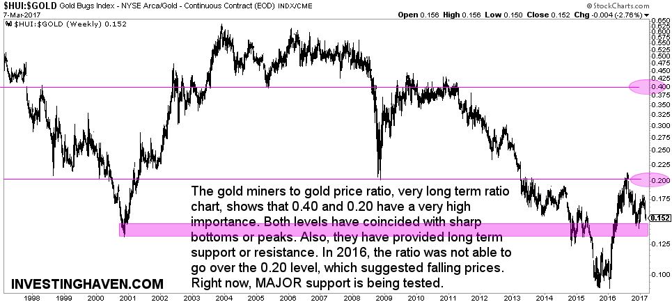
The third chart is the gold miners to gold price ratio. It shows how the ratio is entering major support right now, and that area was also tested during the lows of 2000 and 2014. If the purple area holds, it would be bullish in the medium term. If it does not hold, we could see another (last?) capitulation in the gold market.


