The price of gold (GOLD), the price of silver (SILVER) and precious metals miners (GDX) are all on fire today! This should not come as a surprise as we saw this coming many, many months ago. We reported this in our gold forecast and silver forecast.
In this article we show 3 spectacular charts in the precious metals space that suggest that today was just the beginning. More fireworks is underway, much higher prices are underway!
The 3 charts we feature in this article, especially the first two, are ones hardly anyone on the world looks at. InvestingHaven is one of the few sites that features this type of deep insight. We do so for free, because we want to set up our followers for succes. Big success!
Note that these charts are very powerful as opposed to following gold news. This gold news article for instance has little added value. Similarly, any search on gold related news does not yield any article that is relevant for investors. As said in our 100 investing tips: stay away from news, it is a lagging indicator and it is not created for investors (but primarily to sell advertising space).
Which gold investing vehicle exactly to choose? Most leverage comes from high quality gold and silver miners. We featured top gold stocks as well as top silver stocks several months ago, and they are really still actual!
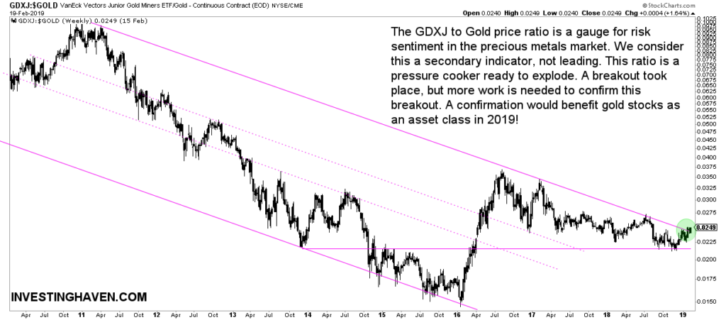
Breakout chart #1: Junior gold miners to gold price ratio
The junior gold miners index (GDXJ) to the price of gold is a ratio that tells something about risk sentiment in the precious metals market. This ratio rises if investors are willing to take (lots of) risk.
This ratio is in a falling channel since 2011. This makes sense of course as that’s when the precious metals bear market started.
However, a spectacular breakout is now in the making, after an 8-year bear market!
The breakout started a couple of months ago, but a small push higher is needed to confirm it.
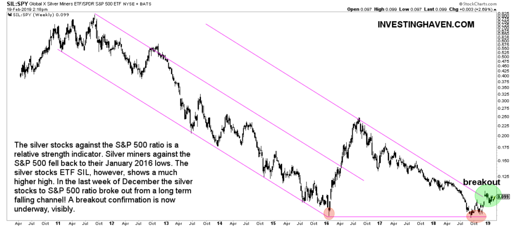
Breakout chart #2: Silver miners to S&P 500 ratio
The silver miners to the S&P 500 is a ratio that we follow closely.
This ratio broke out a few months ago. Similar to the one above just a little bit of work is needed to confirm this breakout. A small push higher in silver miners is needed.
We especially like the double bottom against Jan 2016 on this chart. This is very powerful (read: bullish) when combined with our gold and silver price forecasts as well as gold and silver miner trends.
Breakout chart #3: Inflation expectations
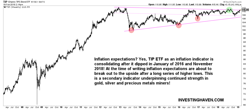
What about inflation expectations?
The TIP ETF as an inflation indicator is consolidating after it dipped in January of 2016 and November 2018! At the time of writing inflation expectations are about to break out to the upside after a long series of higher lows. This is a secondary indicator underpinning continued strength in gold, silver and precious metals miners!

